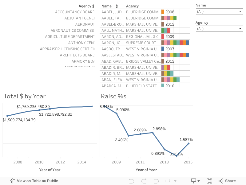
After seeing some work that I did with the University of Kentucky Salaries Viz my mom (who is a teacher at a local college) commented that she thought I should do the same thing with her college. I started looking and found that, unlike Kentucky, the salary records for ALL WV state employees were available all the way back until 2007!!! Yay historical data!
Me when I looked at the site and saw how much historical data there was!
Unfortunately unlike the other salary data I normally have I didn't have access to job titles so there's no way to really know if someone changed positions or anything... it's just name, department, and total compensation for that person per year. Of course with that, particularly given the amount of time... you can do neat things like figure out raise percentages over multiple years! Unfortunately the way the page is laid out that I extracted the data from you cannot look at an individual's salaries over time... so I fixed that with the viz! Below you can type in a name, or a department, and the viz will filter to show that person's salary/raises over time.
Additionally you can click on a particular department or name to have the data re-form to show just that particular set of data. Ie. You can click on the Division of Corrections, then click on Adkins, Lisa to reform the data specifically to show that user. Anyway I'm going to work on some other ways to present this data but in the meantime play around with the dashboard here:
Ultimately you have to remember that, even though it's Thanksgiving... you can't eat money. No matter what Ralph Wiggum tells you:
As always thanks for reading and if you enjoyed this visualization (viz) please share it out on your social networks. If you'd like access to the raw data that I scraped (by hand) from their site then you can download the raw data by clicking here.
Better late than never right!? That's my thoughts on this week's post! I had a lot of life-related things happening recently and I haven't had the time to focus on data collection, ETL, etc as I'd hoped. Part of that was some personal things in my life and then I decided in the middle of the week to come to my hometown of Charleston, WV to spend some time with my dad post hip-replacement surgery.
Telling my dad not to do anything is IMPOSSIBLE.
I have something on-deck for next week that should be pretty big if I can find the time to get it done so that'll hopefully make up for the lack-luster few weeks of Viz!
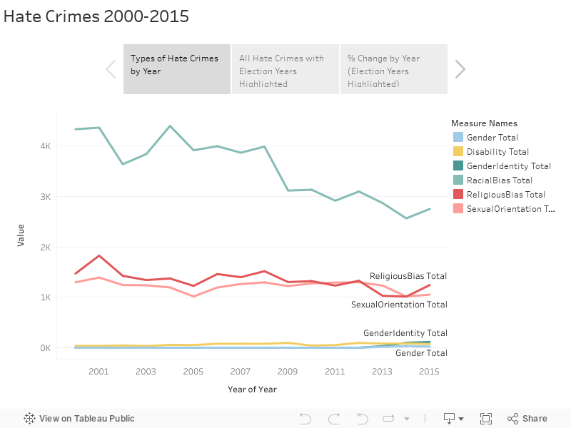
So while looking around on my laptop I realized that I had WAY fewer datasets on here than I anticipated. I've been poking around a little more on Data.World lately and I saw a crosspost between there and /r/datasets about FBI statistics on hate crimes from 2000-2015 and thought with the given political climate this might make for a good viz. Sadly the 2016 data isn't in yet... it's probably gonna be a mess.
If you'd like to read up on what constitutes a "Hate Crime" according to the FBI they have a really great site located here.
You can see I just did the one Tableau Story for this viz as I think it's pretty logical to "step" through and isn't terribly interactive (sorry!). Check it out below:
I can't really think of too many things in the country that occur pretty cyclically every 4 years that could contribute to these pretty significant increases in trends. Of course the largest hate-crime related trend since it has been tracked starting in 2000 is the change in Anti-Islamic hate crimes that happened after 2001 (likely a result of 9/11/2001).
As always hit me up on twitter @wjking0 or via the comments below to talk about dataviz!
First let me apologize... for those readers not in the United States this was election week so everything's been a little.... let's use the word hectic around these parts. Secondly, I'm sick (see photo below) and was hoping Thursday/Friday I could really crunch though some data. That said... I didn't START crunching through the data until about 1AM Friday morning (you should be reading this on Friday hopefully).
Me sick in my comfy hoodie vizzing at 3AM.
I know what you're thinking....
Gotham... great show AMIRIGHT!?
The upshot of all this is to say that, due to various reasons, today's viz is going to be a little... thin. I still wanted to scrape and ETL some data for my readers but it's not nearly the level I'd LIKE to do with this data. If I can convince the awesome folks at Import.io to give me their top-tier plan for free I would be vizzing the shiz outta all kinds of stuff... but my feeble internet connection and their lack of support for their legacy application don't lend themselves to me doing 50,000+ queries anytime soon! That said Import.io's product is my ABSOLUTE FAVORITE for data extraction! *bats eyes, looks for endorsement deal*
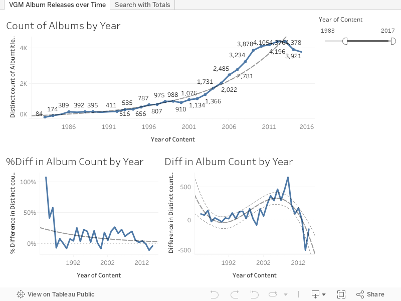
Today's data is my initial scrape from the Video Game Music Database which really is an exhaustive list of titles... of course most of which are in Japanese so I don't necessary know all the titles the music is referring to, it's impressive that their community has built something so rich! They even have a dedicated stats page that you can poke around in located here.
I found this through a podcast I listen to pretty regularly called the Legacy Music Hour featuring 8-bit and 16-bit era games.
This really isn't so much a comprehensive look at the data as it is a quick viz so I can stick to my schedule... that said....
I just did two dashboards... one which simply augments and simplifies their searching process to give you all results that you can scroll through and load by album title. It's nothing fancy but you can use it to total up things to compare how many game soundtracks Sonic has had to Mario, etc.
This next one shows the trends in the video game music industry over the last several years. Unfortunately game sales data is hard to come by (if anyone knows a source please let me know). The height being in the late 2000's around 2009 or so with a dip after that. I kinda wonder that, like with gaming, VGM reached a saturation point where people had more than they could reasonably listen to or enjoy?
I also filtered the early days of VGM and limited it to 1983+ (which you can edit with the filter-slider) because I felt that really the explosion of game music came when the Famicom hit Japan in 1983. You can see this reflected
I promise you all next week I'll unveil something worthwhile when I'm feeling less like poop for a zillion reasons! In the meantime ... at least I'm keeping my schedule of 1 Viz per Week! I do have the scrape started for the deep dive into this data and I'll likely plow through that and get it published in a week or two from now (probably 2 as I don't like to put two similar topics published back-to-back). Hit me up on Twitter @wjking0 or leave a comment below and tell me what you thought!
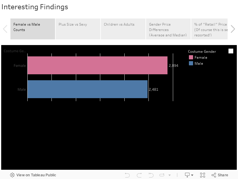
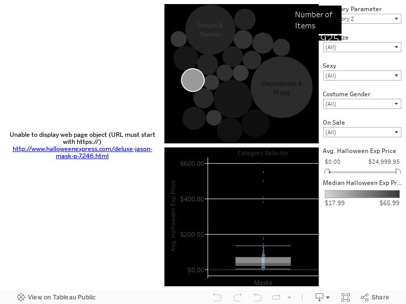
I'll provide visualizations however some of my initial findings are as follows:
Some assumptions you would make are accurate, such as plus size costumes tend to be more expensive I considerable amount (28.60% more expensive on average).
Interestingly enough plus size costumes tend to be cheaper when they are classified as "sexy" (18.18% cheaper!).
There are also just about equal percentages of sexy plus-sized costumes as sexy non-plus size costumes (12.12% Plus vs 16.07% Non-Plus).
Thanks to my friend Barbie I thought it would be a good idea to look at Children vs Adult costumes to see which had more. I would assume more children costume exist than adults costumes, as it turns out there are considerably more adult costumes than children's costumes! The assumption could be that people tend to make children's costumes or children's costumes simply require make-up and accessories (which does make up more than 30% of the total items in the Halloween express store).
Also the assumption that women costume cost more than men's costumes is incorrect men's costumes cost more by approximately 20% and there are approximately 20% fewer men's costumes as women's costumes. This may be a result on pricing vs demand. Just guessing that possibly women's costumes are sold more frequently so can ultimately be priced lower.
I would say I'm sorry for all the Mean Girls gifs... but nah.
Since gender of costume isn't specifically stated in every case I did a little formula, I just wanted to give you a quick note on how I defined gender in this data. If any of the categories or the item title or item subtitle contain the word "women" or "girl" then I defined it as 'Female' and "boy" or "men" then I classified it as a 'Male' costume.
Anyway here's the data that I just mentioned! It's not really meant to be "played with" but don't worry the next viz below this factual story viz will be more interactive!
Now as promised I wanted to put some individual links to things in here that I just found horrifying:
Basically the ENTIRE "Mascots" Category but most specifically this gem. He's a "Patriot" mascot... with a shotgun. Not sure what Mascot carries heat.... but ya never know.
The $25,000 PROP.... which really just scratches the surface of expensive things for sale at Halloween Express. You can play around below with the full dataset and set it to $1,000+ on the filter and you can see HOW many crazy items there are in there!
I've been a little distracted lately so I promise a better and more deep dive into some data next week! As always hit me up on Twitter @wjking0 or in the comments below if you have questions/comments/concerns!
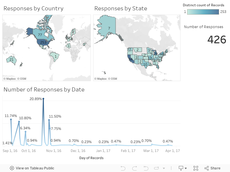
This is the page to display the results of the ongoing Roller Derby Injury Survey. If you are an injured (particularly already recovered) skater I urge you to fill it out to make the data as accurate as possible. One of the nice features of the newest version of Tableau Public that I've been using to display my data is that it can now query Google Sheets nightly for updated data. So what you're seeing on this page is LIVE data (as of midnight Eastern Standard Time on the day of viewing).
Let me first address the big issue everyone has with the survey which is that only a singular injury can be done at a time. This was purposeful as different injuries can have different recovery times/rates/etc and I didn't want to muddy the data with a variety of null results from the approximately 70% or so who had NOT had a previous injury. If you have filled the survey out for one injury but have had others I urge you to PLEASE fill it out again with details about your other injuries! The data is largely parsed by injury type (like time to recovery etc) and to make this data as accurate as possible we need as many data-points as possible. I know it takes time to do but I hope you feel it's time well spent!
Below is the summary of responses thus-far. If you feel that your region (country/state) is not represented enough in the data please spread the survey around to get others to fill it out and help get the data as robust as possible. I'd also like to take this opportunity to thank not only the Gimp Crew forum but also Roller Derby Athletics for helping to get this survey out to as many people as possible in the derby community! Your help is amazeballs! =)
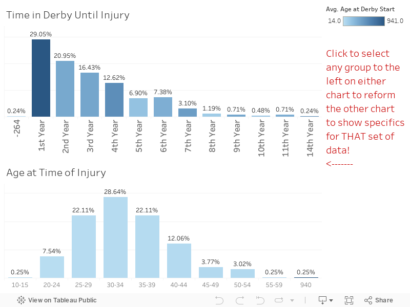
I'll admit going into this data with some preconceived notions I wanted to examine. The first among those was WHEN people get injured. The overarching feeling I've always thought has been the newer skaters are more prone to injury. This turns out to be the case, with almost 1/3 of all injuries happening within the first year of skating.
It seems (with the current dataset) that the longer a skater skates the less-likely an injury is to occur. I may (once there is enough data to warrant this) add in a filter for injury type as I would guess that skaters suffering knee-related injuries would be higher the longer a person has skated with things like ankle injuries still being a "bad fall" type injury that would happen more frequently to newer skaters.
UPDATED 10-26-2016: I realized I had forgotten to put in the following exported image showing the how the age ranges above skew about 5+ years over what you see in the derby community as a whole:
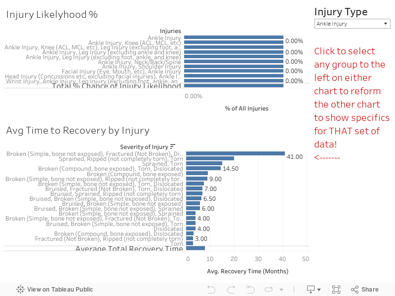
The other thing I was curious about was the frequency of types of injuries and where those tended to take place. As anyone who's been involved in the sport for any length of time can tell you ankle injuries are by far the most prevalent in the data. That said however I feel that there is a LARGE area of unreported injuries with head impact/concussion injuries that is not accurately represented in the data. From personal experience having a teammate that I worked with for years who had to retire due to multiple concussion injuries in a single year (5+) I feel this is probably a part of the sport most people don't see as a "serious" injury so people don't get added to the Gimp Crew forum after concussive injuries. For every ankle break I've seen I've seen at least 3-5 concussions of various levels. At the time of this writing however concussions represent under 10% of the data... just saying that's probably not exactly accurate. While doing a search for some images to represent concussive injuries I came across this AWESOME article about the practices of concussion testing in other pro sports and the policy changes over the last 20 years or so in mandatory testing, etc.
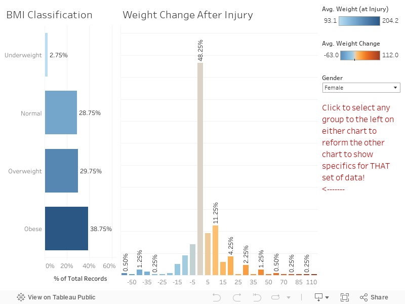
Probably the largest surprise that I found was something I'd guessed about but wasn't sure of the "level" of. One of the reasons that I collected height and weight was to facilitate calculation of BMI to see if BMI's considerably changed after injury. Personally speaking I lost a bit of weight after my injury (leg muscle mass) so I was curious how normal that was. It turns out that weight change is fairly rare with less than 50% (at the time of writing) experiencing any weight change at all. Weight change though is relatively (to height obviously) so I wanted to use the CDC guidelines on BMI health. I'll be the first one to admit that BMI is a ROUGH measurement, I work out, I lift heavy, and have what I would generally consider to be a muscular body (#humblebrag)... that said according to the CDC I'm labelled as "Overweight" based on my height/weight/BMI combo.
Here's the last assumption that people have when thinking about derby injuries... that due to people being injured most typically in their first year of skating most injured skaters aren't in the best shape to begin with. I'm NOT SAYING that ALL injured skaters are out of shape, I'm just putting the data out that (at the time of writing) ~40% of injured skaters have BMI's that would label them as obese. Even if you don't agree with the CDC's definitions, the fact of the matter is that it appears that skaters with some extra weight tend to have a higher rate of injury. Check the chart below for the current numbers on weight change and BMI:
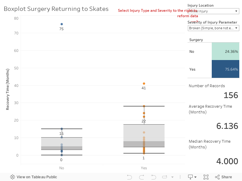
Other common questions that people ask are if surgery sped up or delayed recovery rates. After taking a look at the data I can tell you that in almost every injury case where a surgery was reported that recovery time was longer. In many cases though, in the long term, they tended to feel more "normal" sooner. I don't think this has to do specifically with HAVING surgery but more so the people that medical professionals suggest have surgery are just simply more severely injured. For instance if you look at Compound vs Non-Compound breaks you'll find that in EVERY SINGLE INSTANCE compound breaks required surgery and took significantly longer to heal.
Fortunately for me my health insurance at the time of my accident was pretty amazing and my co-pay and everything for my surgery was seemingly very little. I was curious how many people opted for things like USARS/WFTDA insurance. As it turns out over ~70% have an additional insurance aside from (or instead of) their personal insurance. This number bumps up ~1-3% after an injury... so it doesn't really look like prior injuries are a driving factor in if people decide to get additional insurance. I can create a dashboard for this data but honestly it was just kinda boring. =P
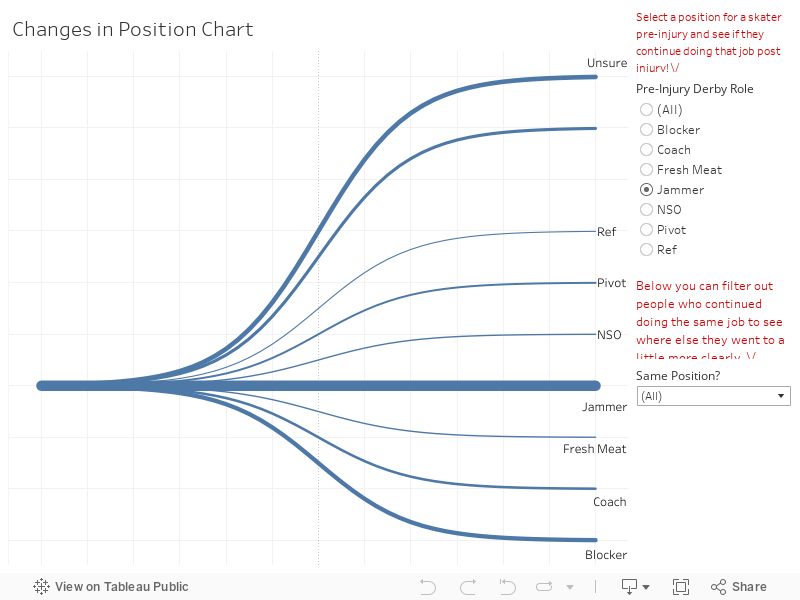
As someone who always wanted to jam I really had hoped that I would be able to come back a jammer... but at the time of writing only about 1/3 of people who used to jam return to jamming post injury whereas 59% of blockers return to blocking. You can check the chart below and see which people stay in which positions etc.
Where do we go from here?! Well the first thing to mention is that this data can be cut/sorted a zillion ways from Sunday. Have a question that this data can answer? Ask! Hit me up at twitter @wjking0 or via the Roller Derby Gimp Crew (which is an AWESOME resource for ANY injured skater with tons of support!) or in the comments below this blog. Since this data is live there is plenty of ways to continue to slice and dice the data in a real-time fashion!
P.S. I have a few more charts I'll likely add on as future blog posts as I get them all polished up (with regards to things like injury/pain data and a few other things). I'll put a link down here when another post goes up about the data!
This is how I feel after looking at injury rates all week...
I knew I would have to do this eventually, I finally came upon a data set so large that I have to split it into multiple posts. I originally was turned on to this data as part of some work I had done with the University of Kentucky Police Department, I had done some work on their crime log and one of the captains thought I would be interested in traffic collision data (Captain Matlock who's super rad and a data nerd himself!). I said oh you mean traffic accidents? He replied, there are no accidents. when he gave me a sample of their data I realized I could deduce several trends in it, particularly in regards to pedestrian and cycling accidents as they occurred on campus.
Being an avid cyclist myself I saw the potential for this data to really help and inform other cyclists and people working on the planning of the University of Kentucky's roads and pathways. One of my last days as an employee of the University of Kentucky was spent with the cycling committee briefing them on this data . They then informed me that this looks to have come from a larger data set from crashinformationKY.org. When I pulled up the site I was giddy with excitement at the fact that there are so many data fields and so much historical data, way more than I had originally been given by the UK police department.
Unfortunately, the yearly downloads from that state police website were not very functional. They were .DAT files but neither of the data definitions listed on the website allowed me to properly parse those 2 GB yearly files into anything usable. I then decided that I needed to just scrape Fayette County as a proof of concept, however even that had to be done in six months intervals which go back over approximately the last six years.
Let's get into the data!
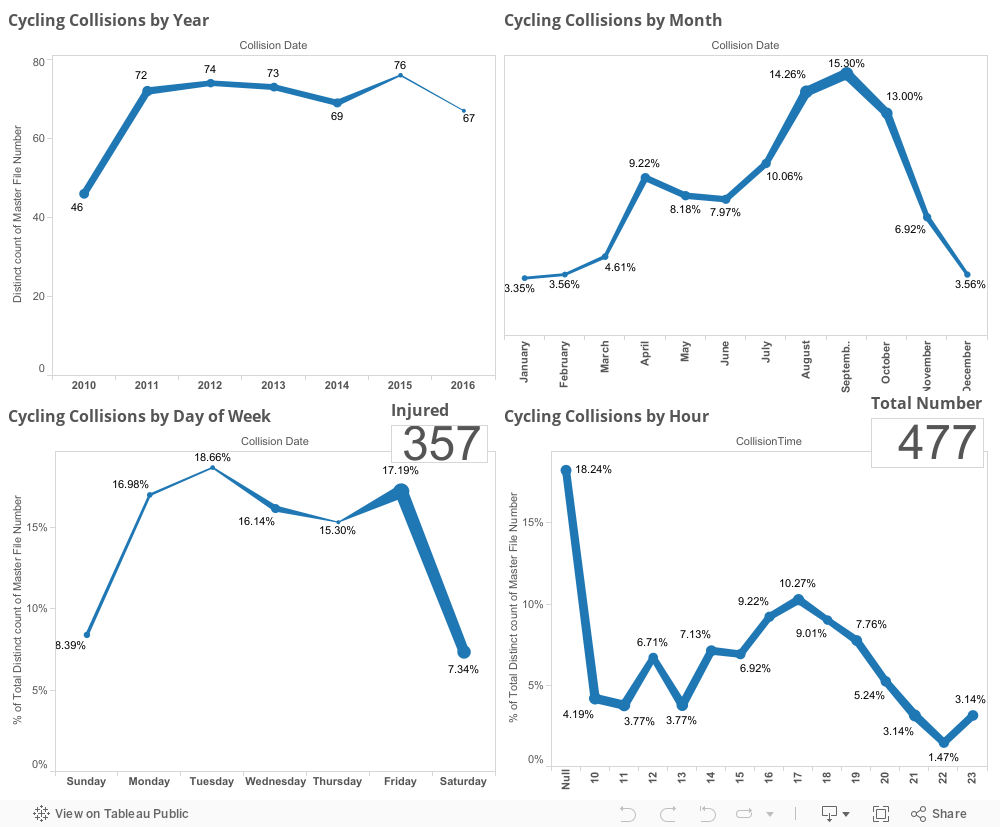
First I would like to mention that all points on the dashboards listed below are clickable, so if you click a roadway name it will reshape all of the shown data to reflect that roadway name until you click off of it clearing that selection. The same goes for things like day of the week of collision or hour of collision, any of those will reshape all the other existing data on the charts below this goes for all four of the dashboards I have posted below.
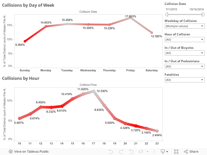
This first dashboard highlights the locations of collisions highlighted by particular roadways with day of the week and hour of day frequency being shown at the bottom. The map to the right of the roadway names shows coloration by number of injured in particular accidents the concentration of redness at different locations can be a good indicator of where are the most injurious areas of a particular roadway. Take a look around at the data and remember you can use the controls in the upper left of the map to zoom in on a particular area of interest after you have set your filters were selected your items on the other charts.
This second dashboard is just a comparison of the percentage change of pedestrian and bicycle collisions by month and year. Taken as a whole pedestrian collisions have risen slightly over the last six years while bicycle collisions have fallen slightly . The thing to remember is the percentage differences in these changes are less than 1% so not terribly significant. If we limit the collisions to the last three years we see those trends are reversed. In the last three years , pedestrian collisions have gone down 0.4% while bicycle collisions have gone up 0.2% . I didn't have any particularly significant dates to slide the slider to in order to examine a particular change in Lexington policy or anything. But I left the date slider on the right in case anyone wanted to check something out.
This third dashboard is a slightly more simplified version of the first except that I wanted to look at injury rates particularly. You'll notice the red coloration is the percentage of people injured on that given day or time. Again, the date sliders are on the right as well as selections for the day and hour of collisions though those can be selected by clicking directly on the dots as well . Things like bicycle and pedestrian collisions as well as, in this visualization, fatalities are included.
This last dashboard is just one purely to look at every aspect of timing of cycling collations including by year, month, day of week, and hour with both injury totals and total number of collisions also listed in the chart.
I will be linking the second or third or possibly even fourth part of this viz down below as I complete them but they will all hopefully be part of my one year of viz challenge that I've made for myself. As always, if you have questions or concerns you can leave them in the comments below this blog or hit me up on Twitter at @wjking0.
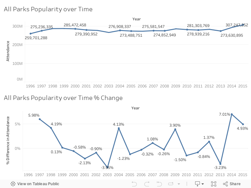
Originally found the subject of today's blog in a Reddit forum that I am an admin of called r/datasets/. I'm a pretty big fan of our national parks and have several faves including Monument, Yellowstone, etc. This year marks the 100th year of the United States National Park Service has been in existence so I thought this would be a great time to make a viz about our nations national parks!
Some of the things that I discovered in the data are as follows:
I started noticing a trend that over the last couple of years national parks have been visited more than any time in the last 20 or so years! I've been searching for a reason in this uptick of people visiting national parks have yet to discern one. One suggestion is that the "Every Kid in a Park" initiative is responsible for the growth over the last couple of years. This seems unlikely however because after further research the beginning of the Every Kid in a Park initiative was September 1, 2015. You'll see by the chart below the last two years in particular since 2013 has seen some of the heaviest growth in recent recorded history.
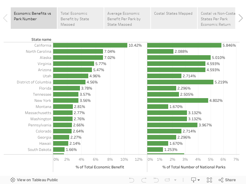
Unfortunately, not all of the data that I'm showing Nice charts was available from a singular data source. I had to scrape the national parks website located here, as well as the national parks statistical site located here. Unfortunately, I was also unable to easily join the data set as the names of the national parks on the website do not match the names of the national parks on the report that they issue on their statistical page. Additionally, the main national parks website does not have any year by year breakdown of monies coming into a state per park (just a state total).
That said, we can still do some calculations with the amount of money that has come in totally and the number of parts located in the state to get a rough value of return over the last years 20 years per park. As you can imagine, none of this requires mind blowing mathematics or calculations. After I began examining data I noticed a trend in which coastal states tended to have a higher return value per national park than non-coastal states. I decided to do a grouping to see if that assumption was correct and it turns out, that it is! Check out the Story below and click through the stages I described above to see for yourself!
This makes sense if you think about it, most people (that I know anyway) don't vacation by going inland but a lot of people who are in land-locked states I believe tend to go towards the coast for vacation purposes. If you're curious about how the NPS calculates the amount of money coming in feel free to check out their write-up on these numbers here (PDF). What this appears to be on the outside is that coastal based national Park tend to pull about half million dollars more a year in revenue then non-coastal national parks. We can figure this out by assuming that the total on the national parks website was from the last 20 years of data they have collected.
Interestingly enough, the state with the highest return her national Park is actually North Carolina!
As always, if you have any questions or concerns you can leave a comment below or hit me up on Twitter at wjking0.