Tuesday, May 2, 2017

Things I've Made Up - Pure Dataviz Imagination

This is part of my #1YearOfViz series! Check out the archive here: http://bourbonandbrains.blogspot.com/p/one-year-of-dataviz.html
It's time to use our...
They're not fabricated datasets... they're "alternative facts"!
This week's #1YearOfViz I've decided to look at something a little different. Instead of the normal socio-political or sales data I normally look at I've decided to show you all some of the things I've done with data I've completely fabricated!

Since being terminated from the University of Kentucky due to a reduction in force I've applied to tons and tons of jobs (viz on that coming at a later date) and with several of those jobs I've found myself not as able to EXPLAIN what I wanted to do with the job as much as I wanted to SHOW the people in charge what I was capable of. I started taking several of the positions I've applied for an worked on designing datasets around those jobs to see what I could make out of their fake data. Sometimes there's an example, sometimes there's just a rough outline with a few numerical values thrown in for good measure...

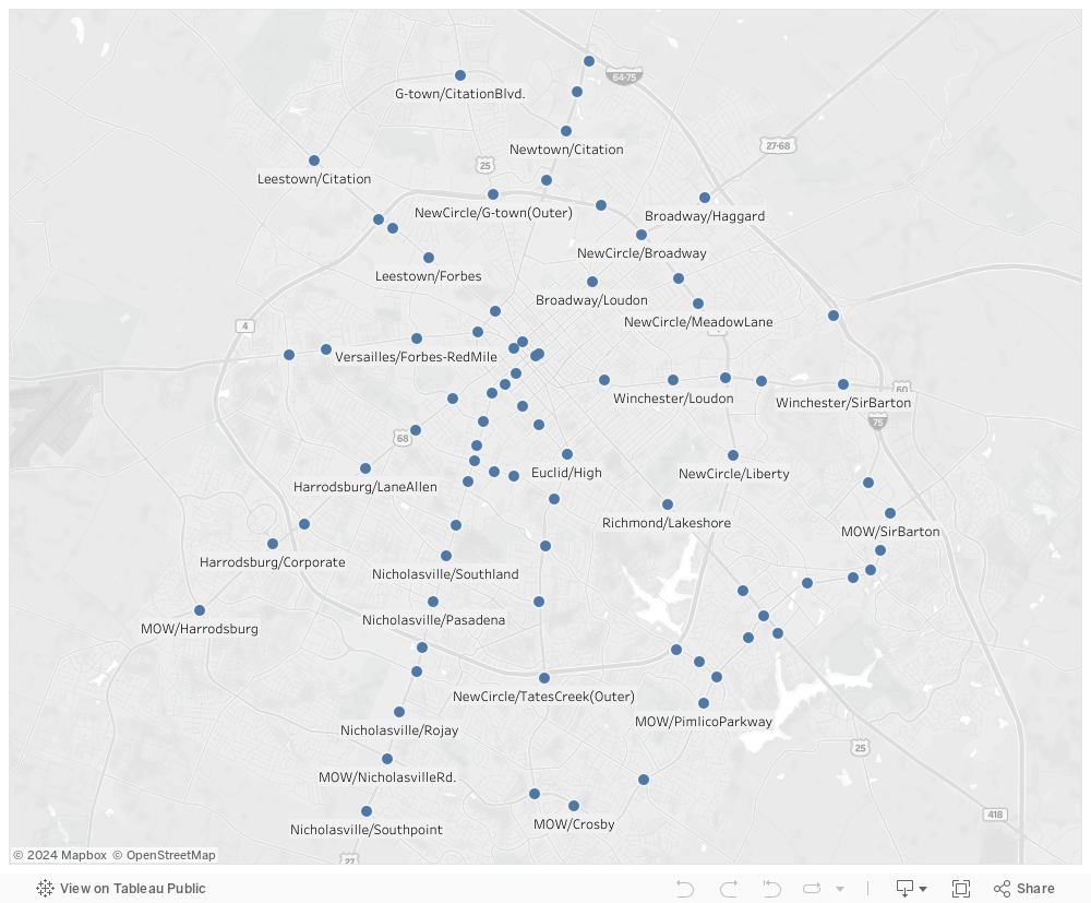
Let's get started with a real dataset that I scraped from a local recruiter. This one came from TEKSystems which is an international company with offices right here in Lexington, KY. I had a meeting with one of their recruiters and I figured I'd better have something to show off my skills. So in about 24 hours I scraped and vizzed the following out of their job listings.

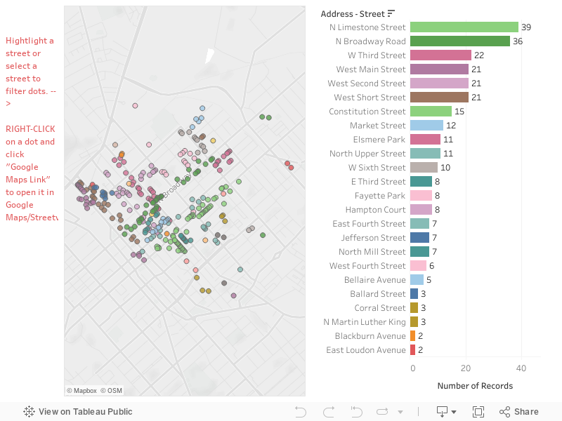
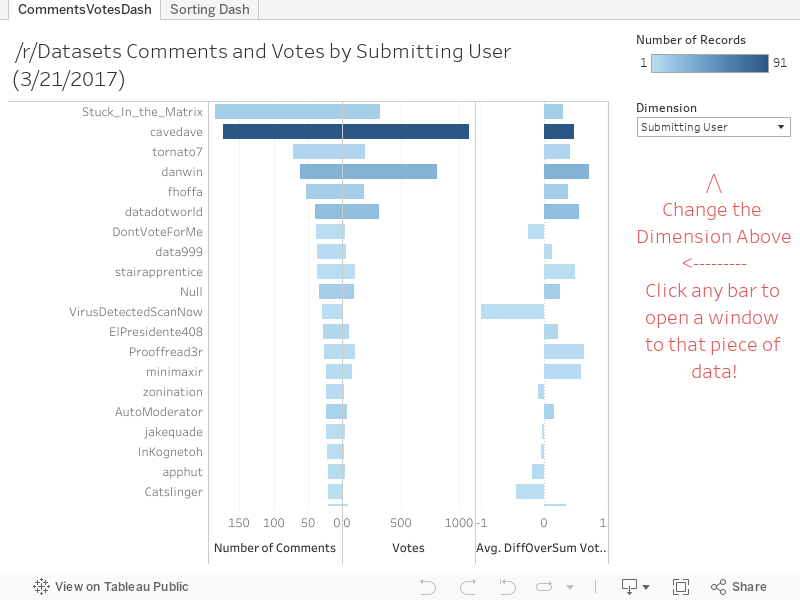
This first dashboard looked at posting trends of the TEK Systems employees to show them trends in their posting habits:


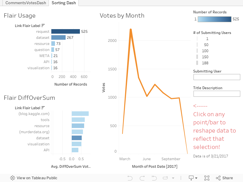
As you can see in the dash above most jobs are either filled or withdrawn after 2-3 weeks... I'm guessing that's their posting window and then they re-list the jobs again to keep it fresh (it looks better that way!). This next dashboard was so I could see what the trends were as far as jobs I'm looking for (IE Tableau dataviz jobs). Where are they located? What are the titles and frequencies etc?


Fun right? Totally a more functional use of their site and their depth of data in my opinion!
Me with data and crappy site interfaces!
I recently had a great interview with Delta Private Jets and was shown a spreadsheet so I was asked to answer a few questions. I fumbled around in Excel for a little bit to answer the bulk of the questions (yuck) but finally visualized the Tableau Desktop interface and walked the interviewer through every step of answer the questions in Tableau step-by-step.

About a week after the interview I got thinking that I'd prefer to actually show them the answers and drive them into some more questions with the data so I set about to re-create some of the data I saw as best I could remember. I vaguely remembered some ranges and the number or rows in the dataset...  then I found mockaroo.com which has been pretty awesome to work with. Given the largest number of rows you can generate for free is 1,000 you can do that as many times as you wish. I downloaded several sets and combined them manually.
Yes Dean, totally made up!
I designed the following Story Dashboard to answer those questions and pose some new ones. Check it out and let me know what you think!


Finally I bring you to the last dataset I've created recently. I read a post from the CEO of Import.io about their sales information and how they'd like to hire a data-wrangler... so I figured I would fake-the-funk with a dataset to show him exactly what I was capable of!

I may fake a dataset... I'll never fake the funk.

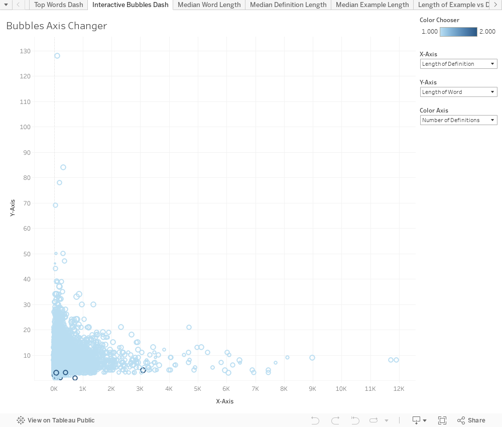
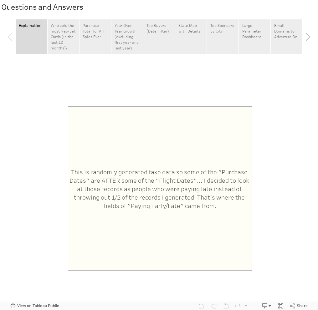
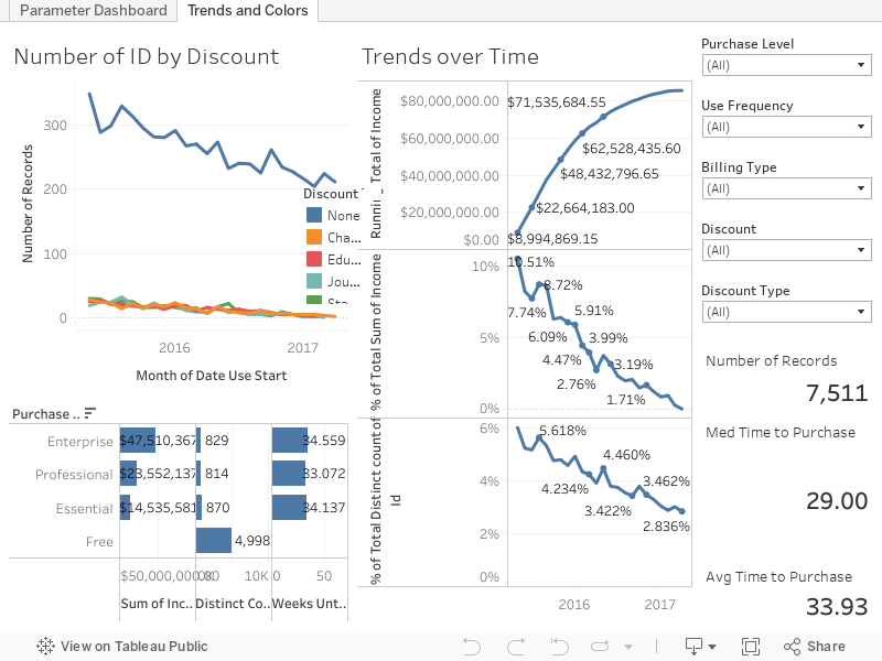
Here's the fake sales data from Import.io ... what's wild to think is that I used fake numbers of sales but even on a fairly conservative end over the last couple of years the company should be worth several million dollars (gross profit) based on it's current pricing structure at a less than 50% adoption rate. What other nuggets of data could you get from all this fancy viz? I completed the data generation, data prep, and viz for this all in under 24 hours!


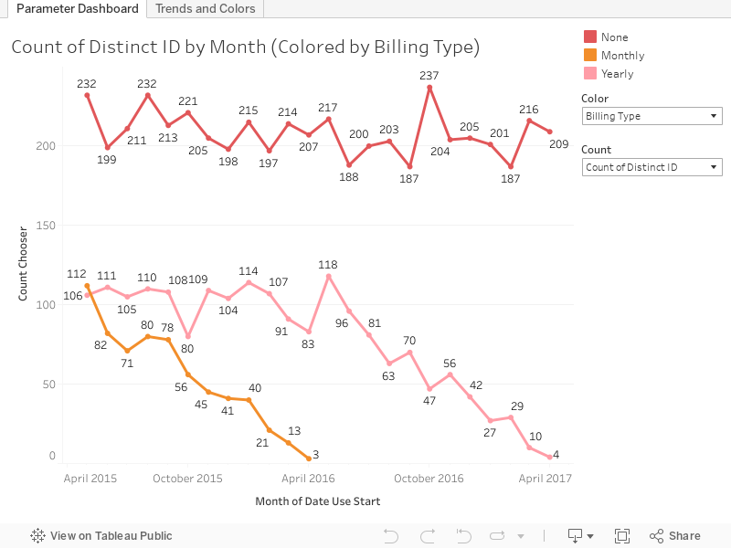
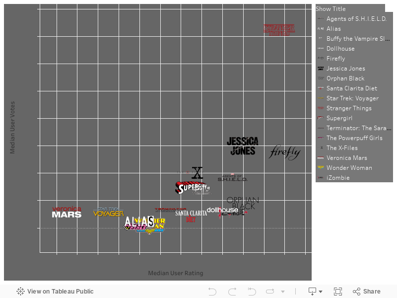
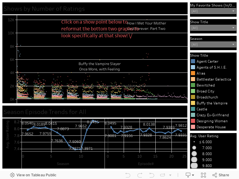
The dash above is meant for an initial overview of a lot of things where you can flip the parameters/colors around... the dash below allows for deep dives in with multiple simultaneous filtering options overlaying the data.


Have any of you readers ever went out of your way to make up something to show off your talents rather than talking about them? Hit me up on twitter or the comments below to let me know! As always if you have any questions/comments/concerns hit me up on Twitter @wjking0 and we'll tweet it up together!

How I feel all these companies look at my resume after seeing my fake data post. =D

Monday, April 24, 2017

Lexington Tableau User Group Presentation #2 and Vizzes!


This is part of my #1YearOfViz series! Check out the archive here: http://bourbonandbrains.blogspot.com/p/one-year-of-dataviz.html

I'm not going to spend a whole lot of time writing up the viz today when I've got the presentation below and the slideshow with all the relevant links in it you can click through yourselves!

We had a GREAT turnout for the Lexington TUG!


Here is the accompanying super-awesome slideshow!


Or click this link to open it in a new window: https://goo.gl/lTi9YO

Please watch the video for an explanation about these vizzes! Here is the Bluegrass Trust Plaques viz:


Here is the fun one, I've since taken the data and saved it up here to Data.World... which, if you haven't checked out is pretty amazing! I'm just now scratching the surface of all the options they have for datasets! Here is the National Parks Visitation Viz:


As usual if you have any questions feel free to hit me up on Twitter @wjking0!
Me by the end of the day!

Wednesday, April 12, 2017

30+ Years of Video Game Music


This is part of my #1YearOfViz series! Check out the archive here: http://bourbonandbrains.blogspot.com/p/one-year-of-dataviz.html
One of the first things I wanted to mention was that I had (what I felt) was a really excellent interview the other day with Delta Private Jets. It felt much more in my wheelhouse than when I did the interview a couple of weeks ago with VetData. In all honesty I think they were looking for more of a programmer and not an analyst (and I heard they hired an ex programmer for the position actually). Anyway... I kinda felt like I might not fit in with the Delta 'corporate people' having worked in Academia my entire career but the people were pretty rad and the job sounds exactly like the type of cross departmental data-exploration that I love diving head-first into! Plus... I mean... things like flight benefits would be pretty rad...
How I felt going to interview with Delta Private Jets
Due to that (interview business) and my girlfriend's kids being on Spring Break I'm publishing last week's viz today and I'll publish another one later this week also!

It's time to get down!
Now into the real subject of today's post! Video Game Music! I started this little endeavor after listening for a couple of years now to the Legacy Music Hour Podcast. I can't recommend it highly enough if you're into that sort of thing... and if you're not, what are you reading this post for!?

I poked around at several music databases to find the site with some of the most comprehensive datasets. I ended up landing on VGMDb.net, their site format and abundance of already available stats allowed me to really cross-check what I was getting from them!

The dataset seemed easy enough to get scraped. I'd liked to have gotten the track data and lengths as well but the formatting below the initial listing got a little too funky to reliably pull with Octoparse. Still initial costs and years of release are pretty awesome so let's work with those... Except there was a minor (read: HUGE) problem with the cost data... It was in about two dozen different currencies (some of which were no longer in existence)!

I ended up parsing the type away from the number and did the conversion manually according to today's dollar values based on this site's conversion. I thought about it after I'd already written the following formula and realized that I could have done a quick scrape and join instead for the conversion values. Again due to the complexity of the whole conversion process I didn't do past value converted to current values with adjustments for inflation etc... I just felt it was a bit too much hacking for a few cents to a dollar difference on some things.

Let's get into the data! This first dash is a generic look at the full release of game soundtracks (on the top) followed by a look that is customizable by Console Type at the bottom to look at how ratings for the soundtracks of games for that particular system changed over time.


This last one is one where you can explore some of the extremes of the data. The bottom half of this dash reshapes the top ("dots") half of the viz. You can choose what types of measure you'd like to use by year and click on the specific year-point on the line to reshape the "dots" at the top. You can then click on the dots to be taken to that specific VGMDb.net page about that album! I think it's a fun kind-of tiered way to get at both analysis and deep dives into the data through some segmentation!


As always if you have any questions hit me up on twitter @wjking0! This whole viz had made me feel SUPER nostalgic... time to go play some old games!


Wednesday, March 29, 2017

Lexington KY Traffic Cameras (Live)

This is part of my #1YearOfViz series! Check out the archive here: http://bourbonandbrains.blogspot.com/p/one-year-of-dataviz.html

This is going to be a SUPER quick post as this is a SUPER small (but useful!) viz that I whipped up. I literally have about 6-7 vizzes that I could put out but I'm working on an actual big story at the moment that I'm hoping to get picked up by some news organizations so I want to really give it the TLC it deserves. So this week instead of a deep dive you get a shallow wade into a more useful than data-filled viz!

I was poking around looking for some things to work with as far as GeoJSON data (which the new Tableau 10.2 supports!) and I came across the "New Mapping" group out of UK. I poked around a little on their github page and found the GeoJSON for all the Lexington Traffic Cameras! I thought, "Wow, this is neat!" and started building my viz around it... then I thought, "STOP!"...

Where did this data come from? Was it being used anywhere else!? Then I found it... Lexington Fayette Urban County Government had already built a site for this!

Then I realized their site doesn't reformat to mobile and while it does provide live video streams (for about 5 seconds before auto-closing) it required a click on each camera to show the data. This seemed like an unnecessary step so I made the dash below so that if you hover over a point the still image camera data will show immediately  (and will refresh upon scrolling over another and back over again). Additionally I created a mobile-specific version formatted for phones! It isn't much but sometimes just improving a UI can mean a huge difference in the utilization of a tool!
The question I always ask myself when re-doing someone else's work
Click the image below for the mobile version or continue to scroll down for the desktop interface:


As always if you have any questions hit me up in the comments below or on Twitter @wjking0.

Thursday, March 23, 2017

Reddit /r/Datasets Analysis


This is part of my #1YearOfViz series! Check out the archive here: http://bourbonandbrains.blogspot.com/p/one-year-of-dataviz.html
Let me start off by apologizing. I've been trying to work out some issues with +Tableau Software and getting Tableau Public working with the last several web pages I've tried to do a web-part embed with... and I've tried all the suggestions on the support forum. It works fine in Tableau Desktop and Tableau Public apps but once I upload it to Tableau Public it just doesn't show up. I originally thought it was the mix of http (this blog) and https (Tableau Public) but even when viewing just on the main Tableau Public page it is still showing up as a blank page. =/


Me shaking the 'Do Better' stick at Tableau Public


What this means for you is today's viz (in part) features new window pop-ups because the integration isn't working right with the Tableau web part.

Today's dataset is an analysis of all the links I could mine back through the history of a subreddit I am one of the admins of. If you're reading this blog and you're into dataviz and you haven't been to /r/Datasets yet then you really need to!

How being a subreddit mod really feels.


Below is the viz... you can change which dimensions you'd like to measure votes/comments by and if it has an associated link (such as profiles, domains, etc) you can click on the bar and a pop-up will come up with that data loaded in it.


The second part of this viz is just a little more in-depth breakdown of things if users from the subreddit are checking it out and want to see a how different categories are broken down.

Ultimately here are some of the base numbers:


52.55% are "Requests"
26.3% are "datasets"
7.31% are "resources"
5.71% are "questions"


Keep in mind this data only represents the past 1000 or so posts in /r/Datasets only really spanning about 3 months worth of time from the date of 3/21/2017 (the original scrape date). In the future I'll likely work on a more "live" version of this probably utilizing some IFTTT recipies but until then I hope you enjoyed this little glimpse into the weird world of datasets and the people who love them! <3


As always if you have any questions/comments/concerns hit me up on Twitter @wjking0 or in the comments below!

A meta image about a meta reddit dataset from where... ? You guessed it... reddit.


Friday, March 17, 2017

Urban Dictionary - Top Words (NSFW Text!)


This is part of my #1YearOfViz series! Check out the archive here: http://bourbonandbrains.blogspot.com/p/one-year-of-dataviz.html

WARNING! If you're offended by "bad" language steer clear of this viz!


Originally this week I was going to work on a viz about Girl Scout Cookies.... I was hoping to find some sales numbers... then after some brief searches I realized that was a pretty fruitless endeavor and the closest I could come was looking at the google trends for the different Girl Scout Cookie names. While interesting... isn't exactly dataviz worthy.


So switching out from the totally mundane and safe for work topic of Girl Scout Cookies (THIN MINTS FOREVER!)... I flipped my mindset entirely and decided to look at Urban Dictionary. I was thinking back to an article that I read about when IBM's Watson was fed Urban Dictionary to help learn slang and ended up having to have it purged as the AI wouldn't stop swearing as part of it's normal speech pattern.

I considered attempting to scrape it but wasn't sure how large a scrape that would be... when low and behold I found someone had already done the work for me! Huzzah!
I'm too lazy to scrape that much data!
I've compiled some quick facts I've learned about words... which is a hilarious sentence to write. I'll link to sources when there was one otherwise it was something I learned through the analysis of the data:
  • Merriam-Webster 

  • Urban Dictionary 
    • Avg 1.277 definitions per word
    • Avg word length 10.05 letters
    • Median word length 9 letters
    • Total number of definitions is 2,079,261
      • This contains phrases as well as words
    • 1,457,980 Unique Words/Phrases

Before we actually get into the data remember that I just manipulated the data into the viz and am not the author of any of this. If you're easily offended by slurs or bad words... now would be the time to check out another viz!

I limited the whole viz to the top 10,000 words/phrases by their sum difference between their Upvotes and Downvotes. Some had multiple definitions and so the list looks slightly different if we use Total instead of Average for the Up/Down difference (in that instance "Sex" becomes the top word instead of the second word). CLICKING ON ANY WORD will cause a pop-up to that word so you may need to disable pop-ups to go out to Urban Dictionary from within the viz!


Now if we compare that to the trending words on Merriam-Webster you may see a SLIGHT difference.

How I picture the people at Merriam-Webster right now.

Now this next viz is really just to let you play around and reformat the data however you'd like. You can change both X/Y/Color axises to answer some of your own questions you may have. I'm still limiting this to the 10000 words... ALL words were just too many to really manipulate the data and click around to learn definitions!


I was thinking because Urban Dictionary uses a "defid" field that seems pretty sequential so I wondered what some of the first words were. Obviously several had been deleted as out of the first 100 "defid" fields only 37 were left. The first remaining one that is visible is ID#7.... Janky which was posted December 09, 1999. The user Boomer is likely one of the first admins and has since posted 19 items total, most of which were at the very beginning of the site.

I hope every had as much fun kicking around in Urban Dictionary's data as I did! I know I learned some new swear words!

Who knew it was SO VERSATILE!
Of course if you have any questions or concerns please give me a shout in the comments below or via twitter @wjking0! As usual please share this if you found it fun/interesting!
How I felt after finishing this viz!

Monday, March 13, 2017

Buffy the Vampire Slayer 20 Year Anniversary & Strong Women on Television

This is part of my #1YearOfViz series! Check out the archive here: http://bourbonandbrains.blogspot.com/p/one-year-of-dataviz.html


I initially wanted to do a viz this week based on Buffy the Vampire Slayer for its 20th anniversary... I got my scrape all figured out and what all I wanted to look at. I considered pulling the Nielsen Ratings from Wikipedia only to discover it was lacking several seasons worth. 

Me when discovering Wikipedia was missing Nielsen data
I'm not a huge fan of their ratings system anyway though as the sample pool is so small they extrapolate more data than I'm comfortable with. (This is probably the reason they don't have a searchable database on their site.)

Then I remembered that IMDB had a ratings system embedded in it!

Thanks Giles! Finding data is my jam!
In my hunt for data I found this fun little viz of Buffy ratings and I based some of what I did initially off of this. I started thinking about doing a viz in a similar vein and then I thought "Why not add more data!?" So I changed up my Octoparse scrape and used a list URL format instead... then I thought about some of my favorite shows... Crap, there's a LOT of my fave shows that have strong female leads in them, what if I miss one!?

I decided to enlist the help of my social networks... when posting about strong female character TV Shows my friends did not run short on suggestions! After 50+ comments (most containing several shows each) I had a pretty solid list together and a much richer chunk of data than I initially was going to viz!

Realizing I now had about 50x more data than I intended...
While some of the shows had strong female roles I tried to limit my personal suggestions to shows where the female character played a lead role. Also I tried to stay away from characters (even if they had a lead role) who were a little too Damsel-in-Distress-y.

One of the first things I noticed was what a HUGE lead Stranger Things has had on basically EVERY other show out... don't get me wrong, it's FANTASTIC... example below along with the listing of "My Shows" that I looked at. Mouse over the icon to see median ratings and number of votes per episode.


Eleven is here to eat waffles and kick ass in ratings... and she's all outta waffles!

I decided to split it up like that example I looked at earlier and color episodes by season and then make them highlight-able and the ratings click-able. For this one I stuck with just my fave shows but I promise all you that put your input in.... the following viz will contain everything. I really like this one below though as I feel it's a fun way to explore the data, clicking around on things and highlighting the zillions of little show points. Kinda reminds you of the lights in Stranger Th--- ARGH gotta stop thinking about that show!


The one thing you should notice however is that the Buffy Episode "Once More With Feeling" is literally one of the highest rated shows EVER (out of this pretty large chunk of VERY popular shows)! So this following viz looks a little rough but contains the data from ALL the suggested shows (with one exception which I found didn't really have any strong female representation in it). The formatting gets a little gross with the dots on this as several of the "old" shows (like I Dream of Genie, and others from that era) had 40+ episodes to a "Season". Feel free to click around on the show points to reformat and see how your favorite shows did season to season or how their ratings changed per episode... Is your favorite show a strong finisher? Does it have a good trend towards mid-season finales? You can find out now!


Same girl. Same.
Finally I did this little number below which doesn't really DO much but is a nice representation of all the data and seeing the trends in shows/seasons by the density of the chart itself. Again this represents all data but I limited the number of episodes to 23 to keep it from getting too broke up due to the older programs.


As always if you have any questions leave a comment below or hit me up on Twitter @wjking0. Finally if you just need a good (ugly) cry you can relive some of the best Buffy moments here.