Showing posts with label DataViz. Show all posts

Saturday, November 20, 2021

Tracking Bigfoot with Data - BFRO Data 1950-2021


Hi everyone... I know it's been a while since I posted. If you could only see my backlog of draft vizzes you'd know how many things I meant to be posting! I've had this one queued up fairly recently and I realized this weekend is Cryptidcon in Lexington KY so what better time to viz one of the most recognizable ones! I scraped data from BFRO.net and let me tell you... the only thing messier than bigfoot's hair is trying to clean data without understanding the shifting structure of their site over the years! That said I appreciate the length of time they've gathered data and the depth of text!
Me dusting off this blog

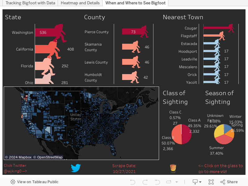
I've recently been spending a good deal of time in Washington State, particularly Northern Washington where Bigfoot/Sasquatch is on EVERYTHING. I asked my partner and she said that there are tons of sightings in that region of WA so I figured I'd see if she was right. Full disclosure, as WA is her home and she has a Bigfoot hoodie she's a little biased! 

So below you can see my partner was COMPLETELY right... Below you'll find numbers by State, County, and Nearest Town (which can be linked to multiple counties etc). Then of course a map and pie charts representing class of sighting ("A" being the most 'real' sightings, to "C" which can be 'heard a noise') and then the seasons of sightings so you can figure out where you need to go if you want to stay warm and hunt Bigfoot sightings (hint, southern US).

Also since we're talking about Bigfoot... Remember Harry and The Hendersons?! John Lithgow was in that! Interestingly enough, even though popular culture references to cryptids tend to increase reports of sightings Harry and The Henderstons did not. The 1980's as a decade had the largest overall lull in Bigfoot sightings (which you can look at in the viz below) but they picked back up in the early 1990's for a reason I'll go into on a future blog post.

Pretty sure this movie gave me nightmares

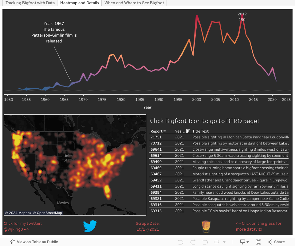
Now let's look at some more data below. I wanted to do more of a heatmap look at the US and when you zoom out one of the things that is crazy is Florida really does become an obvious place to look for our large-footed friend! Also if you're looking for details of particular events the below dashboard will let you select points in time or highlight map areas (also remember to use the map search at the top left of the map itself) to filter the details to just the values you're interested in reading or clicking through to read more detail on the actual site.
Florida in 2012 was clearly like
a little shining dong on America

Also given one of my best friends just moved to the sunshine state I figured I should warn him that perhaps it's the proximity to sasquatches make people a little nutty, the 2012 spike in sightings (the largest currently on record) can largely be attributed to the sunshine state. It appears even cryptids need to retire! As always if you have any questions or concerns hit me up on twitter @wjking0
Bugs had the right solution to the Bigfoot problem in FL


Thursday, December 29, 2016

Fayette Co. (Kentucky) Public Schools (FCPS) Salaries 2015-2016


This is part of my #1YearOfViz series! Check out the archive here: http://bourbonandbrains.blogspot.com/p/one-year-of-dataviz.html

Me when I hit Import.io's scraping limit and get banned (again)
I wanted to start this post talking about the problems I've recently encountered was using Import.io. Multiple times now I have run into the their scraping limit for "free" users and have been temporarily banned from using their services. one time accidentally ran cloud-based scrape as a test but the scrape continued after I closed it so I ended up running a query of a thousand instead of the 20 to 30 I wanted to run. Then this month I've ran a scrape of over 10,000 (their new limit on local clients scraping) in a given month, I was originally told the Legacy client would be allowed to have infinite scraping as long as it was done locally (via their Facebook users group). This was apparently not the case.


I started out looking for a new scraping client checking out several pages for clients to use. But almost all web scraping services required monthly subscription fees, or have no local clients to use for cheaper or free rate. That's when/how I discovered Octoparse!
/\ Me hugging Octoparse!

It is kind of magic! It took me over a week to really learn how to use it, but this is been extraordinarily worth it! The main school and Octoparse are much more tools in imports. Octoparse allows unlimited queries from the local client and you only have to pay when you're using their cloud-based services. Which is the way I suggested import price their systems when support contacted me about my ban from their services.

Hey Octoparse, I just met you,
and this is crazy,
comment my blog,
and sponsor me maybe!?
I only wish I had known about Octoparse earlier so that I could have stayed myself around 12 hours worth of work when I did the West Virginia State salary scrape a while back! what you will be looking at in this visualization is the first scrape that I have completed using Octoparse. The data came out incredibly clean and simple, my only complaint in the export of Octoparse is that CSV export to be not directly readable by excel when opened. It's really a minor complaint next to the awesome flexibility of the product though! Let's get into the data!


I've settled in on my designs for salary-based dashboards with only a single year of data. I decided not to fix it since it's not broke and replicated the same types of dashboards I've done in the UK Salary Viz here and a little bit of the work I did in the WV State Salary Viz mentioned previously. The "Dots Dash" as I call it is really just a fun visual representation of all the people/years/money that goes into something like public education in one single county.


This next one is just Salary Over Time and Number of People Over Time so basically how many people are making approximately how much, how quickly do you see raises given, etc. If you'll notice at the side this viz starts out with a filter of "Instructor" on it to show specifically teachers salaries over time as all teachers (I think) have 'instructor' as part of their titles. You can set this wildcard filter to whatever you'd like (ex. 'bus driver') to see how your or a friend's particular job futures will look over time.


The next story dashboard I really wanted to look at how locations/grade-types pay different teachers. Do art teachers make more at Liberty than at Brian Station? How about music teachers at Elementary schools vs High Schools? Step through the story with the top tabs and you can filter on the right and compare median salaries by location. I'd like to ultimately turn this into part of what I'll use for a future dashboard I'm going to work on that will compare test scores to teacher salaries for particular places... but this will have to do for this week! =D The last little section was just because I was curious how how much principals make in general and I was surprised (and glad) to see they make good money.


This last dash is just the "big list" that a lot of people like to see... if you CLICK on a location or a job title the data to the right (medians/averages of salaries and years worked) will reformat to that highlighted selection. If you click on a job it will not be the medians/averages for that particular school (as each school doesn't have enough non-teaching staff to make that functional) so it reformats to show EVERYONE who shares that job title. You can also filter this list by name if you're looking for someone in particular's salary.


Finally, as the son of a public school teacher let me say to all of you out there doing the work every day...

As always hit me up on twitter @wjking0 or in the comments below for questions/concerns!

Thursday, October 13, 2016

National Parks Tourism and Money Comparison


This is part of my #1YearOfViz series! Check out the archive here: http://bourbonandbrains.blogspot.com/p/one-year-of-dataviz.html

Originally found the subject of today's blog in a Reddit forum that I am an admin of called r/datasets/. I'm a pretty big fan of our national parks and have several faves including Monument, Yellowstone, etc. This year marks the 100th year of the United States National Park Service has been in existence so I thought this would be a great time to make a viz about our nations national parks!

Some of the things that I discovered in the data are as follows:


I started noticing a trend that over the last couple of years national parks have been visited more than any time in the last 20 or so years! I've been searching for a reason in this uptick of people visiting national parks have yet to discern one. One suggestion is that the "Every Kid in a Park" initiative is responsible for the growth over the last couple of years. This seems unlikely however because after further research the beginning of the Every Kid in a Park initiative was September 1, 2015. You'll see by the chart below the last two years in particular since 2013 has seen some of the heaviest growth in recent recorded history.


Unfortunately, not all of the data that I'm showing Nice charts was available from a singular data source. I had to scrape the national parks website located here, as well as the national parks statistical site located here. Unfortunately, I was also unable to easily join the data set as the names of the national parks on the website do not match the names of the national parks on the report that they issue on their statistical page. Additionally, the main national parks website does not have any year by year breakdown of monies coming into a state per park (just a state total).

That said, we can still do some calculations with the amount of money that has come in totally and the number of parts located in the state to get a rough value of return over the last years 20 years per park. As you can imagine, none of this requires mind blowing mathematics or calculations. After I began examining data I noticed a trend in which coastal states tended to have a higher return value per national park than non-coastal states. I decided to do a grouping to see if that assumption was correct and it turns out, that it is! Check out the Story below and click through the stages I described above to see for yourself!


This makes sense if you think about it, most people (that I know anyway) don't vacation by going inland but a lot of people who are in land-locked states I believe tend to go towards the coast for vacation purposes. If you're curious about how the NPS calculates the amount of money coming in feel free to check out their write-up on these numbers here (PDF). What this appears to be on the outside is that coastal based national Park tend to pull about half million dollars more a year in revenue then non-coastal national parks. We can figure this out by assuming that the total on the national parks website was from the last 20 years of data they have collected.

Interestingly enough, the state with the highest return her national Park is actually North Carolina!

As always, if you have any questions or concerns you can leave a comment below or hit me up on Twitter at wjking0.
Enjoy those waves gang!