|
| For those that were wondering, that's my own x-ray in the background! |
Let me first address the big issue everyone has with the survey which is that only a singular injury can be done at a time. This was purposeful as different injuries can have different recovery times/rates/etc and I didn't want to muddy the data with a variety of null results from the approximately 70% or so who had NOT had a previous injury. If you have filled the survey out for one injury but have had others I urge you to PLEASE fill it out again with details about your other injuries! The data is largely parsed by injury type (like time to recovery etc) and to make this data as accurate as possible we need as many data-points as possible. I know it takes time to do but I hope you feel it's time well spent!
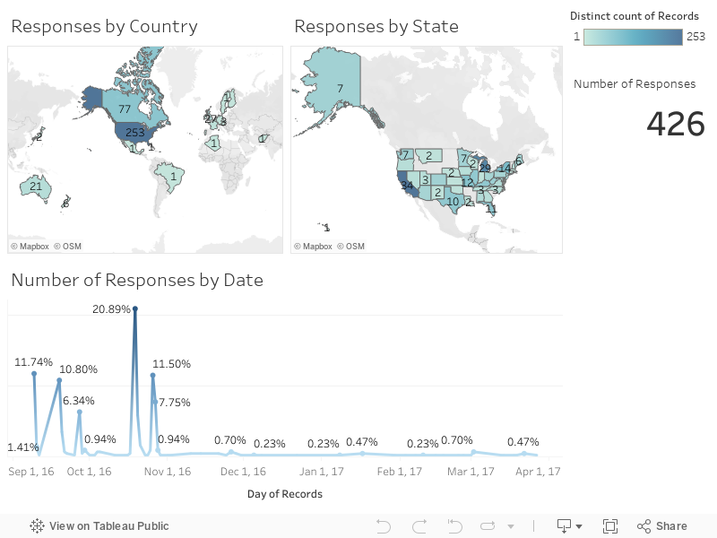
Below is the summary of responses thus-far. If you feel that your region (country/state) is not represented enough in the data please spread the survey around to get others to fill it out and help get the data as robust as possible. I'd also like to take this opportunity to thank not only the Gimp Crew forum but also Roller Derby Athletics for helping to get this survey out to as many people as possible in the derby community! Your help is amazeballs! =)

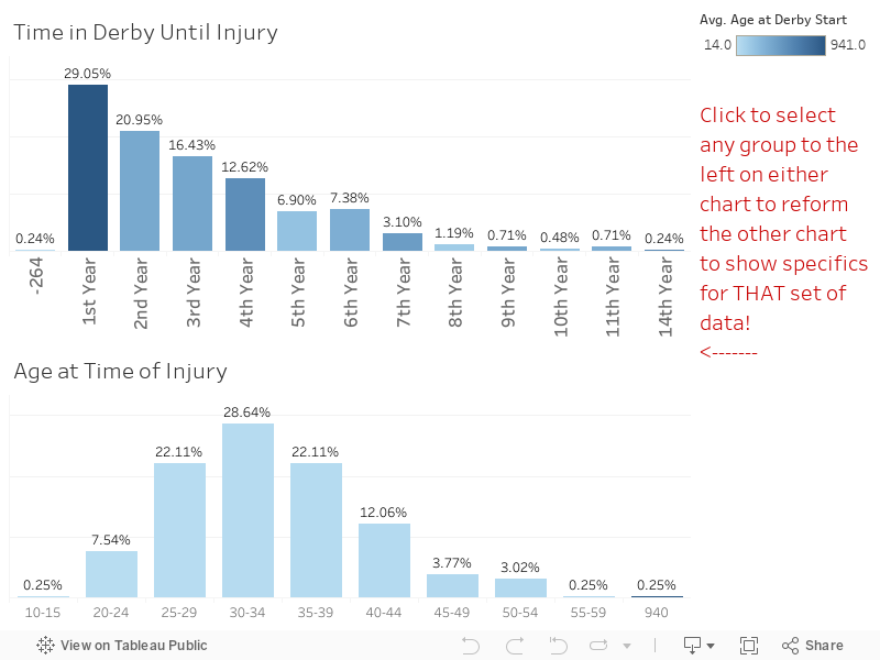
I'll admit going into this data with some preconceived notions I wanted to examine. The first among those was WHEN people get injured. The overarching feeling I've always thought has been the newer skaters are more prone to injury. This turns out to be the case, with almost 1/3 of all injuries happening within the first year of skating.
It seems (with the current dataset) that the longer a skater skates the less-likely an injury is to occur. I may (once there is enough data to warrant this) add in a filter for injury type as I would guess that skaters suffering knee-related injuries would be higher the longer a person has skated with things like ankle injuries still being a "bad fall" type injury that would happen more frequently to newer skaters.
UPDATED 10-26-2016: I realized I had forgotten to put in the following exported image showing the how the age ranges above skew about 5+ years over what you see in the derby community as a whole:

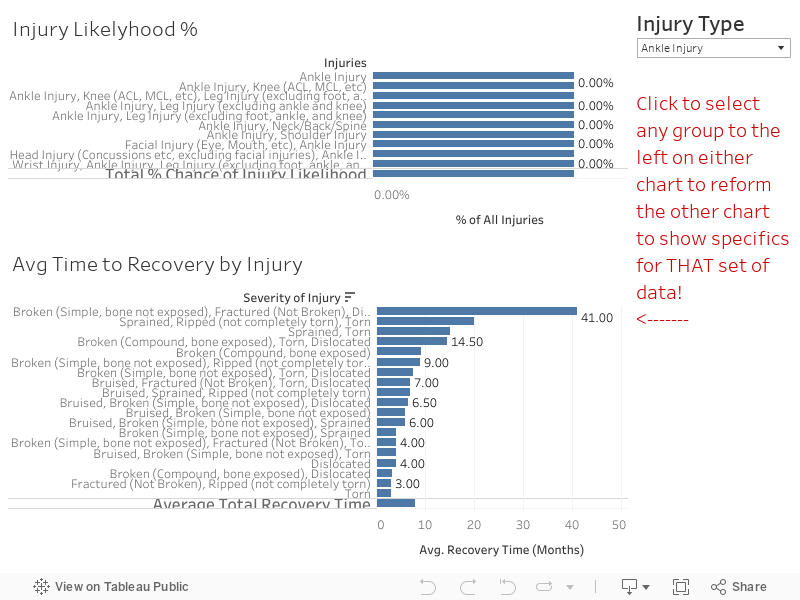
The other thing I was curious about was the frequency of types of injuries and where those tended to take place. As anyone who's been involved in the sport for any length of time can tell you ankle injuries are by far the most prevalent in the data. That said however I feel that there is a LARGE area of unreported injuries with head impact/concussion injuries that is not accurately represented in the data. From personal experience having a teammate that I worked with for years who had to retire due to multiple concussion injuries in a single year (5+) I feel this is probably a part of the sport most people don't see as a "serious" injury so people don't get added to the Gimp Crew forum after concussive injuries. For every ankle break I've seen I've seen at least 3-5 concussions of various levels. At the time of this writing however concussions represent under 10% of the data... just saying that's probably not exactly accurate. While doing a search for some images to represent concussive injuries I came across this AWESOME article about the practices of concussion testing in other pro sports and the policy changes over the last 20 years or so in mandatory testing, etc.

The other thing I was curious about was the frequency of types of injuries and where those tended to take place. As anyone who's been involved in the sport for any length of time can tell you ankle injuries are by far the most prevalent in the data. That said however I feel that there is a LARGE area of unreported injuries with head impact/concussion injuries that is not accurately represented in the data. From personal experience having a teammate that I worked with for years who had to retire due to multiple concussion injuries in a single year (5+) I feel this is probably a part of the sport most people don't see as a "serious" injury so people don't get added to the Gimp Crew forum after concussive injuries. For every ankle break I've seen I've seen at least 3-5 concussions of various levels. At the time of this writing however concussions represent under 10% of the data... just saying that's probably not exactly accurate. While doing a search for some images to represent concussive injuries I came across this AWESOME article about the practices of concussion testing in other pro sports and the policy changes over the last 20 years or so in mandatory testing, etc.
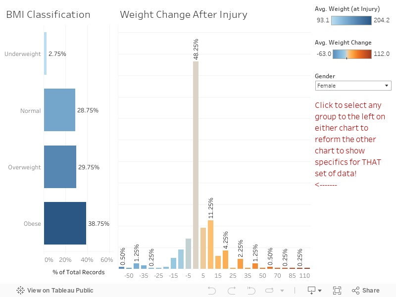
 Probably the largest surprise that I found was something I'd guessed about but wasn't sure of the "level" of. One of the reasons that I collected height and weight was to facilitate calculation of BMI to see if BMI's considerably changed after injury. Personally speaking I lost a bit of weight after my injury (leg muscle mass) so I was curious how normal that was. It turns out that weight change is fairly rare with less than 50% (at the time of writing) experiencing any weight change at all. Weight change though is relatively (to height obviously) so I wanted to use the CDC guidelines on BMI health. I'll be the first one to admit that BMI is a ROUGH measurement, I work out, I lift heavy, and have what I would generally consider to be a muscular body (#humblebrag)... that said according to the CDC I'm labelled as "Overweight" based on my height/weight/BMI combo.
Here's the last assumption that people have when thinking about derby injuries... that due to people being injured most typically in their first year of skating most injured skaters aren't in the best shape to begin with. I'm NOT SAYING that ALL injured skaters are out of shape, I'm just putting the data out that (at the time of writing) ~40% of injured skaters have BMI's that would label them as obese. Even if you don't agree with the CDC's definitions, the fact of the matter is that it appears that skaters with some extra weight tend to have a higher rate of injury. Check the chart below for the current numbers on weight change and BMI:
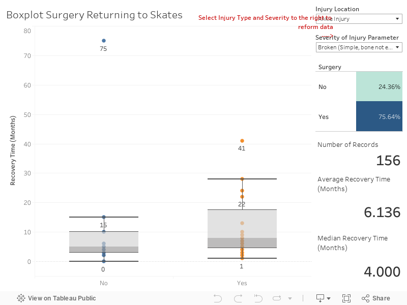
Other common questions that people ask are if surgery sped up or delayed recovery rates. After taking a look at the data I can tell you that in almost every injury case where a surgery was reported that recovery time was longer. In many cases though, in the long term, they tended to feel more "normal" sooner. I don't think this has to do specifically with HAVING surgery but more so the people that medical professionals suggest have surgery are just simply more severely injured. For instance if you look at Compound vs Non-Compound breaks you'll find that in EVERY SINGLE INSTANCE compound breaks required surgery and took significantly longer to heal.
Fortunately for me my health insurance at the time of my accident was pretty amazing and my co-pay and everything for my surgery was seemingly very little. I was curious how many people opted for things like USARS/WFTDA insurance. As it turns out over ~70% have an additional insurance aside from (or instead of) their personal insurance. This number bumps up ~1-3% after an injury... so it doesn't really look like prior injuries are a driving factor in if people decide to get additional insurance. I can create a dashboard for this data but honestly it was just kinda boring. =P
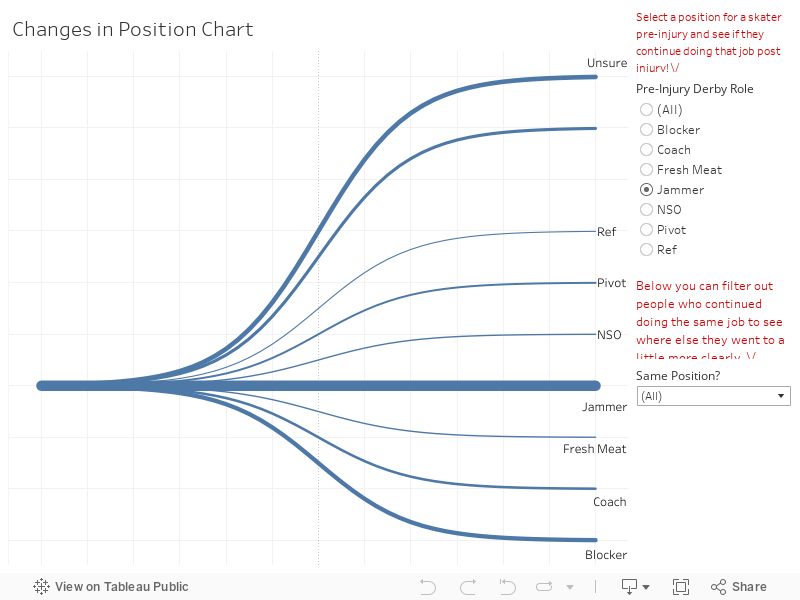
As someone who always wanted to jam I really had hoped that I would be able to come back a jammer... but at the time of writing only about 1/3 of people who used to jam return to jamming post injury whereas 59% of blockers return to blocking. You can check the chart below and see which people stay in which positions etc.
As someone who always wanted to jam I really had hoped that I would be able to come back a jammer... but at the time of writing only about 1/3 of people who used to jam return to jamming post injury whereas 59% of blockers return to blocking. You can check the chart below and see which people stay in which positions etc.
Where do we go from here?! Well the first thing to mention is that this data can be cut/sorted a zillion ways from Sunday. Have a question that this data can answer? Ask! Hit me up at twitter @wjking0 or via the Roller Derby Gimp Crew (which is an AWESOME resource for ANY injured skater with tons of support!) or in the comments below this blog. Since this data is live there is plenty of ways to continue to slice and dice the data in a real-time fashion!
P.S. I have a few more charts I'll likely add on as future blog posts as I get them all polished up (with regards to things like injury/pain data and a few other things). I'll put a link down here when another post goes up about the data!
P.S. I have a few more charts I'll likely add on as future blog posts as I get them all polished up (with regards to things like injury/pain data and a few other things). I'll put a link down here when another post goes up about the data!
 |
| This is how I feel after looking at injury rates all week... |