Tuesday, June 30, 2015

Kentucky's Gay Marriage Denial by Zip Code (Updated 6-30-2015)

Gay Marriage Denials in KY (by Zip) and "Small-town-ness"


I was working on a little something else for another blog post but given the prevalence of the state of Kentucky in the News I figured I should crunch these numbers real quick to see if what I'd been suspecting has been true.

While I'm still going to publish my ultimate "Churches vs Stoplights" viz blog post at some point I won't show all my cards for that one. Where I grew up in WV we used to joke that the measure of a "Small-town" was if it had twice as many churches as stoplights (as mine did). So I'm using that as my "small-town" base. Then I used the current list of counties denying marriage licenses to couples since the ruling from the SCOTUS and broke those down into their applied zip codes. The results are as follows!


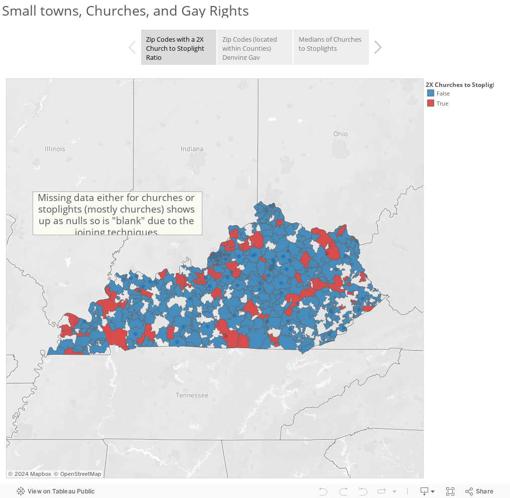
If you'd like to see how your zip code fares do a search for it here:


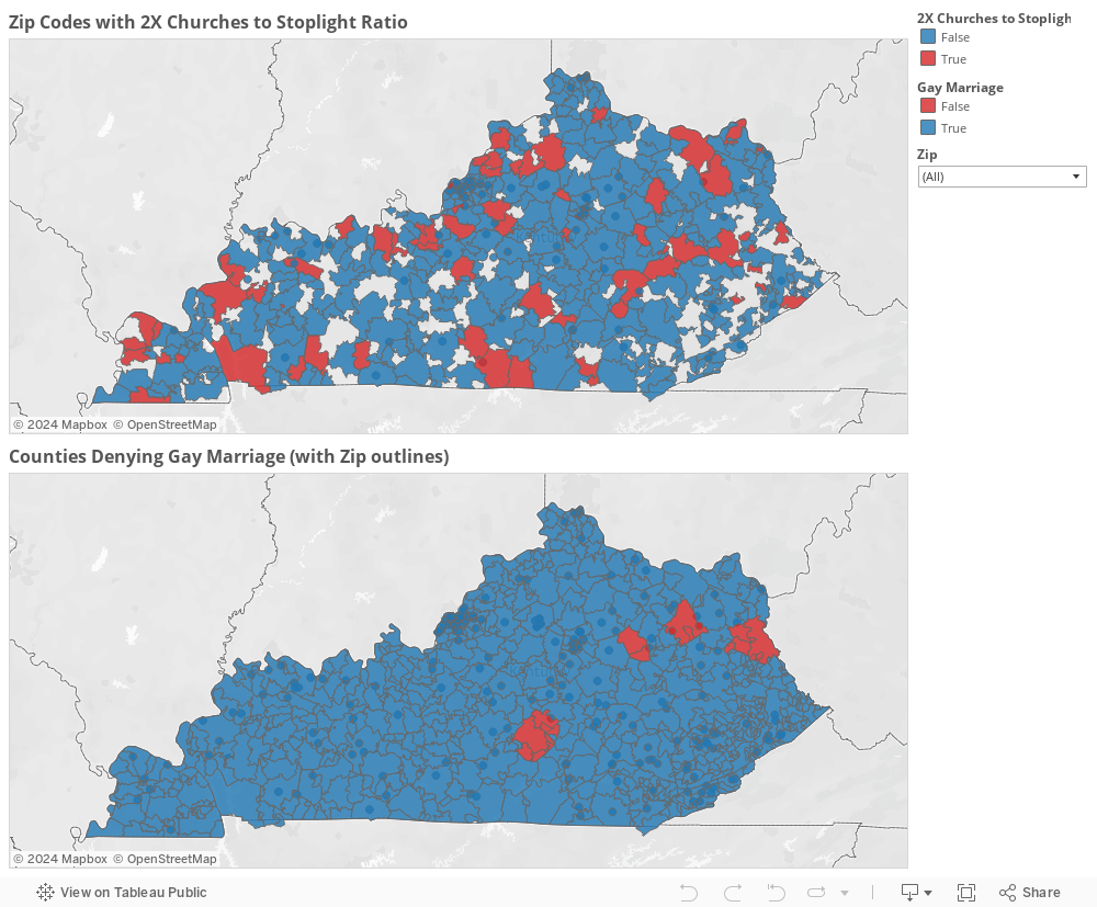
So it turns out that most "Small Towns" (at least by my own made-up definition) are actually OK with the SCOTUS ruling! This wasn't the result I was expecting at ALL! I'm not saying that these places are accepting or even friendly to my LGBT brothers and sisters but I'm saying that the places listed are at least adhering to national law so please take all this with a grain of salt!

If you have any questions/comments/concerns shoot me a message @wjking0 on Twitter or comment here on the blog!


Thursday, June 18, 2015

University of Kentucky Salary Data (2014)


So I like malleable things... like playdoh. As most of you know I was out with a broken leg based on one of my prior blogs. While I was out I worked with a LOT of public data sets. Finally I sat down and scraped UK's Salary data from several different public resources.** It was the 2014 data but I figured it would still let me do some fun things with the data.

So let's get right to it! The fields that were available were as follows:
  • Department
  • Description ("Job Code", Professional, Exec, Faculty, etc)
  • Title (Job Title)
  • Status (Full Time / Part Time)
  • Salary
  • Start Date (BIG NOTE, this is their start date at the University NOT their start date for that particular position!)
  • Years Worked (which I derived from Start Date)
Without any further chatter let's look at what you came here for! This first dashboard is just something pretty I whipped up to be able to visualize EVERY employee at the University of Kentucky. Continue scrolling down for further explanation of each dashboard and how it works!


This second Dashboard is just to look at the salary vs years worked for employees.


Finally this is the big one! This third dashboard is a list of every Title by Department regarding Status and Description by Salary and Years Worked. You'll notice that off to the right-hand side of the viz you'll see Average and Median's for both Salary and Years Worked. These are dynamic and what you see currently is the Averages and Median's for EVERY employee at the University of Kentucky. What makes this Viz very powerful is the ability to click on Title (Job Title) to see the median/averages for that particular job. Interested to see where you fall in the scale of your particular position? You can know that now! See how your length of service at the University compares to your peers but please keep in mind that the years worked DOES NOT mean years worked in that particular job, just total at UK!


What do you all think!? Please hit me up on twitter @wjking0 or comment on the blog and if you like what you saw here I have TONS more public data coming from my two months of FMLA leave sitting around with a broken leg! Subscribe via your RSS readers!

**Also I'd just like to note that all this data was scraped publicly using freely available tools such as the AMAZING Import.io and some URL builders while I was at home on FMLA so none of UK's time/resources went into these viz's.