
This is part of my #1YearOfViz series! Check out the archive here: http://bourbonandbrains.blogspot.com/p/one-year-of-dataviz.html
Originally found the subject of today's blog in a Reddit forum that I am an admin of called r/datasets/. I'm a pretty big fan of our national parks and have several faves including Monument, Yellowstone, etc. This year marks the 100th year of the United States National Park Service has been in existence so I thought this would be a great time to make a viz about our nations national parks!
Some of the things that I discovered in the data are as follows:
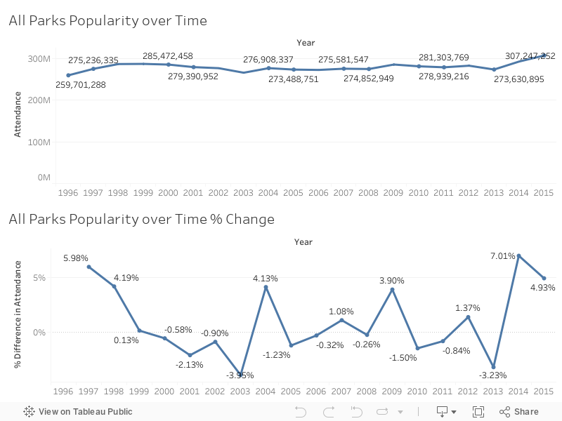
I started noticing a trend that over the last couple of years national parks have been visited more than any time in the last 20 or so years! I've been searching for a reason in this uptick of people visiting national parks have yet to discern one. One suggestion is that the "Every Kid in a Park" initiative is responsible for the growth over the last couple of years. This seems unlikely however because after further research the beginning of the Every Kid in a Park initiative was September 1, 2015. You'll see by the chart below the last two years in particular since 2013 has seen some of the heaviest growth in recent recorded history.

That said, we can still do some calculations with the amount of money that has come in totally and the number of parts located in the state to get a rough value of return over the last years 20 years per park. As you can imagine, none of this requires mind blowing mathematics or calculations. After I began examining data I noticed a trend in which coastal states tended to have a higher return value per national park than non-coastal states. I decided to do a grouping to see if that assumption was correct and it turns out, that it is! Check out the Story below and click through the stages I described above to see for yourself!
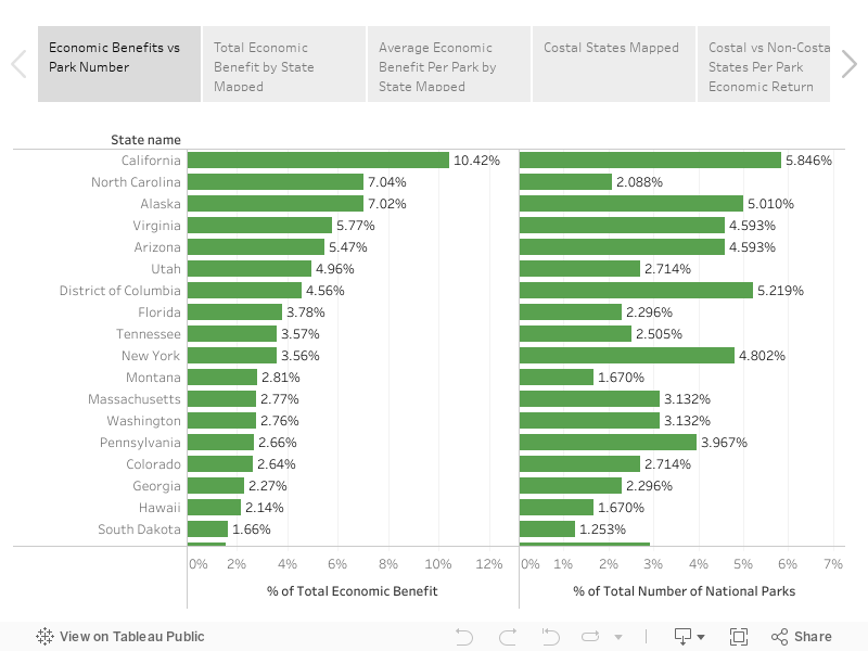
This makes sense if you think about it, most people (that I know anyway) don't vacation by going inland but a lot of people who are in land-locked states I believe tend to go towards the coast for vacation purposes. If you're curious about how the NPS calculates the amount of money coming in feel free to check out their write-up on these numbers here (PDF). What this appears to be on the outside is that coastal based national Park tend to pull about half million dollars more a year in revenue then non-coastal national parks. We can figure this out by assuming that the total on the national parks website was from the last 20 years of data they have collected.
Interestingly enough, the state with the highest return her national Park is actually North Carolina!
As always, if you have any questions or concerns you can leave a comment below or hit me up on Twitter at wjking0.
 |
| Enjoy those waves gang! |
No comments:
Post a Comment