Showing posts with label #KY. Show all posts

Wednesday, February 15, 2017

The International Investments in Kentucky - Part 2


This is part of my #1YearOfViz series! Check out the archive here: http://bourbonandbrains.blogspot.com/p/one-year-of-dataviz.html
As promised I'd like to jump back into the data I started two weeks ago with information about international dollars that come into the state of Kentucky based on investments in businesses both foreign and domestic.

I just had SO MUCH DATA from the ThinkKentucky.com site that I wanted to split it into two different blogs so I could really not overwhelm browsers (particularly on mobile) with a huge page-load. Really though, too much data ... what a problem to have! I think the big thing also is the diversity of the data and the number of dimensions/measures that I was able to play with really allowed for a lot of interesting viz out of what's in there.


Originally I planned to write up something about the proposed trade restrictions on Mexico and how that could affect the Kentucky economy but after hashing out the data I wasn't really pleased with how it read. I'm a proponent of the NAFTA and unfortunately putting the larger amount that Mexico would have had to spend made it appear that the economy would be that much richer if the border taxes were enabled as proposed. Realistically though you can see in news stories such as this one... the real result is that when the cost becomes to much to export to a particular place a country finds another venue.

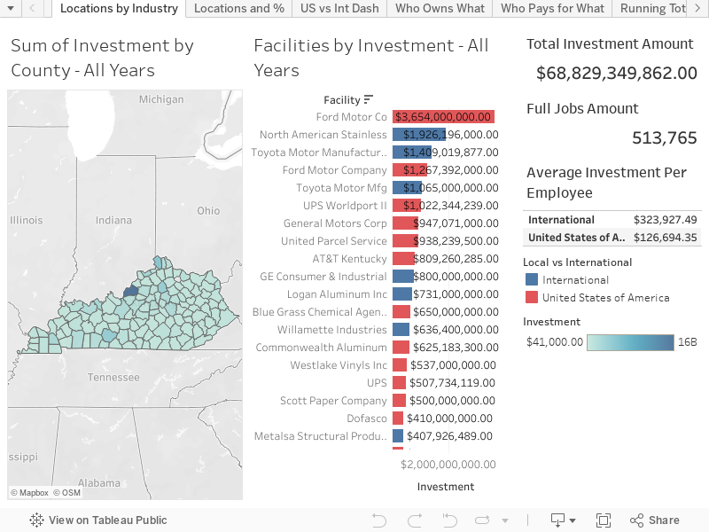
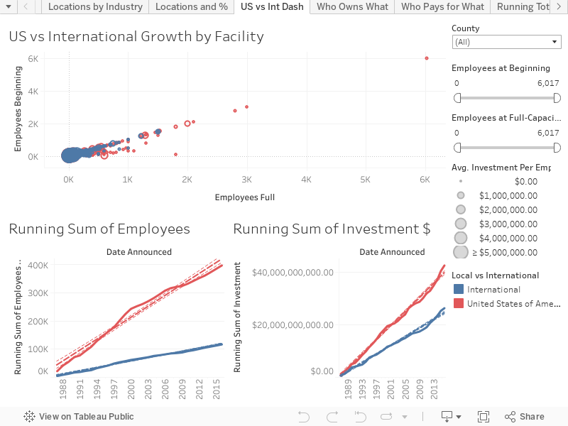
On this first dash I wanted to point out something; you'll notice that in the graphs below the running sum of investments by US vs International groups is MUCH closer than the personnel hiring. This lead to the bubble graph at the top showing Starting vs Full Employment numbers sized by the amount per person spend on the facility. There really isn't a whole lot of interactivity to this graph beyond looking at the County selection to see how each county has been funded over time. When combined with the other dashboard from part 1 you can really begin to get a more full view of how each county in Kentucky is impacted by international dollars.


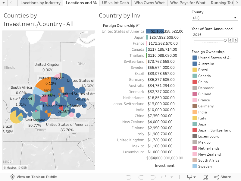
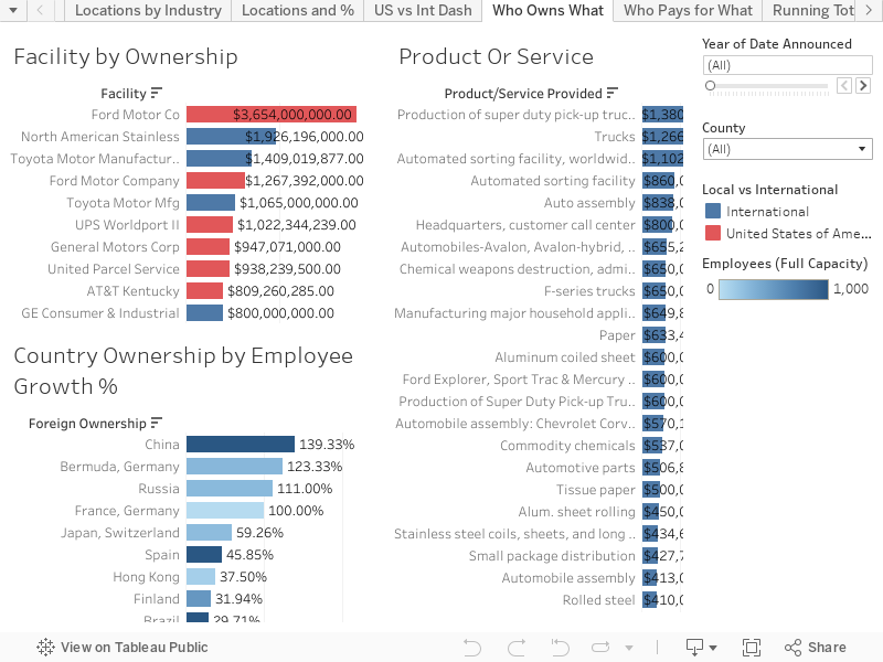
Who is providing the most job growth, for what places, and regarding what industries though? That's when I developed this next Dashboard to look at the ways the different countries funded different industries and with differing rates of job growth. All of the following bar charts just have to be moused-over to filter the other two charts further. As with the other chart you can choose to define it by county or even by particular year (though I feel adding both county/year tends to be a little too refining).


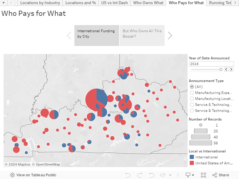
Lastly I have a little "story" I put together which has a breakdown of how much each City has had invested in it by US companies vs International companies... and while working on the Dashboard above I got thinking about distilleries and how many "Kentucky" distilleries were actually owned by a multi-national corporation. Mouse-Over the dots to uncover what Countries invest in your favorite drinks!

Four Roses funding is Japanese!


I wanted to share all this out, like I mentioned previously, because a lot of people want to separate the United States from the rest of the world. This is just a sample of how complex international business is within the relatively small state of Kentucky. So when ideas like changing HUGE trade agreements comes around... please try to remember all you've learned looking through all this data! As always if you have any questions or concerns please post them in the comments below or give me a shout at @wjking0 on Twitter!

Monday, February 6, 2017

The International Investments in Kentucky - Part 1

This is part of my #1YearOfViz series! Check out the archive here: http://bourbonandbrains.blogspot.com/p/one-year-of-dataviz.html
I'd like to start off with the fact that I live in one of the larger cities in Kentucky. Lexington is known for it's diversity of people and it's large international community. Given recent events and the recent gathering of people to protest the now overturned ban on people re-entering the US from several countries I thought it would be interesting to look at what the international community brings to the 'economic table' of Kentucky!

First a picture from one of my awesome junior roller derby skaters from the Lexington protest:
A photo posted by amelia (@amelia.loeffler) on


I found this data at the ThinkKentucky.com site which is actually the Cabinet for Economic Development. Their datasets weren't numerous but their site allows for a lot of search/interaction so I dug that! Thanks again for all the rad data and if anyone from there wants to give me a shout I'd love to get some more in depth data sometime!

That said, I designed over 25+ worksheets out of this data and realized it would be foolish (as well as poor time management) to squeeze them all into one blog post. So this week will be covering the viz I published last week and then a secondary part of the viz I've buffed up for this week! That way I'm totally still on schedule for publishing one a week!
Me when I looked down and saw I'd already created 25+
Tableau worksheets from data!
Let's get to it! I took investments in towns/counties and looked at how the domestic vs foreign interests were spread around... this first dashboard is a look at Total Investments in Areas by Facilities. If you mouse-over any county the industries that have invested in that county will be displayed to the right color-coded by their ownership (foreign or domestic).


The second dash (and last one of today) is a little more in-depth breakdown of particular countries investments in counties in Kentucky. Again in this viz just mouse over an area to see it highlighted in the other half of the viz or for a more in-depth look by county or year feel free to manipulate the dropdown/slider at the top right of the viz.


I think the big thing to remember is that while we think of places as "American" literally 38.2% of investments in businesses in Kentucky over the last 2-3 decades or so have come from international money. With the climate of separatism that has arisen lately in these beautiful United States of ours... it's good to keep in perspective what international businesses have done for even rural areas in places like Kentucky with SERIOUS investment dollars!

Don't worry part 2 will be coming soon!
As always, if you have any questions or concerns leave a comment below or find me on twitter @wjking0!

Wednesday, October 5, 2016

Where (NOT) to Eat in Lexington, KY - UPDATED LIVE DATA!

Lexington, KY Skyline
This is part of my #1YearOfViz series! Check out the archive here: http://bourbonandbrains.blogspot.com/p/one-year-of-dataviz.html

I posted the original version of this back several years ago as one of my very first geo-located dataviz that I'd created. With the new changes in Tableau Public I have finally found a way to get the live-updated data from the Lexington Health Department. If you'd like to see the raw Google Sheet that I'm pulling this data from I'll make it available here.

I didn't do too much as far as changing this data from it's original form except making the data a live-updating format and putting some additional filters and analysis on top of what I'd done previously.

First off I'd like to announce that I've developed what I think is a good mobile version which you can pull up on your phone if you'd like to bookmark to be able to quickly/easily check food scores/violations for a place. Click on the image below to be linked out directly to the dash!


If you'd like to see the full dash and analysis list click below to open up the rest of the blog post!

Wednesday, September 7, 2016

Churches versus Stoplights - "Small Towns" in KY


Growing up in a small town just outside of Charleston, WV and being part of the "Bible Belt" it was always a running joke in my hometown between some of us there there were (literally speaking) twice as many churches as there were stoplights in our small town. With 6 Churches and 3 Stoplights (giving the town the 3rd stoplight is pretty generous as it's on the very edge of town) the math was easy. I wondered though, could I do it on a larger scale? A scale of a larger city? Or a whole State?

First trick would be to find the church data? I tried to think of religious databases then I realized I was approaching it was from the wrong direction. What is every church besides a religious organization...? A tax exempt organization! You know who likes taxes? The Federal Government! I knew that tax records are a matter of public record so a quick jaunt over to data.gov later and I'm swimming in tax exemption data!


I realized after I got this data that I'll do a future blog just about the non-profit data in the US, there is WAY more than I anticipated there being in that data. Luckily there is a tax exemption category for "churches" which includes churches, synagogues, mosques, and of course the Church of Scientology.

Next I wondered how in the world I was going to get the location of every single stoplight in KY. I hopped onto the Kentucky Transportation Cabinet and found their IT staff and shot one of them an email. BOOM! The county/latitude/longitude of EVERY SINGLE operating stoplight in the entire state! They were SUPER NICE about it too! I didn't even have to file an open records request! That is how you do public service ladies and gentlemen!

Thanks to the Kentucky Transportation Cabinet for making Kentucky a safer place to drive than this!


Interestingly one of the things I came to notice really quickly was that several entire COUNTIES within Kentucky contained not ONE single stoplight! This thusly caused a "divide-by-zero" error in my calculations which is why you'll see several that are "null" in the maps etc (which are by zip not county). I figured out a different way to write my calculations to take into account the Null/Zero data for stoplights in certain zip codes.

Let's get into the data!

Where ARE all these things!? Check out this and click through the tabs to see where the locations and densities of churches and stoplights throughout Kentucky!


Next is a little Tableau Story showing the True/False status of "Small Towns" by Zip. Red represents small towns and blue are "Big City" towns. The next tab contains a more granular breakdown of "levels" of smallness. Finally is a chart showing "largest" to "smallest" using a difference over sum equation to normalize for the total number of churches/stoplights and keep it relative! Where does your hometown or birthplace fall!?


Ultimately what it all boils down to is that there are 504 zip codes with relevant data in the state of Kentucky and of those 185 are "big towns" in Kentucky and 319 are "small towns".

I know this data may not seem like much but it's been a LONG time in preparation and presentation. As always if you have any questions or anything hit me up on twitter at @wjking0!

P.S. This is the first in what I'm going to call my #1YearOfViz where I'm going to try to do a visualization EVERY SINGLE WEEK. I can't promise I'll always publish on the same day of the week or time but right now I'm looking at either Mondays or Wednesdays as my "publish days". If anyone knows any newspaper contacts or data journalism contacts that are looking for fun data related news stories have them tune in and get in touch! Also if you have any suggestions or thoughts on what you'd like to see over the next 52 weeks of viz give me a shout or leave a comment below!


Thursday, June 2, 2016

Kentucky School Vaccination Rates (2015)


Let's talk about vaccines. First off, I'm NOT going to have a debate about how effective or dangerous vaccines are. They're both effective AND safe. I've crunched the numbers for the amount of things like mercury (Thimerosal actually) contained in vaccines and basically if you've eaten fish in the last year or two you've consumed more actual mercury than in all your childhood vaccines combined.

OK, now that we're done with that... let's talk about vaccination rates! Contrary to popular belief MOST of the world is vaccinated!
Rates of measles vaccination worldwide
Turns out that even in super-rural and third-world countries people will travel great distances to get their children vaccinated.

I stumbled across the Student Health Data provided by the Kentucky Department of Education and thought, "Man, I wonder how many kids in this state go unvaccinated?" For those with other questions such as what the average BMI of school kids of different grades in different counties are etc.

Turns out more kids are vaccinated than I expected when I started crunching through the data! Good job Bluegrass! To let you know how these numbers were calculated I used the enrollment number of each school and just did a little division with the other variables represented. No fancy-dancy math needed here! To be clear the data comes from the 2015 school year.

The classification for the numbers you're going to see here may need a little defining.


  • "Grade"
    • 0 = 5-6 years old 'Preschool' (pre-1st Grade)
    • 6 = 12-13 years old 'Middle School' age
  • Vaccinated Definitions
    • 'Vaccinated' = Fully Vaccinated and Up-To-Date on Boosters
    • 'Non-Vaccinated Missing' = No Vaccines and No Boosters
    • 'Non-Vaccinated Expired' = Previously Vaccinated but did not receive booster shots
    • 'Non-Vaccinated Religious' = Vaccinations not applied for "religious reasons"
    • 'Non-Vaccinated Medical' = Vaccinations should not be applied to these individuals likely because of immuno-compromising diseases or treatments (such as AIDs or chemotherapy)
    • 'Non-Vaccinated Provisional' = Vaccines may not be completely up-to-date and/or may be being delivered at a staggered rate for medical reasons but are planning to be delivered on a particular schedule.
  • "In/Out of Independent School"
    • In = Independent/Private School System
    • Out = Public School System
  • "District"
    • For most senses this is represented as the county in which the school resides but excludes Independent School systems

Let's jump right in to the data!


For those of you who would prefer a sort-able list to see where your county falls in the scheme of things you can also use the following Tableau Story to click through... also feel free to click around and sort any of these fields you would like to!


I know there's not a ton of interactivity on these Viz's nor a lot of differentiation but I wanted to just share that the percentage of immunizations in KY was surprising to me. The big thing is that there are preventable things happening in regards to immunizations in children which could easily be preventable. The prime thing is keeping children current on vaccines.

The trend in the data from my perspective is that In almost every other category

To summarize here are a few things I found interesting:

  • The majority of KY children who are susceptible to these types of infections are ones who have not received booster shots so they fall into the "Expired" vaccine category
    • The largest change in any group is in the "Expired" group
    • The increase in students from grades 0-6 is about 4.869% in lack of updated booster shots
  • In virtually EVERY other category (save Provisional which increases by 0.010%) all other reasons for non-vaccination go down rather drastically between grades 0-6
  • Looking at the difference between Independent (private) and Public schools I saw very little difference on most issues and didn't feel it was relevant to look at it with this differentiation included. A few things worth noting:
    • Independent schools do start with a higher average of students with religious and provisional exceptions
    • By grade 6 stay Independents retain almost exactly the same % of vaccinated students
      • Expired %s go way up (3x approximately)
      • Missing and Religious %s go down
  • The data in some places is missing a fairly large number of students
  • Bell and Bath Counties all are VERY low as far as full vaccination rates (this could be because of missing data, which we have to count as a loss)
  • Breathitt County has 15.8% of their students non-vaccinated due to legitimate medical reasons


Places like Breathitt County are the reason that the idea of herd immunity is very important! Unfortunately the rest of their stats aren't looking very good either, the big problem is the total number of enrollment there is very low so the likelihood that those immuno-compromised students will interact with non-vaccinated students is very high. Finally I just wanted to share out with you this little gif explaining why herd immunity is important in protecting people:

As always for comments or questions comment below or hit me up at @wjking0 on Twitter!