Monday, January 30, 2017

My Previous Life - Analysis of Trouble Tickets

This is part of my #1YearOfViz series! Check out the archive here: http://bourbonandbrains.blogspot.com/p/one-year-of-dataviz.html

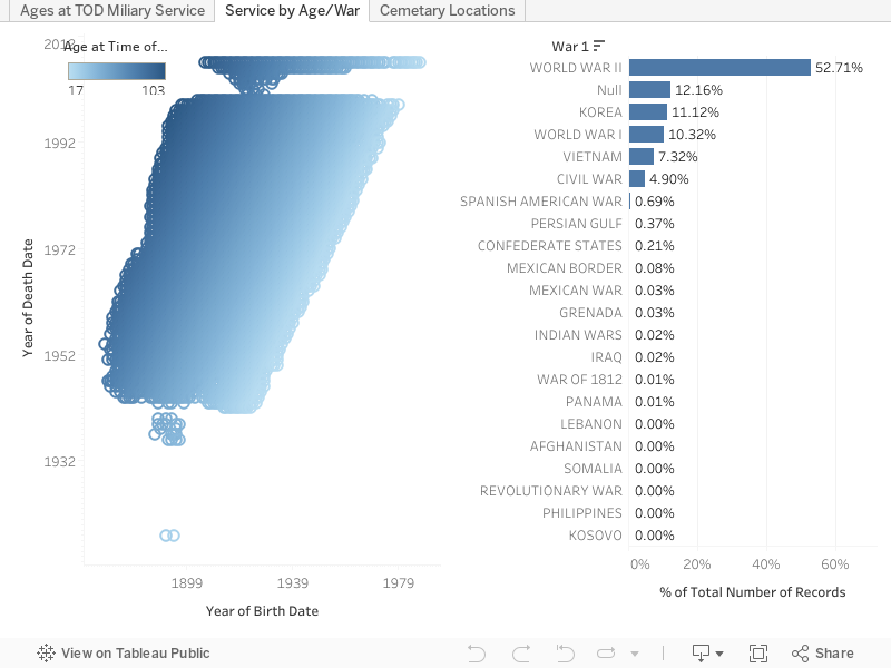
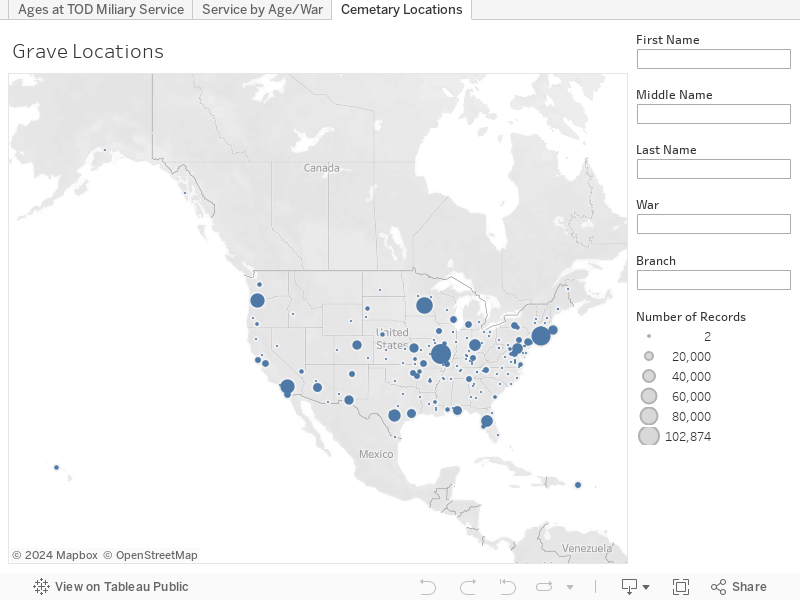
Before we get started this week I wanted to say that I haven't spent a whole lot of time on anything but I did publish this little quickie viz from last week (hey they can't all be winners right?!). I spent a good part of last week working on upgrading my dad's computer and hanging out with my niece... so while the viz got published last week it's taken me a while to sit down and write a blog post for it! I'm sure you can understand!
Me reading to the Niece (Regan)
It's really because after almost 5 years I finally took down my "ticketing" form that I used for people in my prior job as a sys admin at the University of Kentucky to submit trouble tickets (if possible). Of course there were TONS of people who couldn't submit a ticket online, due to connection issues or whatever, so they ended up calling in. These represent I'd guess about 3/4 of the total amount of tickets myself and my partner in crime would get through the course of our time there.

I worked at the University of Kentucky (UK) for 19 years in total... I literally worked there my entire professional career. I worked there longer than I didn't work there (I started when I was 18). It really became a second home to me. I was let go back in October as part of a "Reduction in Force" during a departmental merger. A lot of people would think I'd be SUPER mad about it but honestly this has given me the kick-in-the-butt I've always needed to pursue my career as a data analyst; which is something I found myself heavily involved with in my last 4-5 years there.

Click image for full comic!
A lot of people think I should be mad about the whole situation... but I'm not mad. Honestly I'm just sad (see comic to the left!) about the whole thing. I just felt very invested in the future of the University only to find out they weren't terribly invested in the future of me. Isn't that crappy?! Shouldn't I be mad about that!? The problem is WHO to be mad at... the people who actually let me go are nice people who really weren't given any other choice. They had to make some hard decisions and I fully expect they'll retire after the full transition period is done.

Over my time at the University I spearheaded several programs that I felt really made a difference both in our impact towards students and on things like the environment. One of the largest (and EASILY most painful) projects I worked on was the transition from personal printers, which at the time consisted of about 35% of my work-time, to large-scale networked printers via our UK contract with Ricoh for Managed Print Services.

Towards the end the large majority of requests came for adding/removing users, file problems... just hum-drum admin stuff. Which is one of the reasons I started poking around with Tableau in the first place actually! So yay boring work! I limited the time in this viz to only the time I was actually at work (even though the form itself stayed up until very recently).


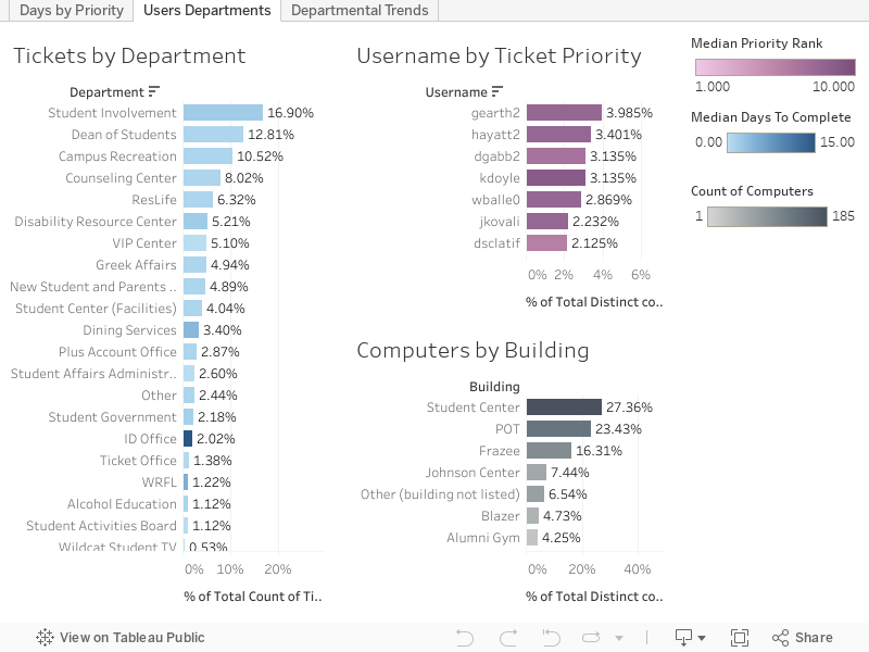
Let's break down the numbers real quick:


  • 1,882 Tickets submitted from 11/16/2011 - 9/29/2016
    • 912 Distinct Days Tickets Submitted
    • Approximately 2 tickets per day
  • Avg Days to Complete = 7
    • This number was driven up by a few VERY longstanding tickets that we couldn't do anything to speed up
  • Median Days to Complete = 1
    • I'm super-proud of this obviously!
  • Avg Priority Rank (self-ranked by the way!) = 6.912 (out of 10)
  • Median Priority Rank = 7
  • Served 336 distinct usernames
  • Worked on 666 distinct computer names
  • Covering 22 departments across 19 different buildings
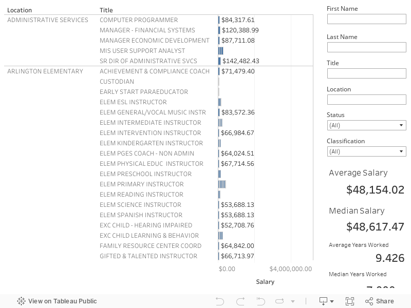
First here's a quick little look at tickets by priority:


Now let's get into it and look at Users and Departments:


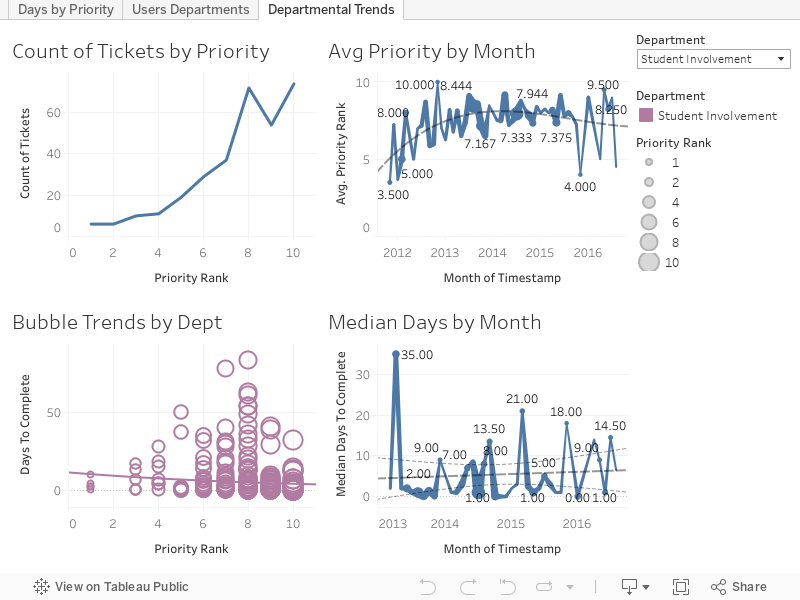
Finally let's examine trends by department:


As always hit me up in the comments below or on Twitter @wjking0 if you have any questions!

Friday, January 20, 2017

EPA Critical Violations (Last 3 Years)


This is part of my #1YearOfViz series! Check out the archive here: http://bourbonandbrains.blogspot.com/p/one-year-of-dataviz.html

I know I promised everyone a Casey Neistat viz this week but I'm hoping to give that one a little more love and do some fancy-dancy things with it.... so it's getting postponed a while!
Instead I'm bringing you another things near and dear to my heart... EPA violations! I was thinking about pollution and I decided to swing by the EPA website to see if they had information worth scrapping or looking at.

That's when I saw it... not only did they have EVERY SINGLE BIT OF DATA IMAGINABLE for every facility that reports to the EPA... they had them all ALREADY GEOCODED.

ARE YOU EVEN KIDDING ME RIGHT NOW EPA!? I LOVE YOU! (But not as much as cats or pizza... )

So I tried to export all 500,000+ records but they have some limits on their queries. Another amazing thing is that if you try a query that returns over their query limit they have SUGGESTED FILTERS that pop up on the side for ways to filter the data down to actually pull results! I decided to only pull "Significant Violations" for this particular viz. Seriously, whoever designed their search system... I owe you SO many donuts! I'm still looking for the pure raw data to pull down for a more in-depth dive (I'm guessing it's located on data.gov but I haven't gone searching for it really hard yet) into all this but I decided in the meantime to pull down all the locations nationwide which have had a "critical problem".

I really didn't want any of my family to wake up to
 be the Toxic Avenger!
The first thing I noticed was that there were not many "sanctions" really being delved out. I came across this as I was looking at this list of court cases brought by the EPA against companies/individuals. For those of you in WV you obviously heard about the American Industries scandal as chemicals were leaked into water intakes for drinking water around the state. My own family was involved in this so it's pretty fresh in my mind. Did you know that the President of Freedom Industries only got a few months in prison for that? Does that seem like a lot to you? Another person I read about dumped sewage into a much smaller river and ended up getting 3 years of prison time. I was hoping to scrape all the prison terms and such but it's not formatted equally enough for me to get it at this time. Again, I hope that I'll be able to get some of this down the road.

Here's the data on states and sanctioning vs inspections, click on either the state or the number of quarters of non-compliance (or both) to reshape the data to show average inspections, EPA actions, and number of records:


Me when I find out how many places DON'T
get punished for consistent EPA violations. =/
Now keep in mind these are ONLY facilities which have a "Significant Violation"... still the average number of EPA actions even for places with 11 quarters of non-compliance (we can assume that 12 quarters could possibly be an error... or the frightening truth). Eleven quarters means that at SOME POINT they were compliant in the last 3 years... of places with 9-11 quarters of non-compliance (2-2.75 years) this comprises 22.21% of all significant violation records. Of those with 9-11 quarters of non-compliance the average "Formal Action Count" is 1.025 out of an average of 3.057 inspections.

This last dashboard allows you to zoom in on the area you (or your loved-ones) might live to look around at facilities near them that have had critical EPA violations and read more in-depth about the facilities themselves. You can search by facility name, state, and city. Clicking on the dot will load up the EPA page in a new window and you can read up for yourself! Edit: I tried to get the viz to load the page INSIDE the dashboard but both http and https versions weren't working once I actually saved to Tableau Public so I figured this was the best compromise since I still wanted the individual facilities to be viewable.


I grew up in a place known as the Chemical Valley (highlighted in this graphic I exported from Tableau below) so I care about the existence of the EPA, they keep the people safe from corporate interests in a very real way. Prior to crackdowns in EPA regulation there were places close to where I grew up that had population cancer rates OVER 85%... thanks to the EPA those rates are significantly lower today. Just something to think about when people talk about doing away with the EPA in favor of "self regulation" (ie no regulation). =/ As always hit me up on twitter @wjking0 and I hope to create a little more in-depth dive with this data a little later on.


Friday, January 13, 2017

Boozey Kentucky Locations Viz


This is part of my #1YearOfViz series! Check out the archive here: http://bourbonandbrains.blogspot.com/p/one-year-of-dataviz.html

First off I wanted to say that I had a BLAST as one of the first ever presenters at the Lexington Tableau Users Group! I did a presentation about Public Data for Public Good. I'll be doing a subsequent blog post once I get the video a little better produced and I'll post that here on the blog as well! In the meantime here's a couple pictures from it and a very nice tweet after I got done!


I'm hoping to do this again soon with some other organizations (particularly some newspaper groups) and really spread the love of public data and the #1YearOfViz around!

Let's get into this week's viz. I scraped the Kentucky Alcohol Beverage Control (ABC) database of liquor licenses. I was really hoping there would be some interesting data to crunch out of it and was kind of let down. I think one of the most interesting realizations that came out of this data was that Kroger was the largest liquor license holder in the state at 300 licenses!

As with the typical vizzes I publish like this EVERYTHING is clickable and sortable. The only section that doesn't reformat the data is the color coding of the liquor license types. If you'd like to sort by those please click up on the numerical values above the color pallet to do so. Hop on in and find out who owns the most liquor licenses in your zip code!


As always please hit me up on twitter @wjking0 if you have any questions or comments!

Also be sure to check out next week as I'm working on something special based on my fave YouTuber Casey Neistat!

Thursday, January 5, 2017

Veterans Affairs Database of Military Graves


This is part of my #1YearOfViz series! Check out the archive here: http://bourbonandbrains.blogspot.com/p/one-year-of-dataviz.html

I hope this week's viz doesn't come across as too morbid, You'll also find none of my typical gifs in this post as I wanted to keep it as respectful as possible. I was looking through data.gov the other day for a Kentucky-centric piece of data to viz when I found the Kentucky record from the VA of military burial sites and it seemed to be out of a larger dataset. Sure enough, I found the entire dataset which includes full names, birth dates, death dates, wars fought in, branch and occasionally rank of the individuals!

This is really neat for me as I've had several family members serve including both grandfathers who fought in World War II. As a matter of fact I recently got to go to LA to hang out with one of my best friends and we got to tour my Grandfather Davis' old battleship the USS Iowa! Here's a pic:
Me in front of my Grandpa's old ship the USS Iowa - Photo courtesy of Casey Miller

I having birthdays and death dates I was hoping I could do some more in-depth calculations on ages at time of death but the problem is that you can't specifically know based on the data that an individual died IN that particular conflict. You can make some pretty strong inferences to see how wars in particular pull down the median ages of people who pass away at different points. Let's go ahead and look at that dashboard now. You can click on a branch of military (the % of ALL records are on the right) and the ages/dates will reformat on the left (Median ages of people who passed away certain years). You can also just enter in a particular branch or rank on the left hand side if you'd like to filter the whole dashboard that way as well.


As you can see periods of war, particularly the first and second World Wars caused great dips in the median ages of veterans that passed away on those years. These pronunciations become much more distinct if you limit the ages of those who pass away to 35 and younger. The data as it's shown above represents ages 16-62 (the mandatory retirement age for military personnel barring special circumstances). In this next dash however you can see some gaps in the VA's data. Particularly between the years of 2001-2005... there's only a very small spattering of people represented in those years compared to the rest. Again you can reformat either side of the data by clicking or selecting parts from the opposite side. I'd suggest using a box select on the left side and selecting an individual war on the right. You can expand the "War" column on the right to allow for people who served in multiple wars to be selected. Generally speaking they are in chronological order but occasionally not. Some people, for instance, had WWI listed AFTER WWII... but let me assure you I did a TON of data cleanup on this... and I had to stop somewhere so ordering all the dimensions was my stopping point!


Finally this last one is a map of all the known military burial sites listed by the VA. I imagined there would be more than 183 but several have VERY large sections dedicated to soldiers. If you know that you have a family member or friend that is buried in one of these locations you can do searches. If you limit it down to a single person per location it will actually give you the full details of the location of the grave in the tooltip if you hover over the location with your mouse or finger. I hope that can be useful for some of you out there to find your loved ones.


Lastly let me say thank you to all those who have served... who lived and died for the freedom for people like me to be able to find public data and publish it.

As always hit me up in the comments below or on twitter @wjking0 if you have any questions or concerns.

Thursday, December 29, 2016

Fayette Co. (Kentucky) Public Schools (FCPS) Salaries 2015-2016


This is part of my #1YearOfViz series! Check out the archive here: http://bourbonandbrains.blogspot.com/p/one-year-of-dataviz.html

Me when I hit Import.io's scraping limit and get banned (again)
I wanted to start this post talking about the problems I've recently encountered was using Import.io. Multiple times now I have run into the their scraping limit for "free" users and have been temporarily banned from using their services. one time accidentally ran cloud-based scrape as a test but the scrape continued after I closed it so I ended up running a query of a thousand instead of the 20 to 30 I wanted to run. Then this month I've ran a scrape of over 10,000 (their new limit on local clients scraping) in a given month, I was originally told the Legacy client would be allowed to have infinite scraping as long as it was done locally (via their Facebook users group). This was apparently not the case.


I started out looking for a new scraping client checking out several pages for clients to use. But almost all web scraping services required monthly subscription fees, or have no local clients to use for cheaper or free rate. That's when/how I discovered Octoparse!
/\ Me hugging Octoparse!

It is kind of magic! It took me over a week to really learn how to use it, but this is been extraordinarily worth it! The main school and Octoparse are much more tools in imports. Octoparse allows unlimited queries from the local client and you only have to pay when you're using their cloud-based services. Which is the way I suggested import price their systems when support contacted me about my ban from their services.

Hey Octoparse, I just met you,
and this is crazy,
comment my blog,
and sponsor me maybe!?
I only wish I had known about Octoparse earlier so that I could have stayed myself around 12 hours worth of work when I did the West Virginia State salary scrape a while back! what you will be looking at in this visualization is the first scrape that I have completed using Octoparse. The data came out incredibly clean and simple, my only complaint in the export of Octoparse is that CSV export to be not directly readable by excel when opened. It's really a minor complaint next to the awesome flexibility of the product though! Let's get into the data!


I've settled in on my designs for salary-based dashboards with only a single year of data. I decided not to fix it since it's not broke and replicated the same types of dashboards I've done in the UK Salary Viz here and a little bit of the work I did in the WV State Salary Viz mentioned previously. The "Dots Dash" as I call it is really just a fun visual representation of all the people/years/money that goes into something like public education in one single county.


This next one is just Salary Over Time and Number of People Over Time so basically how many people are making approximately how much, how quickly do you see raises given, etc. If you'll notice at the side this viz starts out with a filter of "Instructor" on it to show specifically teachers salaries over time as all teachers (I think) have 'instructor' as part of their titles. You can set this wildcard filter to whatever you'd like (ex. 'bus driver') to see how your or a friend's particular job futures will look over time.


The next story dashboard I really wanted to look at how locations/grade-types pay different teachers. Do art teachers make more at Liberty than at Brian Station? How about music teachers at Elementary schools vs High Schools? Step through the story with the top tabs and you can filter on the right and compare median salaries by location. I'd like to ultimately turn this into part of what I'll use for a future dashboard I'm going to work on that will compare test scores to teacher salaries for particular places... but this will have to do for this week! =D The last little section was just because I was curious how how much principals make in general and I was surprised (and glad) to see they make good money.


This last dash is just the "big list" that a lot of people like to see... if you CLICK on a location or a job title the data to the right (medians/averages of salaries and years worked) will reformat to that highlighted selection. If you click on a job it will not be the medians/averages for that particular school (as each school doesn't have enough non-teaching staff to make that functional) so it reformats to show EVERYONE who shares that job title. You can also filter this list by name if you're looking for someone in particular's salary.


Finally, as the son of a public school teacher let me say to all of you out there doing the work every day...

As always hit me up on twitter @wjking0 or in the comments below for questions/concerns!

Friday, December 23, 2016

A Year on Google's Project Fi


This is part of my #1YearOfViz series! Check out the archive here: http://bourbonandbrains.blogspot.com/p/one-year-of-dataviz.html
Most of you that know me know that I drink deep of the Google Kool-Aid... I've been a nexus 10 owner for years, I've beta tested apps from the Googs... you name it. That's why, about a year ago I was thinking about switching my cell phone service when I realized that they had a no-interest payment plan on their latest phone! I figured I would give the service a shot and see if it was everything it was cracked up to be. This is not as much a DataViz post as it is a Quantified Self post about what I learned while changing cell phone providers.

Also I just SUPER wanted a new phone, again if you've known me for a few years I carried around a Samsung Galaxy S3 with a screen that was more often cracked that normal (thanks alcohol!). Anyway the Nexus 6P was about the sexiest phone I've ever laid eyes on and I figured if Google held up their promises of using multiple networks to boost speeds it might be pretty amazing. I ordered my phone and was going to wait until Jan 1st to turn it on... it arrived and I had it in my hands for a cool 2-3 days (using wifi only) when my Galaxy S3 gave up the ghost and had a major problem with it's motherboard. To this day I think it was just jealous of the new phone. =D

What I hadn't really thought too much on was exactly WHEN and HOW I used my cell service. I kept thinking "I shouldn't really use much 'real' data because I'm always at places with wifi"...like my apt, my office, etc. This is where I was WRONG. After getting the phone that first day I was really wanting to run speed tests all the time and see exactly what this combined network signal would mean as far as speeds on the phone... but to test speeds do you know what you need? Large data files to transfer. I burned through almost 1/2 a gig in a few hours... I'd only allotted myself 2Gb a month (though it's not a problem if you use more, it just adds to your bill). You see I was coming from an UNLIMITED Sprint plan that I'd had forever and it was pretty rad. Anyway... I've logged my wifi connections via IFTTT for years so I figured I would give it a solid year to look at the differences. Let's get into the data:


Let's just take stock of the positives and negatives:
Super fast = Super Pricey!

  • Positives
    • It's AH-MAZING-LY fast! (see screenshot to the right!)
    • Reception is better in most previously "dead" zones
    • The build-quality of the Nexus/Pixel line of phones is impeccable
    • Initial cost of entry is very low ($20/month)
    • Integration with Google Services (like Google Voice/Hangouts) is GREAT
  • Cons
    • Actual phone call quality (particularly on Wifi) is kinda janky
    • $10/Gig of data is TOO DAMNED HIGH
      • Ex. I spent $5 in a few hours just running speed tests around town the first day or so.
      • I could burn through 1/2 Gb of data A DAY walking to work watching YouTube which, if I continued doing, would have cost me approximate $100/month in data
    • Really paying per gig is almost impossibly hard when you're used to unlimited data
    • Have I mentioned that fast network speeds really only matter when you feel that you're not paying for every Mb that flys to your phone at Mach 6!?


How I feel after trashing a Google Service
What does all this mean? Well... have I had good network speeds? Yes. Has my call quality been good? MOSTLY (drops sometimes, particularly in Wifi calling). Have I had to SUBSTANTIALLY alter the way I think about my phone being online? HELLS to the YES. That to me is the big flaw in Project Fi... The fast access just means that ultimately you're going to pay them more because you're going to pull down larger data and more HD video, etc. If they said something like "OK, all Google-related services are going to be FREE to access..." I could subsist on YouTube and Play movies/music etc while walking around town. Now I see the draw to places like T-Mobile who are bundling things like Netflix and Hulu in as "Unlimited" as far as data usage goes. Don't even get me started on things like image-heavy Instagram and other services that are no longer text based but image/video based only... ugh.

Bottom Line (literally)... Can I recommend Project Fi as a service to most people? Yes. Only if you're not someone who likes to constantly have your phone out. If you're a super nerd like myself and live on the Interwebs... you're going to hate Fi.

As always hit me up on twitter @wjking0 with any comments or questions!

Thursday, December 15, 2016

Kentucky State Childcare Map

Yes this is actually my niece! =D
This is part of my #1YearOfViz series! Check out the archive here: http://bourbonandbrains.blogspot.com/p/one-year-of-dataviz.html

Me as a babysitter... also an amazing movie.

I've been pretty busy recently... went to California, hung out in the desert, Los Angeles and everywhere inbetween!

This is a little something I've worked on previously. It isn't much but it's just to get the data out there!

You can find information on what the star ratings mean (4 being the max btw!) here: http://chfs.ky.gov/dcbs/dcc/stars/starsproviderinfo.htm

The data I scraped was located in their search tool located here: https://prdweb.chfs.ky.gov/KICCSPublic/ProviderSearchPublic.aspx

Let's hop right into the map!


As always hit me up on Twitter @wjking0 with any questions!

So true Millhouse, so true.