Showing posts with label #UniversityOfKentucky. Show all posts

Thursday, February 22, 2018

UK Crimes Minutia

Hi new readers! For those of you returning I'm sorry about my absence from blogging for a while! It's been a busy year or two! I lost my job at the University of Kentucky due to a departmental merger... floated around on unemployment for a while applying to jobs and finally ended up with a job at a startup in Southern California where I worked tons and increased my Tableau skills even more than before.

This is the longer/more-boring version of the shortened article here: http://bourbonandbrains.blogspot.com/2018/02/university-of-kentucky-crimes-mapped.html

One thing kept nagging at me though and that was a project I started years ago while I was still working at UK. Here's the quick story... I worked in the Division of Student Affairs for the last 15 or so years of my employment with the University. Years and YEARS ago I thought that the way we reported crimes on campus was ridiculous. Due to both federal and state laws (known as Clery/Minger laws) the University has to report all crimes and acts of arson on campus. That is currently done in the following format:


Now, I don't know about you but while that fulfills the "letter of the law" I don't feel it fulfills the "spirit" of the law. Those laws were done so people could educate themselves on crime and trends to determine their (or their child's) safety on a college campus. I went to my boss at the time telling her I'd like to get a group together to map out crime on campus to help places like our Violence Intervention Center and other places focus efforts and overall to make campus a more safe place. I was told, in no uncertain terms, that I was not to do that. The fear was that it would "reflect poorly on our Greek community." (Which, once I looked at the data, it doesn't actually!) This, of course, pissed me off. I didn't have the tools to do it on my own... fast forward a few years and I became one of the Tableau super-users on campus and I realize that I now have all the tools (data scraping) and knowledge of data visualization (Tableau) to do this whole project myself. I went to my boss at the time, a different VP who was more forward thinking (Dr. Robert Mock) and let him know that I had gathered this data, analyzed it, and I was going to publish it. I let him know (as with now) I did it all on my own time with my own resources from publicly available data and I wasn't so much asking permission as I was just letting him know I might be kicking a hornet's nest. He told me to contact the UK Police and let them know what I'd done before I publish it... so I did. I wanted to show the police what I'd done and give them a chance to weigh in. I met MULTIPLE times with the then Lt. Barefoot (I believe Captain Barefoot now) and when I showed him the data he wasn't at all surprised. He helped clear up some of my understanding of the data and was SUPER HELPFUL. I can't speak highly enough of all the University of Kentucky Police Department. Seriously, they're great and very forward thinking. 

One of the first things they asked me was if I could do this data live against their database, which I was THRILLED to hear. I worked on a version to be published publicly and running against their database they were using to display on the Crime Log page. Unfortunately this project got bogged down in minutia primarily regarding updating map coordinates. I heard whispers up until about a year ago that someone was still going to publish/maintain it but without me driving the issue it ultimately never happened... UNTIL NOW!

This data is hand-entered into a system so you can imagine with 16000+ rows there is a lot of fat-fingering errors that happen. Additionally the text parsing to clean the addresses was a NIGHTMARE. Basically what I did was find every way to say "RD" and every permeation of every street ending you can imagine and did a huge if/then to combine all those. Took away the punctuation from everything and ended up hand-geocoding most of it with the AH-MAZE-ZING service Geocodio.

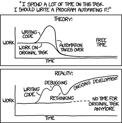
After that I tried to go in and manually include building names where the addresses matched. I considered doing this problematically but honestly it would have taken about the same amount of time either way. Whenever faced with a big problem like that I always like to refer to this XKCD comic:


Anyway... those are the gory details of why I did all this and how I did it. Just as before this data could be presented in this way live but it has never been made a priority by the University. Given the nature of some of the things that have happened recently maybe things like Terroristic Threatening should get a little more of a spotlight shown on it.

As always if you have any questions/comments/concerns hit me up on twitter @wjking0

University of Kentucky Crimes Mapped


Sorry it's been a while since I posted! I promise I'm going to get on a better public-release schedule.

That said... this data, while formatted nice has a TON of fat-finger errors in it... it's hand-entry of over 16,000+ things from a state-wide police system to their front-end web interface. If you'd like to hear about it and all the minutia that lead up to this and why it's important to me click here.

Me scrubbing data only to find more data that needs scrubbed.
With recent news of the mishandling of a poor young woman's case as detailed by the Kentucky Kernel I decided now was a good time to talk about the public nature of crime data... Let's get into it!


A couple things to note about the above viz is that CSA cases do NOT require a police officer to be involved. Those stand for "Campus Security Authority" so a CSA case can be something like someone spitting on a nurse (a frequent occurrence unfortunately) or drinking in a dorm room etc. To get an idea of the "real" police workload change the filter for "Case Number CSA" to False. Now you'll be looking at only the crimes where an actual officer was involved.
Aside from Eastern State Hospital (which is largely a mental health facility) what is one of the main drivers of crime on campus? Well... turns out that's UK Football. When you look at crimes by individual dates over the years there are some pretty obvious spikes. When I checked the dates, yep... all home UK football games.


What's that? You want to know the longest list of charges? Well that would belong to case 20143565 which has the following laundry-list of offenses:
"FAILURE TO ILLUMINATE HEAD LAMPS/V, DISREGARDING TRAFFIC CONT DEV-TRAFFIC LIGHT/V, OPER MTR VEHICLE U/INFLU ALC/DRUGS/ETC. .08(AGG CIRCUM) 1ST OFF/M, FLEEING OR EVADING POLICE, 1ST DEGREE (MOTOR VEHICLE)/F, FLEEING OR EVADING POLICE, 1ST DEGREE (ON FOOT)/F, CARRYING A CONCEALED WEAPON/M, WANTON ENDANGERMENT-1ST DEGREE-POLICE OFFICER/F, POSS OF MARIJUANA/M, TRAFFICKING IN SYNTHETIC CANNABINOID AGONISTS OR PIPERAZINES/M, POSS CONT SUB 1ST DEG 1ST OFF (COCAINE)/F, PROMOTING CONTRABAND-1ST DEGREE/F, WANTON ENDANGERMENT-1ST DEGREE/F, POSS OF OPEN ALC BEVERAL CONT IN MOTOR VEH PROHIBITED/V."


Want to dig a little deeper into specific crimes? Check out the viz below!


Realistically though the University of Kentucky Police are really SUPER AWESOME and nice people whom I've met with personally several times. The next chart highlights close rates of cases and the ones you'd expect to not get closed (theft, burglary, etc) are the types of things you see most unsolved. Click around and see what you're curious about. When I was going through the data one of the most concerning things to me was to look at the "Unfounded" category and see how Sex Offenses is the highest rank (when including CSA cases). That doesn't seem like a thing people would exaggerate on and I trust the UK Police to have done their due diligence, but I also am concerned about the culture we live in and how that affects things like this in aggregate.


I'd also like to share this cleaned version of data that I am posting out on Google Drive for download as well as one of my new fave repositories at Data.World. If you'd like to know more about what went into cleaning the data again go to the page here where I talk about some of the data cleansing that went on.

As always I hope you all found this informative and if you have questions please post a comment below or hit me up on twitter @wjking0!


Monday, January 30, 2017

My Previous Life - Analysis of Trouble Tickets

This is part of my #1YearOfViz series! Check out the archive here: http://bourbonandbrains.blogspot.com/p/one-year-of-dataviz.html

Before we get started this week I wanted to say that I haven't spent a whole lot of time on anything but I did publish this little quickie viz from last week (hey they can't all be winners right?!). I spent a good part of last week working on upgrading my dad's computer and hanging out with my niece... so while the viz got published last week it's taken me a while to sit down and write a blog post for it! I'm sure you can understand!
Me reading to the Niece (Regan)
It's really because after almost 5 years I finally took down my "ticketing" form that I used for people in my prior job as a sys admin at the University of Kentucky to submit trouble tickets (if possible). Of course there were TONS of people who couldn't submit a ticket online, due to connection issues or whatever, so they ended up calling in. These represent I'd guess about 3/4 of the total amount of tickets myself and my partner in crime would get through the course of our time there.

I worked at the University of Kentucky (UK) for 19 years in total... I literally worked there my entire professional career. I worked there longer than I didn't work there (I started when I was 18). It really became a second home to me. I was let go back in October as part of a "Reduction in Force" during a departmental merger. A lot of people would think I'd be SUPER mad about it but honestly this has given me the kick-in-the-butt I've always needed to pursue my career as a data analyst; which is something I found myself heavily involved with in my last 4-5 years there.

Click image for full comic!
A lot of people think I should be mad about the whole situation... but I'm not mad. Honestly I'm just sad (see comic to the left!) about the whole thing. I just felt very invested in the future of the University only to find out they weren't terribly invested in the future of me. Isn't that crappy?! Shouldn't I be mad about that!? The problem is WHO to be mad at... the people who actually let me go are nice people who really weren't given any other choice. They had to make some hard decisions and I fully expect they'll retire after the full transition period is done.

Over my time at the University I spearheaded several programs that I felt really made a difference both in our impact towards students and on things like the environment. One of the largest (and EASILY most painful) projects I worked on was the transition from personal printers, which at the time consisted of about 35% of my work-time, to large-scale networked printers via our UK contract with Ricoh for Managed Print Services.

Towards the end the large majority of requests came for adding/removing users, file problems... just hum-drum admin stuff. Which is one of the reasons I started poking around with Tableau in the first place actually! So yay boring work! I limited the time in this viz to only the time I was actually at work (even though the form itself stayed up until very recently).


Let's break down the numbers real quick:


  • 1,882 Tickets submitted from 11/16/2011 - 9/29/2016
    • 912 Distinct Days Tickets Submitted
    • Approximately 2 tickets per day
  • Avg Days to Complete = 7
    • This number was driven up by a few VERY longstanding tickets that we couldn't do anything to speed up
  • Median Days to Complete = 1
    • I'm super-proud of this obviously!
  • Avg Priority Rank (self-ranked by the way!) = 6.912 (out of 10)
  • Median Priority Rank = 7
  • Served 336 distinct usernames
  • Worked on 666 distinct computer names
  • Covering 22 departments across 19 different buildings
First here's a quick little look at tickets by priority:


Now let's get into it and look at Users and Departments:


Finally let's examine trends by department:


As always hit me up in the comments below or on Twitter @wjking0 if you have any questions!

Friday, May 27, 2016

University of Kentucky Salaries 2015-2016 Viz


Since the 2014-2015 University of Kentucky Salary Viz was such a hit I figured I would both redo and improve some of the fancy stuff I did previously. First off let me say that I work at the University and have for quite some time. I've loved my work and the people I work for, I also think that everyone should watch this video (embedded below) first before wanting to be super-secretive about what they make:


After the last time I presented this data several emails went around UK regarding if I had done anything illegal in creating these viz's. Soon afterwards I actually met with UK Human Resources (who were extremely nice by the way) to talk about ways to get this info in a more "live" format for them to use. To be able to do quick assessments on medians and averages for different position levels or departments was apparently something they'd been striving to do for about 2 years. Even going so far as to hire a person specifically for the development of that kind of system. I ended up meeting with them and discussing the idea of developing a live version using our UK Tableau server but never really heard much back after the initial meeting. Anyway... the upshot was, I didn't get in trouble as that one (like this one) was done on my own equipment, on my own time, using publicly available data.

NOW, on with the viz!

The three graphs you'll recognize from last year but I also squashed several bugs. The first is the bubble graph showing all salaries and years worked. Years worked is represented by the size of the circle and salaries is the richness of the blue coloring.


Next I wanted to establish medians with quartiles for both years worked and salary. At about 17 years now I'm in the upper threshold of the quartile for years worked and hovering just over the median salary at UK.


Third is the big "full list" of salaries that you can scroll through. It's sorted by position (aka "job title") and then Department, Full-Time or Part-Time, then "Rank" (which only applies to faculty so there is a rank of 'non-faculty' for everyone else), Salary, and the number of Years Worked. I sorted it by position because if you hover the mouse over the Position the info on the right (medians and averages for years worked and salaries) will change to reflect the job title you're exploring.


Now comes the big one... the one that I know a lot of people have waited over a year for. What can you calculate when you have TWO years of salary data? Raise percentages. The BIG THINGS to keep in mind here is that when calculating these I made sure the people met the following criteria:


  1. In the same Department as 2014-2015 data
  2. In the same Position as 2014-2015 data
  3. In the same Full-Time/Part-Time status as 2014-2015 data
  4. In the same Exempt/Non-Exempt status as 2014-2015 data


The other thing I thought about was if there was any discrepancy to raise % by the number of years worked. IE is there a good-ole-boy system at play that rewards people who stick around longer? The short answer to that is not particularly, pay rates DO go up over years but that's to be expected, raise percentages don't tend to increase that much as you go up the scale (and remember the "scale" we're looking at is over 40+ years in length of service). The one noticeable trend I did see was that, over time, raises at the Medical Center side of campus tended to add up to larger amounts. You'll see the orange line at the top of this dashboard represents a MOVING AVERAGE of raise percentages. This is generally pretty low because there are LOT of people, particularly when you include part-timers, that receive 0% raises.

You'll notice the list of raise percentages is very similar to the median/averages for salary/years worked from the other dashboard but the primary sorting field is now department so you can click on a particular department and see how raises have been handled by the number of years worked. Obviously, when you have such few numbers you'll notice that the moving averages tend to shift pretty severely... still, if you select a department with hundreds of people you can get a pretty good idea on what the financial upward mobility looks like there.


This last little one is just to give you median's by "Rank" (faculty/non-faculty) over time. To keep the graph at least someone accurate and smooth it out a little I limited it to at least 5 people with that particular number of years worked. You can bump the slider up to 10 if you'd like a little more accurate picture.


Ultimately though the university spends $1,137,609,613.91 on Salaries according to their released data for the 2015-2016 fiscal year. While that may seem like a METRIC TON of money (and it is), think that the University of Kentucky is also one of the single largest employers in the state of Kentucky. It's the flagship university of the state of Kentucky. And sadly while none of us working here will ever be like the guy picture below, it's nice to know where state money is going and to know (now that we can calculate raise percentages and have historical data) that nothing crazy is going on.


Lastly I'd like to make this data as available as possible so you can obtain all the data used in this here: https://goo.gl/S8fVTc

As always you can hit me up in the comments below or on twitter @wjking0