Wednesday, October 19, 2016

Car, Cycling and Pedestrian Collision Data - Part 1


This is part of my #1YearOfViz series! Check out the archive here: http://bourbonandbrains.blogspot.com/p/one-year-of-dataviz.html

I knew I would have to do this eventually, I finally came upon a data set so large that I have to split it into multiple posts. I originally was turned on to this data as part of some work I had done with the University of Kentucky Police Department, I had done some work on their crime log and one of the captains thought I would be interested in traffic collision data (Captain Matlock who's super rad and a data nerd himself!). I said oh you mean traffic accidents? He replied, there are no accidents. when he gave me a sample of their data I realized I could deduce several trends in it, particularly in regards to pedestrian and cycling accidents as they occurred on campus.


Being an avid cyclist myself I saw the potential for this data to really help and inform other cyclists and people working on the planning of the University of Kentucky's roads and pathways. One of my last days as an employee of the University of Kentucky was spent with the cycling committee briefing them on this data . They then informed me that this looks to have come from a larger data set from crashinformationKY.org. When I pulled up the site I was giddy with excitement at the fact that there are so many data fields and so much historical data, way more than I had originally been given by the UK police department.

Unfortunately, the yearly downloads from that state police website were not very functional. They were .DAT files but neither of the data definitions listed on the website allowed me to properly parse those 2 GB yearly files into anything usable. I then decided that I needed to just scrape Fayette County as a proof of concept, however even that had to be done in six months intervals which go back over approximately the last six years.

Let's get into the data!

First I would like to mention that all points on the dashboards listed below are clickable, so if you click a roadway name it will reshape all of the shown data to reflect that roadway name until you click off of it clearing that selection. The same goes for things like day of the week of collision or hour of collision, any of those will reshape all the other existing data on the charts below this goes for all four of the dashboards I have posted below.

This first dashboard highlights the locations of collisions highlighted by particular roadways with day of the week and hour of day frequency being shown at the bottom. The map to the right of the roadway names shows coloration by number of injured in particular accidents the concentration of redness at different locations can be a good indicator of where are the most injurious areas of a particular roadway. Take a look around at the data and remember you can use the controls in the upper left of the map to zoom in on a particular area of interest after you have set your filters were selected your items on the other charts.



 This second dashboard is just a comparison of the percentage change of pedestrian and bicycle collisions by month and year. Taken as a whole pedestrian collisions have risen slightly over the last six years while bicycle collisions have fallen slightly . The thing to remember is the percentage differences in these changes are less than 1% so not terribly significant. If we limit the collisions to the last three years we see those trends are reversed. In the last three years , pedestrian collisions have gone down 0.4% while bicycle collisions have gone up 0.2% . I didn't have any particularly significant dates to slide the slider to in order to examine a particular change in Lexington policy or anything. But I left the date slider on the right in case anyone wanted to check something out. 



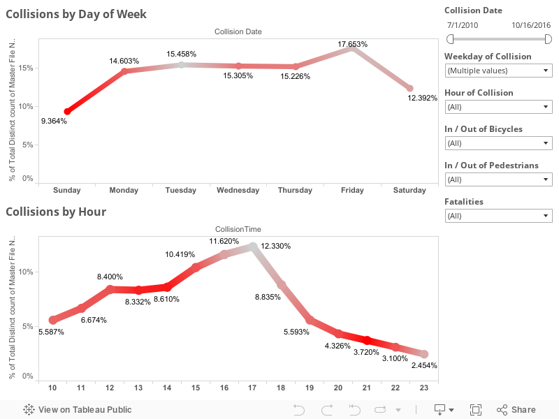
This third dashboard is a slightly more simplified version of the first except that I wanted to look at injury rates particularly. You'll notice the red coloration is the percentage of people injured on that given day or time. Again, the date sliders are on the right as well as selections for the day and hour of collisions though those can be selected by clicking directly on the dots as well . Things like bicycle and pedestrian collisions as well as, in this visualization, fatalities are included. 

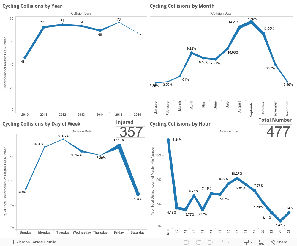
This last dashboard is just one purely to look at every aspect of timing of cycling collations including by year, month, day of week, and hour with both injury totals and total number of collisions also listed in the chart.


 I will be linking the second or third or possibly even fourth part of this viz down below as I complete them but they will all hopefully be part of my one year of viz challenge that I've made for myself. As always, if you have questions or concerns you can leave them in the comments below this blog or hit me up on Twitter at @wjking0.


Thursday, October 13, 2016

National Parks Tourism and Money Comparison


This is part of my #1YearOfViz series! Check out the archive here: http://bourbonandbrains.blogspot.com/p/one-year-of-dataviz.html

Originally found the subject of today's blog in a Reddit forum that I am an admin of called r/datasets/. I'm a pretty big fan of our national parks and have several faves including Monument, Yellowstone, etc. This year marks the 100th year of the United States National Park Service has been in existence so I thought this would be a great time to make a viz about our nations national parks!

Some of the things that I discovered in the data are as follows:


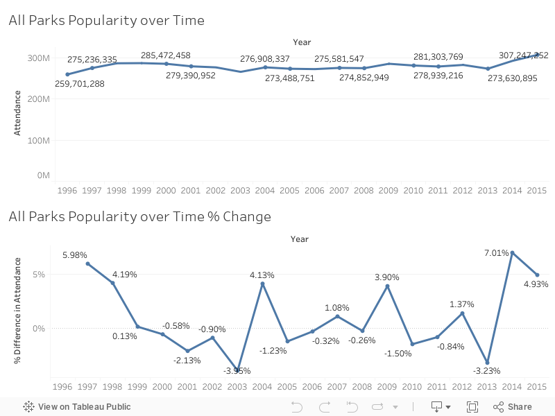
I started noticing a trend that over the last couple of years national parks have been visited more than any time in the last 20 or so years! I've been searching for a reason in this uptick of people visiting national parks have yet to discern one. One suggestion is that the "Every Kid in a Park" initiative is responsible for the growth over the last couple of years. This seems unlikely however because after further research the beginning of the Every Kid in a Park initiative was September 1, 2015. You'll see by the chart below the last two years in particular since 2013 has seen some of the heaviest growth in recent recorded history.


Unfortunately, not all of the data that I'm showing Nice charts was available from a singular data source. I had to scrape the national parks website located here, as well as the national parks statistical site located here. Unfortunately, I was also unable to easily join the data set as the names of the national parks on the website do not match the names of the national parks on the report that they issue on their statistical page. Additionally, the main national parks website does not have any year by year breakdown of monies coming into a state per park (just a state total).

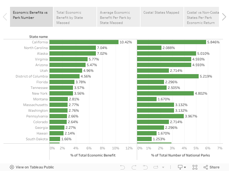
That said, we can still do some calculations with the amount of money that has come in totally and the number of parts located in the state to get a rough value of return over the last years 20 years per park. As you can imagine, none of this requires mind blowing mathematics or calculations. After I began examining data I noticed a trend in which coastal states tended to have a higher return value per national park than non-coastal states. I decided to do a grouping to see if that assumption was correct and it turns out, that it is! Check out the Story below and click through the stages I described above to see for yourself!


This makes sense if you think about it, most people (that I know anyway) don't vacation by going inland but a lot of people who are in land-locked states I believe tend to go towards the coast for vacation purposes. If you're curious about how the NPS calculates the amount of money coming in feel free to check out their write-up on these numbers here (PDF). What this appears to be on the outside is that coastal based national Park tend to pull about half million dollars more a year in revenue then non-coastal national parks. We can figure this out by assuming that the total on the national parks website was from the last 20 years of data they have collected.

Interestingly enough, the state with the highest return her national Park is actually North Carolina!

As always, if you have any questions or concerns you can leave a comment below or hit me up on Twitter at wjking0.
Enjoy those waves gang!

Wednesday, October 5, 2016

Where (NOT) to Eat in Lexington, KY - UPDATED LIVE DATA!

Lexington, KY Skyline
This is part of my #1YearOfViz series! Check out the archive here: http://bourbonandbrains.blogspot.com/p/one-year-of-dataviz.html

I posted the original version of this back several years ago as one of my very first geo-located dataviz that I'd created. With the new changes in Tableau Public I have finally found a way to get the live-updated data from the Lexington Health Department. If you'd like to see the raw Google Sheet that I'm pulling this data from I'll make it available here.

I didn't do too much as far as changing this data from it's original form except making the data a live-updating format and putting some additional filters and analysis on top of what I'd done previously.

First off I'd like to announce that I've developed what I think is a good mobile version which you can pull up on your phone if you'd like to bookmark to be able to quickly/easily check food scores/violations for a place. Click on the image below to be linked out directly to the dash!


If you'd like to see the full dash and analysis list click below to open up the rest of the blog post!

Friday, September 30, 2016

Phoning It In - Analyzing My Call History


This is part of my #1YearOfViz series! Check out the archive here: http://bourbonandbrains.blogspot.com/p/one-year-of-dataviz.html

Disclaimer: This viz is only calls I've MADE, not calls I've RECEIVED. There isn't really any way for IFTTT to track incoming calls and Project Fi (my provider) does have a data-dump utility but it doesn't have contact names etc in it. Additionally it's only limited to around Feb 2016 and Forward so the historical data isn't really there yet for me. Also this viz (thanks to the new Google Sheets connector in Tableau 10.0) will automagically update by itself as time goes on so the viz you're looking at now will be the most fresh version anytime you look at it!

For the last few years I've been keeping some details of my usage of various things (calls, wifi, etc) that I do with my phone in order to work more on what a lot of data scientists called the "Quantified Self". A little better self-understanding never really hurt anyone and understanding your own usage of things can be a good predictor of future needs as well as making behavioral changes.

I started logging all of my outgoing calls on April 24, 2014 and had a slight hiccup in data collection from 5/2/2015 to 12/18/2015 as I didn't know there was a problem with the IFTTT formula I was using and it stopped working until I checked on it. DOH!

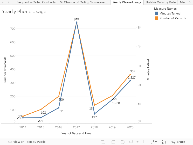
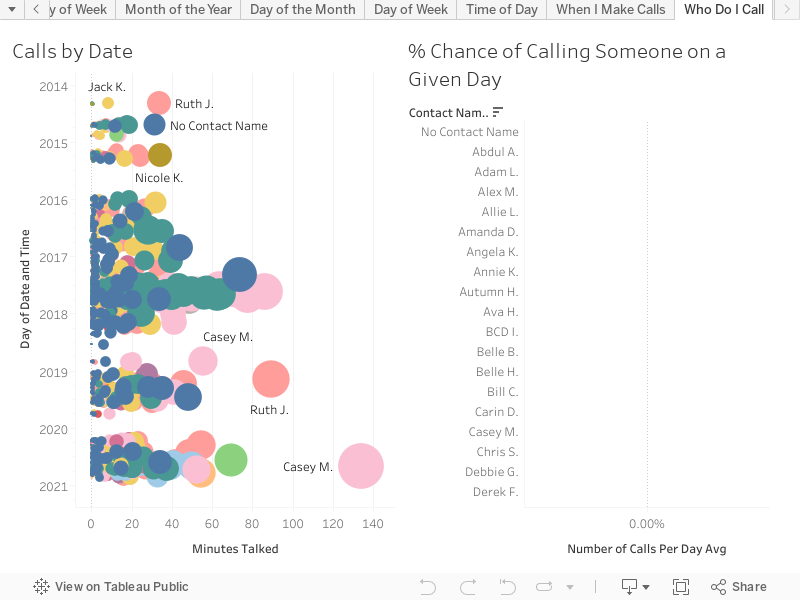
Like the title suggests this was a pretty quick viz for me to throw together. Let's jump into the data! The first chart is just something I found interesting when the data is zoomed out to the topmost level. You think that you're making less phone calls and your talking less but according to my data (which again is largely incomplete from 2015) that's actually inaccurate. I'm making MORE calls in 2016 than in previous years!


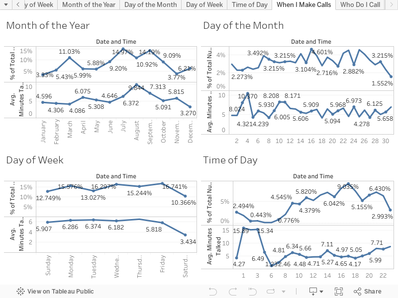
The second viz is literally just a chart of all the breakdowns you can imagine for a phone call, Month of Year, Day of Month, Day of Week, and Time of Day.


And of all the strange things I found when I was doing the write-up for this viz I came across this gem...

The last one is the one I like the best, it shows frequency of contacts. I decided the most fun calculation was to see how likely I was to call a given person any given day. I calculated up how many days there had been total that I'd gathered data and divided by the count of days for each individual user to come up with a nice little percentage chance that you'll get a phone call from me!


If you really want to talk to me though you'll have to reach out to me either in the comment section below or via twitter @wjking0 (Or Click the giant Pusheen kitty below!).


Friday, September 23, 2016

Does Marijuana Legalization Affect Drug Deaths?


I saw a question recently on Facebook that was asked somewhat rhetorically asking the following:

So with all the heroin overdoses I sit here wondering what the overdose percentage is in the states where marijuana is medically approved or legal. Do they have the same trouble with heroin as the rest of the country?

I thought to myself... 'I bet I could legitimately answer that!' I started searching around and discovered that there was a study done just a few months ago that looked at opioid usage in conjunction with state laws for medicinal marijuana. The findings were inconclusive when looked at as a whole but when the researcher looked at the 21-40 year old age group there was a pretty significant decline in automobile fatalities when compared to similar cases in areas where marijuana dispensaries (for medicinal purposes) were unavailable. Link to the full study can be found here.

That wasn't really getting at the core of what I think the person was asking which I see as 'does recreational marijuana's legalization cause a decline in opioid and particularly heroin usage?'


Me looking for the right up-to-date data
I searched around pretty extensively looking for facts about heroin usage and drug deaths but almost all data was, at the most recent, published for 2014. Most states and municipalities didn't legalize recreational marijuana until 2015 with Colorado being the exception. Even then finding drug related fatalities proved difficult and when I found drug-specific totals they were always at the national level. The upshot is that this search for data turned out to be WAY more difficult than I anticipated! The big problem was that arrest data or death data was just not as recent as I needed it to be to compare multiple states.


Suddenly I found out that the CDC keep records of "drug poisoning deaths" (overdoses). I found this article from the Colorado Public Radio which finally linked me to the data I needed! I started looking at the CDC blog... man this graph-style looks so famil-IT'S TABLEAU PUBLIC! Crap! I had already pulled down the raw data myself and started doing some work showing that the trends in Colorado were indeed a little worse than the national average of age-adjusted deaths by drugs.

That's when I noticed that the CDC and myself had built almost the EXACT same dashboard! (Screenshots below):

http://blogs.cdc.gov/nchs-data-visualization/drug-poisoning-mortality/
The CDC's Dashboard they created, click image to go to blog post about it!
The Dashboard I designed before seeing theirs!

On the plus side it made me feel pretty good that I was making similar design choices as someone who's employed by the CDC to do this type of dataviz!

Now the thing has become 'How can I salvage this or make it better?!'
Thinking how I could improve this to salvage the weekly #1yearofviz challenge!
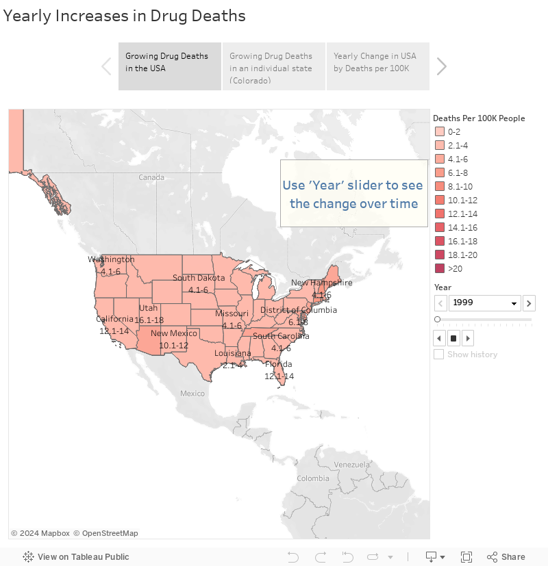
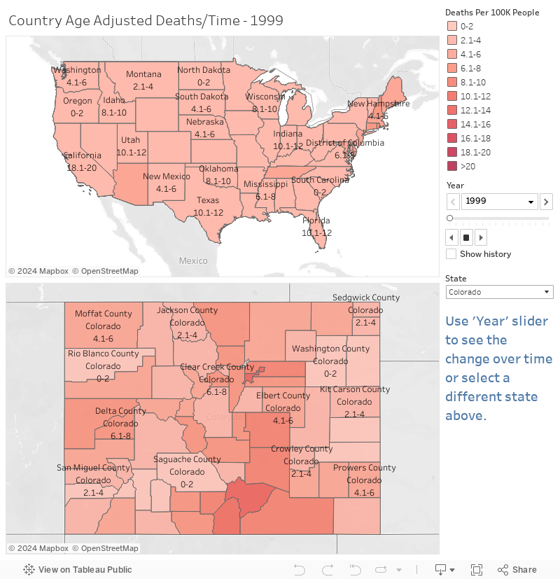
I know I'm replicating some effort here but I think it's working looking at the way I lay out the map of drug deaths over time country-wide and state-wide. Particularly worth looking at is the last page of this Tableau Story where you see the national averages slide from the left to the right side over time:

If you'd like to see how your state looks compared to the same time nationally by state averages surrounding it you can use this dashboard here:


Of course most of this can be viewed in the CDC viz and I didn't want to duplicate too much effort....


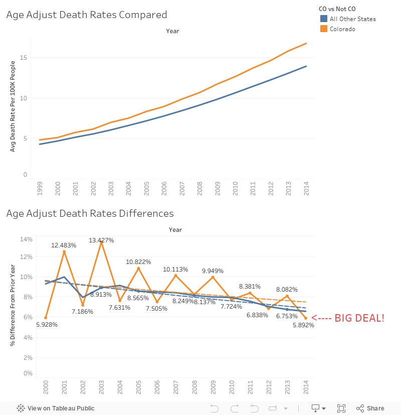
The CDC was focused on how drug deaths have been steadily increasing year-to-year so I decided to change up the bottom graph to show relative change over time... what PERCENTAGE were drug deaths going up year-to-year and is there any difference in Colorado in that regard? I then came up with the following dashboard:


Now while this is just one year's worth of data the lower uptake of drug-related deaths in Colorado in 2014 is SIGNIFICANT. This is officially the slowest increase since 1999 and WAY below the national average! This is a key thing as Colorado has been (as mentioned previously) in the top states for drug related deaths per capita for the past few years. One would tend to think that trend upwards would continue as it has nationally but in 2014, while it DID INCREASE, it was the smallest increase in 16 years! Now correlation doesn't equal causation but this data can be revisited later for other states who adopted recreational marijuana policies in 2015 when that data becomes more readily available! The answer to our earlier question if it reduced opioid/heroin deaths... that's hard to say but as those are the most likely cause of death currently among illegal drugs we can assume that those drug overdoses were reflected in this reduced increase in numbers.

Me at my friend's places after they go to Colorado for "hiking"


I hope you round this data interesting. If so please comment/like/share it out on social media. As always if you'd like to say something feel free to comment below or to hit me up on twitter @wjking0. If you have a question you'd like Viz'ed out as part of my #1YearOfViz please hit me up and let me know! Thanks to James for the question this week and I'm sorry more data wasn't available to get a more robust answer!
Wednesday, September 14, 2016

Live Fast, Die Young... Celebrity Birthdays/Deathdays!


Given the rash of celebrity deaths in 2016 I got thinking about the longevity of celebrity. Not the celebrity itself or the time someone is famous, but the longevity of actual celebrities lives themselves.


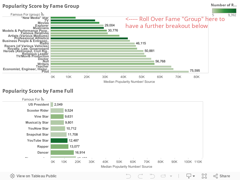
Of course, the first trick is figuring out what constitutes a celebrity? I thought about looking at list on Wikipedia what is the top 100 rock stars or something like that. But none of that seemed like a reliable list with a lot of historical data that I can do something with a real analysis on. That's when I found www.famousbirthdays.com and I realize that I could do a whole lot which date set they were using!

When I realized they had WHAT people were "famous for" I could have just died... they even had what I will go on to classify as "new media" stars in it (people like YouTube stars, Instagram celebs, etc). This was pretty much my face when I started getting into the thick of it:

I started wondering not only if celebrities were dying younger today than they used to but also if I could figure out any trends based on "type" of celebrity.

Let's hop into the data!

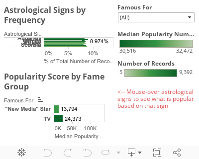
First off lets look at the nature of the celebrities on FamousBirthdays.com. The big thing to remember is the LOWER the number the HIGHER the celebrity "value". Ie "1" would be the top celebrity on the site (which is currently Justin Bieber by the way).


For all those people out there who think astrological signs play into personality I have this breakdown of astrological signs:

Cancers tend to be the largest contingent of "famous" people with 8.9% of the population but consist of only 8.5 % of the US population.

But you didn't come here for astrology....
Dave Coulier is almost as awesome as Bob Sagat


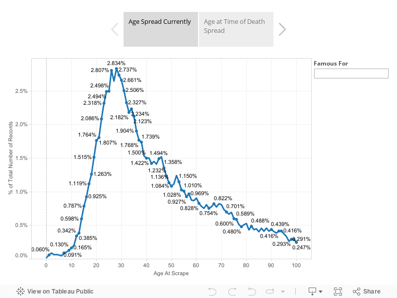
First let's look at the age spread in the population of the data both currently and at time of death:

The median age at the time of death for this group is 51.5 years old. When we think of celebrities though we tend of think of the Kurt Cobain's, the Chris Farley's, and other young talent killed because of choices or lifestyle. Given 52 is still far younger than the median death age of 78.6 here in the United States we could chalk it up to all kinds of external factors like diet, lack of sleep, etc.

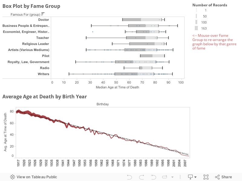
So finally here's the big chart, here's the proof in the puddin' that, YES, celebrity is killing people quicker now than ever before. You can see at the bottom of the following chart that the average age of celebrities dying over time has gotten younger and younger... younger now than I honestly thought would be reasonable. I believe the main cause for this extremely low age of death is due to the fact that a LARGE chunk of this data set is taken up by "New Media" (as I've defined it) stars and because these stars tend to be of a younger generation it's skewed more recent data towards younger trends in death. Obviously though that's not entirely the case as if you mouse-over areas below such as "Musician" you'll notice that the trend towards younger deaths has been going for almost 100 years!


The average lifespan in the United States increases by approximately 1 year for every decade while the average lifespan of "celebrities" tends to drop by about 8 years for every decade!

Of course you may hope that your fave celebrity will live forever and you wouldn't be alone.

In the meantime I say that we cast whatever witchcraft we have to to keep Betty White around and telling jokes!


I hope you found this interesting. This data isn't quite as malleable as I hoped that it would be and it took a TON of data-shaping to get the large-scale celebrity groups created but I think the analysis has been worth it. If you have any questions or concerns you know you can always hit me up on twitter at @wjking0 or leave a comment below!

P.S. This is the second entry in my #1YearOfViz that I'm working on. You can check out the list of all published works here.

Wednesday, September 7, 2016

Churches versus Stoplights - "Small Towns" in KY


Growing up in a small town just outside of Charleston, WV and being part of the "Bible Belt" it was always a running joke in my hometown between some of us there there were (literally speaking) twice as many churches as there were stoplights in our small town. With 6 Churches and 3 Stoplights (giving the town the 3rd stoplight is pretty generous as it's on the very edge of town) the math was easy. I wondered though, could I do it on a larger scale? A scale of a larger city? Or a whole State?

First trick would be to find the church data? I tried to think of religious databases then I realized I was approaching it was from the wrong direction. What is every church besides a religious organization...? A tax exempt organization! You know who likes taxes? The Federal Government! I knew that tax records are a matter of public record so a quick jaunt over to data.gov later and I'm swimming in tax exemption data!


I realized after I got this data that I'll do a future blog just about the non-profit data in the US, there is WAY more than I anticipated there being in that data. Luckily there is a tax exemption category for "churches" which includes churches, synagogues, mosques, and of course the Church of Scientology.

Next I wondered how in the world I was going to get the location of every single stoplight in KY. I hopped onto the Kentucky Transportation Cabinet and found their IT staff and shot one of them an email. BOOM! The county/latitude/longitude of EVERY SINGLE operating stoplight in the entire state! They were SUPER NICE about it too! I didn't even have to file an open records request! That is how you do public service ladies and gentlemen!

Thanks to the Kentucky Transportation Cabinet for making Kentucky a safer place to drive than this!


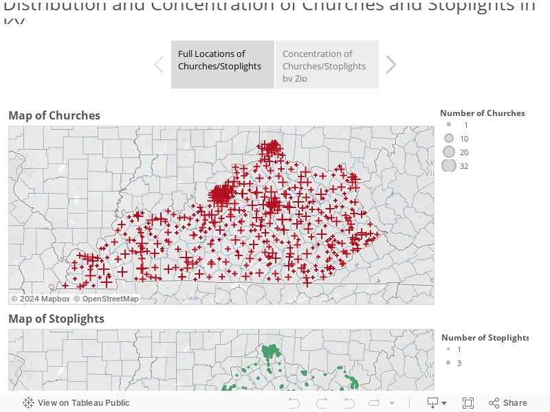
Interestingly one of the things I came to notice really quickly was that several entire COUNTIES within Kentucky contained not ONE single stoplight! This thusly caused a "divide-by-zero" error in my calculations which is why you'll see several that are "null" in the maps etc (which are by zip not county). I figured out a different way to write my calculations to take into account the Null/Zero data for stoplights in certain zip codes.

Let's get into the data!

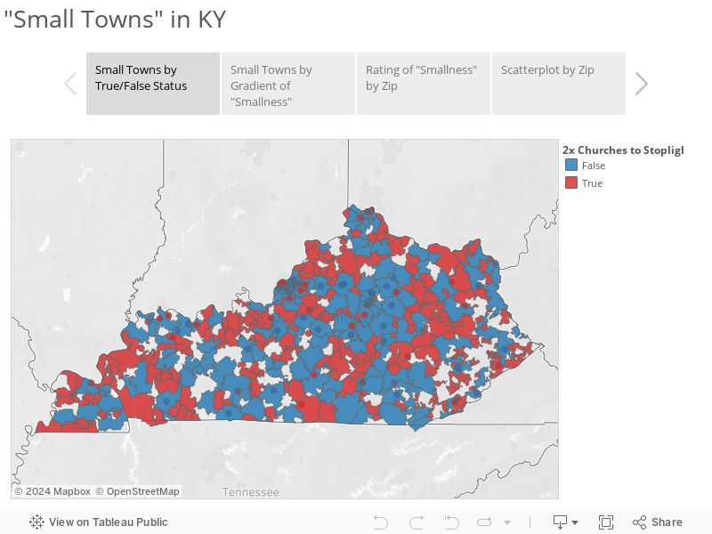
Where ARE all these things!? Check out this and click through the tabs to see where the locations and densities of churches and stoplights throughout Kentucky!


Next is a little Tableau Story showing the True/False status of "Small Towns" by Zip. Red represents small towns and blue are "Big City" towns. The next tab contains a more granular breakdown of "levels" of smallness. Finally is a chart showing "largest" to "smallest" using a difference over sum equation to normalize for the total number of churches/stoplights and keep it relative! Where does your hometown or birthplace fall!?


Ultimately what it all boils down to is that there are 504 zip codes with relevant data in the state of Kentucky and of those 185 are "big towns" in Kentucky and 319 are "small towns".

I know this data may not seem like much but it's been a LONG time in preparation and presentation. As always if you have any questions or anything hit me up on twitter at @wjking0!

P.S. This is the first in what I'm going to call my #1YearOfViz where I'm going to try to do a visualization EVERY SINGLE WEEK. I can't promise I'll always publish on the same day of the week or time but right now I'm looking at either Mondays or Wednesdays as my "publish days". If anyone knows any newspaper contacts or data journalism contacts that are looking for fun data related news stories have them tune in and get in touch! Also if you have any suggestions or thoughts on what you'd like to see over the next 52 weeks of viz give me a shout or leave a comment below!