Showing posts with label Fayette. Show all posts

Thursday, December 29, 2016

Fayette Co. (Kentucky) Public Schools (FCPS) Salaries 2015-2016


This is part of my #1YearOfViz series! Check out the archive here: http://bourbonandbrains.blogspot.com/p/one-year-of-dataviz.html

Me when I hit Import.io's scraping limit and get banned (again)
I wanted to start this post talking about the problems I've recently encountered was using Import.io. Multiple times now I have run into the their scraping limit for "free" users and have been temporarily banned from using their services. one time accidentally ran cloud-based scrape as a test but the scrape continued after I closed it so I ended up running a query of a thousand instead of the 20 to 30 I wanted to run. Then this month I've ran a scrape of over 10,000 (their new limit on local clients scraping) in a given month, I was originally told the Legacy client would be allowed to have infinite scraping as long as it was done locally (via their Facebook users group). This was apparently not the case.


I started out looking for a new scraping client checking out several pages for clients to use. But almost all web scraping services required monthly subscription fees, or have no local clients to use for cheaper or free rate. That's when/how I discovered Octoparse!

/\ Me hugging Octoparse!

It is kind of magic! It took me over a week to really learn how to use it, but this is been extraordinarily worth it! The main school and Octoparse are much more tools in imports. Octoparse allows unlimited queries from the local client and you only have to pay when you're using their cloud-based services. Which is the way I suggested import price their systems when support contacted me about my ban from their services.

Hey Octoparse, I just met you,
and this is crazy,
comment my blog,
and sponsor me maybe!?
I only wish I had known about Octoparse earlier so that I could have stayed myself around 12 hours worth of work when I did the West Virginia State salary scrape a while back! what you will be looking at in this visualization is the first scrape that I have completed using Octoparse. The data came out incredibly clean and simple, my only complaint in the export of Octoparse is that CSV export to be not directly readable by excel when opened. It's really a minor complaint next to the awesome flexibility of the product though! Let's get into the data!


I've settled in on my designs for salary-based dashboards with only a single year of data. I decided not to fix it since it's not broke and replicated the same types of dashboards I've done in the UK Salary Viz here and a little bit of the work I did in the WV State Salary Viz mentioned previously. The "Dots Dash" as I call it is really just a fun visual representation of all the people/years/money that goes into something like public education in one single county.


This next one is just Salary Over Time and Number of People Over Time so basically how many people are making approximately how much, how quickly do you see raises given, etc. If you'll notice at the side this viz starts out with a filter of "Instructor" on it to show specifically teachers salaries over time as all teachers (I think) have 'instructor' as part of their titles. You can set this wildcard filter to whatever you'd like (ex. 'bus driver') to see how your or a friend's particular job futures will look over time.


The next story dashboard I really wanted to look at how locations/grade-types pay different teachers. Do art teachers make more at Liberty than at Brian Station? How about music teachers at Elementary schools vs High Schools? Step through the story with the top tabs and you can filter on the right and compare median salaries by location. I'd like to ultimately turn this into part of what I'll use for a future dashboard I'm going to work on that will compare test scores to teacher salaries for particular places... but this will have to do for this week! =D The last little section was just because I was curious how how much principals make in general and I was surprised (and glad) to see they make good money.


This last dash is just the "big list" that a lot of people like to see... if you CLICK on a location or a job title the data to the right (medians/averages of salaries and years worked) will reformat to that highlighted selection. If you click on a job it will not be the medians/averages for that particular school (as each school doesn't have enough non-teaching staff to make that functional) so it reformats to show EVERYONE who shares that job title. You can also filter this list by name if you're looking for someone in particular's salary.




Finally, as the son of a public school teacher let me say to all of you out there doing the work every day...
As always hit me up on twitter @wjking0 or in the comments below for questions/concerns!

Wednesday, October 19, 2016

Car, Cycling and Pedestrian Collision Data - Part 1


This is part of my #1YearOfViz series! Check out the archive here: http://bourbonandbrains.blogspot.com/p/one-year-of-dataviz.html

I knew I would have to do this eventually, I finally came upon a data set so large that I have to split it into multiple posts. I originally was turned on to this data as part of some work I had done with the University of Kentucky Police Department, I had done some work on their crime log and one of the captains thought I would be interested in traffic collision data (Captain Matlock who's super rad and a data nerd himself!). I said oh you mean traffic accidents? He replied, there are no accidents. when he gave me a sample of their data I realized I could deduce several trends in it, particularly in regards to pedestrian and cycling accidents as they occurred on campus.


Being an avid cyclist myself I saw the potential for this data to really help and inform other cyclists and people working on the planning of the University of Kentucky's roads and pathways. One of my last days as an employee of the University of Kentucky was spent with the cycling committee briefing them on this data . They then informed me that this looks to have come from a larger data set from crashinformationKY.org. When I pulled up the site I was giddy with excitement at the fact that there are so many data fields and so much historical data, way more than I had originally been given by the UK police department.

Unfortunately, the yearly downloads from that state police website were not very functional. They were .DAT files but neither of the data definitions listed on the website allowed me to properly parse those 2 GB yearly files into anything usable. I then decided that I needed to just scrape Fayette County as a proof of concept, however even that had to be done in six months intervals which go back over approximately the last six years.

Let's get into the data!

First I would like to mention that all points on the dashboards listed below are clickable, so if you click a roadway name it will reshape all of the shown data to reflect that roadway name until you click off of it clearing that selection. The same goes for things like day of the week of collision or hour of collision, any of those will reshape all the other existing data on the charts below this goes for all four of the dashboards I have posted below.

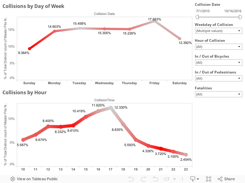
This first dashboard highlights the locations of collisions highlighted by particular roadways with day of the week and hour of day frequency being shown at the bottom. The map to the right of the roadway names shows coloration by number of injured in particular accidents the concentration of redness at different locations can be a good indicator of where are the most injurious areas of a particular roadway. Take a look around at the data and remember you can use the controls in the upper left of the map to zoom in on a particular area of interest after you have set your filters were selected your items on the other charts.


 This second dashboard is just a comparison of the percentage change of pedestrian and bicycle collisions by month and year. Taken as a whole pedestrian collisions have risen slightly over the last six years while bicycle collisions have fallen slightly . The thing to remember is the percentage differences in these changes are less than 1% so not terribly significant. If we limit the collisions to the last three years we see those trends are reversed. In the last three years , pedestrian collisions have gone down 0.4% while bicycle collisions have gone up 0.2% . I didn't have any particularly significant dates to slide the slider to in order to examine a particular change in Lexington policy or anything. But I left the date slider on the right in case anyone wanted to check something out. 


This third dashboard is a slightly more simplified version of the first except that I wanted to look at injury rates particularly. You'll notice the red coloration is the percentage of people injured on that given day or time. Again, the date sliders are on the right as well as selections for the day and hour of collisions though those can be selected by clicking directly on the dots as well . Things like bicycle and pedestrian collisions as well as, in this visualization, fatalities are included. 


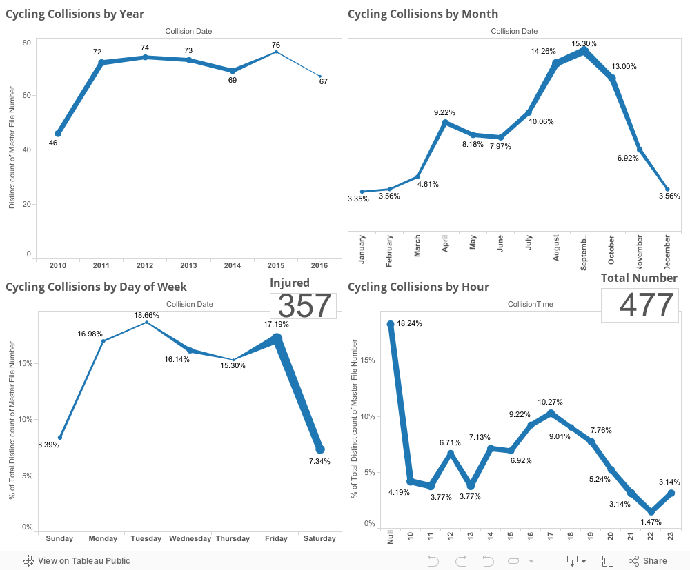
This last dashboard is just one purely to look at every aspect of timing of cycling collations including by year, month, day of week, and hour with both injury totals and total number of collisions also listed in the chart.


 I will be linking the second or third or possibly even fourth part of this viz down below as I complete them but they will all hopefully be part of my one year of viz challenge that I've made for myself. As always, if you have questions or concerns you can leave them in the comments below this blog or hit me up on Twitter at @wjking0.