Showing posts with label #PublicData. Show all posts

Thursday, February 22, 2018

UK Crimes Minutia

Hi new readers! For those of you returning I'm sorry about my absence from blogging for a while! It's been a busy year or two! I lost my job at the University of Kentucky due to a departmental merger... floated around on unemployment for a while applying to jobs and finally ended up with a job at a startup in Southern California where I worked tons and increased my Tableau skills even more than before.

This is the longer/more-boring version of the shortened article here: http://bourbonandbrains.blogspot.com/2018/02/university-of-kentucky-crimes-mapped.html

One thing kept nagging at me though and that was a project I started years ago while I was still working at UK. Here's the quick story... I worked in the Division of Student Affairs for the last 15 or so years of my employment with the University. Years and YEARS ago I thought that the way we reported crimes on campus was ridiculous. Due to both federal and state laws (known as Clery/Minger laws) the University has to report all crimes and acts of arson on campus. That is currently done in the following format:


Now, I don't know about you but while that fulfills the "letter of the law" I don't feel it fulfills the "spirit" of the law. Those laws were done so people could educate themselves on crime and trends to determine their (or their child's) safety on a college campus. I went to my boss at the time telling her I'd like to get a group together to map out crime on campus to help places like our Violence Intervention Center and other places focus efforts and overall to make campus a more safe place. I was told, in no uncertain terms, that I was not to do that. The fear was that it would "reflect poorly on our Greek community." (Which, once I looked at the data, it doesn't actually!) This, of course, pissed me off. I didn't have the tools to do it on my own... fast forward a few years and I became one of the Tableau super-users on campus and I realize that I now have all the tools (data scraping) and knowledge of data visualization (Tableau) to do this whole project myself. I went to my boss at the time, a different VP who was more forward thinking (Dr. Robert Mock) and let him know that I had gathered this data, analyzed it, and I was going to publish it. I let him know (as with now) I did it all on my own time with my own resources from publicly available data and I wasn't so much asking permission as I was just letting him know I might be kicking a hornet's nest. He told me to contact the UK Police and let them know what I'd done before I publish it... so I did. I wanted to show the police what I'd done and give them a chance to weigh in. I met MULTIPLE times with the then Lt. Barefoot (I believe Captain Barefoot now) and when I showed him the data he wasn't at all surprised. He helped clear up some of my understanding of the data and was SUPER HELPFUL. I can't speak highly enough of all the University of Kentucky Police Department. Seriously, they're great and very forward thinking. 

One of the first things they asked me was if I could do this data live against their database, which I was THRILLED to hear. I worked on a version to be published publicly and running against their database they were using to display on the Crime Log page. Unfortunately this project got bogged down in minutia primarily regarding updating map coordinates. I heard whispers up until about a year ago that someone was still going to publish/maintain it but without me driving the issue it ultimately never happened... UNTIL NOW!

This data is hand-entered into a system so you can imagine with 16000+ rows there is a lot of fat-fingering errors that happen. Additionally the text parsing to clean the addresses was a NIGHTMARE. Basically what I did was find every way to say "RD" and every permeation of every street ending you can imagine and did a huge if/then to combine all those. Took away the punctuation from everything and ended up hand-geocoding most of it with the AH-MAZE-ZING service Geocodio.

After that I tried to go in and manually include building names where the addresses matched. I considered doing this problematically but honestly it would have taken about the same amount of time either way. Whenever faced with a big problem like that I always like to refer to this XKCD comic:
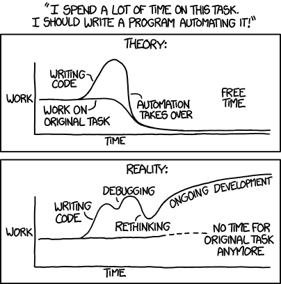

Anyway... those are the gory details of why I did all this and how I did it. Just as before this data could be presented in this way live but it has never been made a priority by the University. Given the nature of some of the things that have happened recently maybe things like Terroristic Threatening should get a little more of a spotlight shown on it.

As always if you have any questions/comments/concerns hit me up on twitter @wjking0

University of Kentucky Crimes Mapped


Sorry it's been a while since I posted! I promise I'm going to get on a better public-release schedule.

That said... this data, while formatted nice has a TON of fat-finger errors in it... it's hand-entry of over 16,000+ things from a state-wide police system to their front-end web interface. If you'd like to hear about it and all the minutia that lead up to this and why it's important to me click here.

Me scrubbing data only to find more data that needs scrubbed.
With recent news of the mishandling of a poor young woman's case as detailed by the Kentucky Kernel I decided now was a good time to talk about the public nature of crime data... Let's get into it!


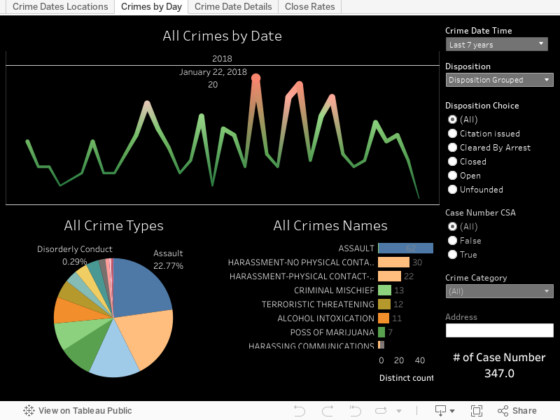
A couple things to note about the above viz is that CSA cases do NOT require a police officer to be involved. Those stand for "Campus Security Authority" so a CSA case can be something like someone spitting on a nurse (a frequent occurrence unfortunately) or drinking in a dorm room etc. To get an idea of the "real" police workload change the filter for "Case Number CSA" to False. Now you'll be looking at only the crimes where an actual officer was involved.
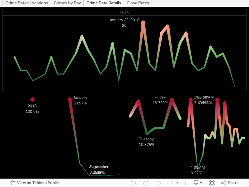
Aside from Eastern State Hospital (which is largely a mental health facility) what is one of the main drivers of crime on campus? Well... turns out that's UK Football. When you look at crimes by individual dates over the years there are some pretty obvious spikes. When I checked the dates, yep... all home UK football games.


What's that? You want to know the longest list of charges? Well that would belong to case 20143565 which has the following laundry-list of offenses:
"FAILURE TO ILLUMINATE HEAD LAMPS/V, DISREGARDING TRAFFIC CONT DEV-TRAFFIC LIGHT/V, OPER MTR VEHICLE U/INFLU ALC/DRUGS/ETC. .08(AGG CIRCUM) 1ST OFF/M, FLEEING OR EVADING POLICE, 1ST DEGREE (MOTOR VEHICLE)/F, FLEEING OR EVADING POLICE, 1ST DEGREE (ON FOOT)/F, CARRYING A CONCEALED WEAPON/M, WANTON ENDANGERMENT-1ST DEGREE-POLICE OFFICER/F, POSS OF MARIJUANA/M, TRAFFICKING IN SYNTHETIC CANNABINOID AGONISTS OR PIPERAZINES/M, POSS CONT SUB 1ST DEG 1ST OFF (COCAINE)/F, PROMOTING CONTRABAND-1ST DEGREE/F, WANTON ENDANGERMENT-1ST DEGREE/F, POSS OF OPEN ALC BEVERAL CONT IN MOTOR VEH PROHIBITED/V."


Want to dig a little deeper into specific crimes? Check out the viz below!


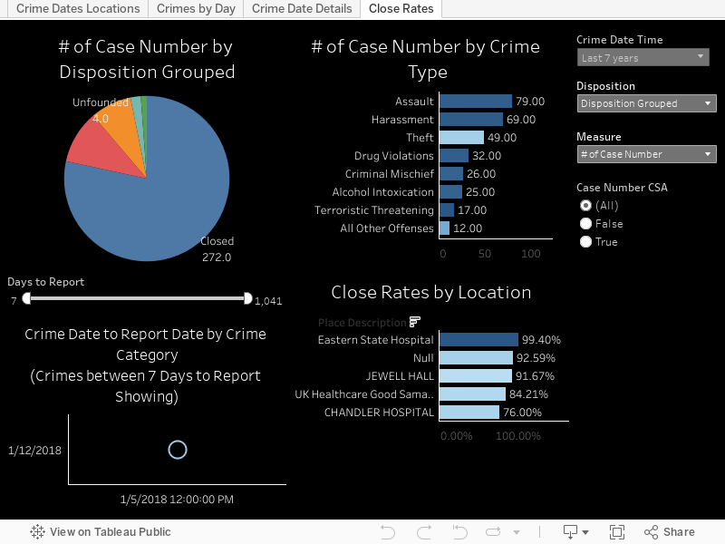
Realistically though the University of Kentucky Police are really SUPER AWESOME and nice people whom I've met with personally several times. The next chart highlights close rates of cases and the ones you'd expect to not get closed (theft, burglary, etc) are the types of things you see most unsolved. Click around and see what you're curious about. When I was going through the data one of the most concerning things to me was to look at the "Unfounded" category and see how Sex Offenses is the highest rank (when including CSA cases). That doesn't seem like a thing people would exaggerate on and I trust the UK Police to have done their due diligence, but I also am concerned about the culture we live in and how that affects things like this in aggregate.


I'd also like to share this cleaned version of data that I am posting out on Google Drive for download as well as one of my new fave repositories at Data.World. If you'd like to know more about what went into cleaning the data again go to the page here where I talk about some of the data cleansing that went on.

As always I hope you all found this informative and if you have questions please post a comment below or hit me up on twitter @wjking0!


Monday, March 13, 2017

Buffy the Vampire Slayer 20 Year Anniversary & Strong Women on Television

This is part of my #1YearOfViz series! Check out the archive here: http://bourbonandbrains.blogspot.com/p/one-year-of-dataviz.html


I initially wanted to do a viz this week based on Buffy the Vampire Slayer for its 20th anniversary... I got my scrape all figured out and what all I wanted to look at. I considered pulling the Nielsen Ratings from Wikipedia only to discover it was lacking several seasons worth. 

Me when discovering Wikipedia was missing Nielsen data
I'm not a huge fan of their ratings system anyway though as the sample pool is so small they extrapolate more data than I'm comfortable with. (This is probably the reason they don't have a searchable database on their site.)

Then I remembered that IMDB had a ratings system embedded in it!

Thanks Giles! Finding data is my jam!
In my hunt for data I found this fun little viz of Buffy ratings and I based some of what I did initially off of this. I started thinking about doing a viz in a similar vein and then I thought "Why not add more data!?" So I changed up my Octoparse scrape and used a list URL format instead... then I thought about some of my favorite shows... Crap, there's a LOT of my fave shows that have strong female leads in them, what if I miss one!?

I decided to enlist the help of my social networks... when posting about strong female character TV Shows my friends did not run short on suggestions! After 50+ comments (most containing several shows each) I had a pretty solid list together and a much richer chunk of data than I initially was going to viz!

Realizing I now had about 50x more data than I intended...
While some of the shows had strong female roles I tried to limit my personal suggestions to shows where the female character played a lead role. Also I tried to stay away from characters (even if they had a lead role) who were a little too Damsel-in-Distress-y.

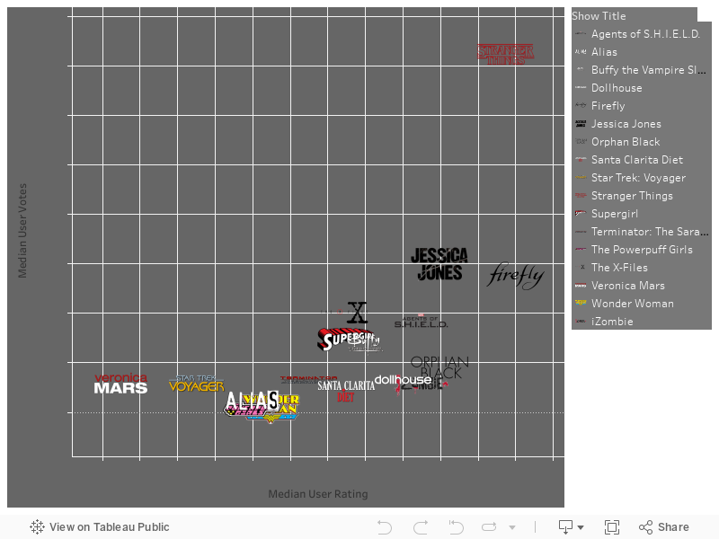
One of the first things I noticed was what a HUGE lead Stranger Things has had on basically EVERY other show out... don't get me wrong, it's FANTASTIC... example below along with the listing of "My Shows" that I looked at. Mouse over the icon to see median ratings and number of votes per episode.


Eleven is here to eat waffles and kick ass in ratings... and she's all outta waffles!

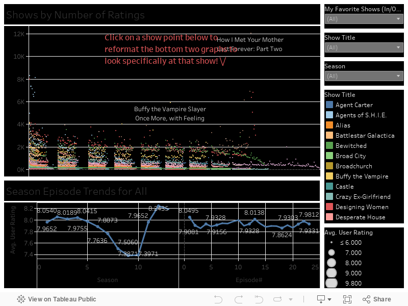
I decided to split it up like that example I looked at earlier and color episodes by season and then make them highlight-able and the ratings click-able. For this one I stuck with just my fave shows but I promise all you that put your input in.... the following viz will contain everything. I really like this one below though as I feel it's a fun way to explore the data, clicking around on things and highlighting the zillions of little show points. Kinda reminds you of the lights in Stranger Th--- ARGH gotta stop thinking about that show!


The one thing you should notice however is that the Buffy Episode "Once More With Feeling" is literally one of the highest rated shows EVER (out of this pretty large chunk of VERY popular shows)! So this following viz looks a little rough but contains the data from ALL the suggested shows (with one exception which I found didn't really have any strong female representation in it). The formatting gets a little gross with the dots on this as several of the "old" shows (like I Dream of Genie, and others from that era) had 40+ episodes to a "Season". Feel free to click around on the show points to reformat and see how your favorite shows did season to season or how their ratings changed per episode... Is your favorite show a strong finisher? Does it have a good trend towards mid-season finales? You can find out now!


Same girl. Same.
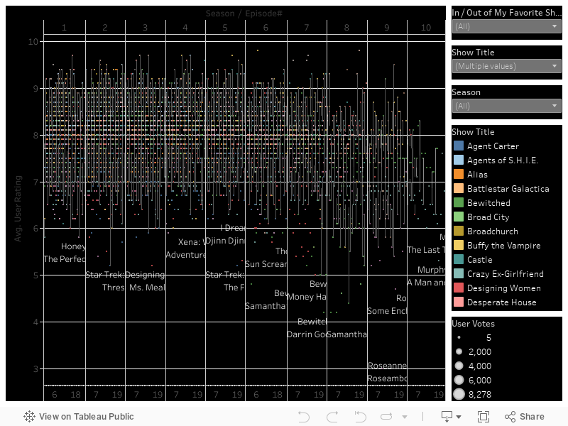
Finally I did this little number below which doesn't really DO much but is a nice representation of all the data and seeing the trends in shows/seasons by the density of the chart itself. Again this represents all data but I limited the number of episodes to 23 to keep it from getting too broke up due to the older programs.


As always if you have any questions leave a comment below or hit me up on Twitter @wjking0. Finally if you just need a good (ugly) cry you can relive some of the best Buffy moments here.


Friday, January 20, 2017

EPA Critical Violations (Last 3 Years)


This is part of my #1YearOfViz series! Check out the archive here: http://bourbonandbrains.blogspot.com/p/one-year-of-dataviz.html

I know I promised everyone a Casey Neistat viz this week but I'm hoping to give that one a little more love and do some fancy-dancy things with it.... so it's getting postponed a while!
Instead I'm bringing you another things near and dear to my heart... EPA violations! I was thinking about pollution and I decided to swing by the EPA website to see if they had information worth scrapping or looking at.

That's when I saw it... not only did they have EVERY SINGLE BIT OF DATA IMAGINABLE for every facility that reports to the EPA... they had them all ALREADY GEOCODED.

ARE YOU EVEN KIDDING ME RIGHT NOW EPA!? I LOVE YOU! (But not as much as cats or pizza... )

So I tried to export all 500,000+ records but they have some limits on their queries. Another amazing thing is that if you try a query that returns over their query limit they have SUGGESTED FILTERS that pop up on the side for ways to filter the data down to actually pull results! I decided to only pull "Significant Violations" for this particular viz. Seriously, whoever designed their search system... I owe you SO many donuts! I'm still looking for the pure raw data to pull down for a more in-depth dive (I'm guessing it's located on data.gov but I haven't gone searching for it really hard yet) into all this but I decided in the meantime to pull down all the locations nationwide which have had a "critical problem".

I really didn't want any of my family to wake up to
 be the Toxic Avenger!
The first thing I noticed was that there were not many "sanctions" really being delved out. I came across this as I was looking at this list of court cases brought by the EPA against companies/individuals. For those of you in WV you obviously heard about the American Industries scandal as chemicals were leaked into water intakes for drinking water around the state. My own family was involved in this so it's pretty fresh in my mind. Did you know that the President of Freedom Industries only got a few months in prison for that? Does that seem like a lot to you? Another person I read about dumped sewage into a much smaller river and ended up getting 3 years of prison time. I was hoping to scrape all the prison terms and such but it's not formatted equally enough for me to get it at this time. Again, I hope that I'll be able to get some of this down the road.

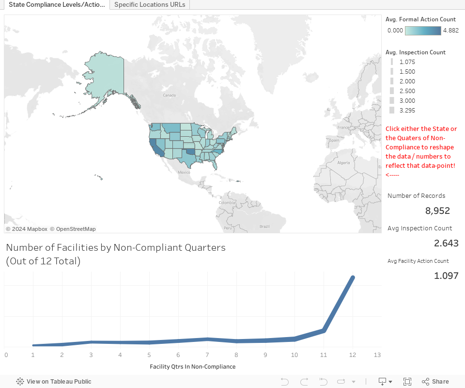
Here's the data on states and sanctioning vs inspections, click on either the state or the number of quarters of non-compliance (or both) to reshape the data to show average inspections, EPA actions, and number of records:


Me when I find out how many places DON'T
get punished for consistent EPA violations. =/
Now keep in mind these are ONLY facilities which have a "Significant Violation"... still the average number of EPA actions even for places with 11 quarters of non-compliance (we can assume that 12 quarters could possibly be an error... or the frightening truth). Eleven quarters means that at SOME POINT they were compliant in the last 3 years... of places with 9-11 quarters of non-compliance (2-2.75 years) this comprises 22.21% of all significant violation records. Of those with 9-11 quarters of non-compliance the average "Formal Action Count" is 1.025 out of an average of 3.057 inspections.

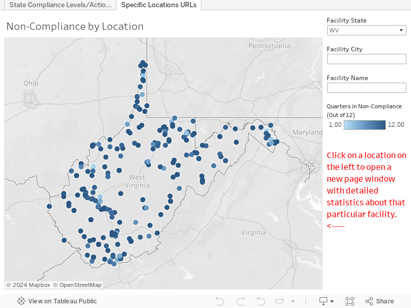
This last dashboard allows you to zoom in on the area you (or your loved-ones) might live to look around at facilities near them that have had critical EPA violations and read more in-depth about the facilities themselves. You can search by facility name, state, and city. Clicking on the dot will load up the EPA page in a new window and you can read up for yourself! Edit: I tried to get the viz to load the page INSIDE the dashboard but both http and https versions weren't working once I actually saved to Tableau Public so I figured this was the best compromise since I still wanted the individual facilities to be viewable.


I grew up in a place known as the Chemical Valley (highlighted in this graphic I exported from Tableau below) so I care about the existence of the EPA, they keep the people safe from corporate interests in a very real way. Prior to crackdowns in EPA regulation there were places close to where I grew up that had population cancer rates OVER 85%... thanks to the EPA those rates are significantly lower today. Just something to think about when people talk about doing away with the EPA in favor of "self regulation" (ie no regulation). =/ As always hit me up on twitter @wjking0 and I hope to create a little more in-depth dive with this data a little later on.


Thursday, December 29, 2016

Fayette Co. (Kentucky) Public Schools (FCPS) Salaries 2015-2016


This is part of my #1YearOfViz series! Check out the archive here: http://bourbonandbrains.blogspot.com/p/one-year-of-dataviz.html

Me when I hit Import.io's scraping limit and get banned (again)
I wanted to start this post talking about the problems I've recently encountered was using Import.io. Multiple times now I have run into the their scraping limit for "free" users and have been temporarily banned from using their services. one time accidentally ran cloud-based scrape as a test but the scrape continued after I closed it so I ended up running a query of a thousand instead of the 20 to 30 I wanted to run. Then this month I've ran a scrape of over 10,000 (their new limit on local clients scraping) in a given month, I was originally told the Legacy client would be allowed to have infinite scraping as long as it was done locally (via their Facebook users group). This was apparently not the case.


I started out looking for a new scraping client checking out several pages for clients to use. But almost all web scraping services required monthly subscription fees, or have no local clients to use for cheaper or free rate. That's when/how I discovered Octoparse!
/\ Me hugging Octoparse!

It is kind of magic! It took me over a week to really learn how to use it, but this is been extraordinarily worth it! The main school and Octoparse are much more tools in imports. Octoparse allows unlimited queries from the local client and you only have to pay when you're using their cloud-based services. Which is the way I suggested import price their systems when support contacted me about my ban from their services.

Hey Octoparse, I just met you,
and this is crazy,
comment my blog,
and sponsor me maybe!?
I only wish I had known about Octoparse earlier so that I could have stayed myself around 12 hours worth of work when I did the West Virginia State salary scrape a while back! what you will be looking at in this visualization is the first scrape that I have completed using Octoparse. The data came out incredibly clean and simple, my only complaint in the export of Octoparse is that CSV export to be not directly readable by excel when opened. It's really a minor complaint next to the awesome flexibility of the product though! Let's get into the data!


I've settled in on my designs for salary-based dashboards with only a single year of data. I decided not to fix it since it's not broke and replicated the same types of dashboards I've done in the UK Salary Viz here and a little bit of the work I did in the WV State Salary Viz mentioned previously. The "Dots Dash" as I call it is really just a fun visual representation of all the people/years/money that goes into something like public education in one single county.


This next one is just Salary Over Time and Number of People Over Time so basically how many people are making approximately how much, how quickly do you see raises given, etc. If you'll notice at the side this viz starts out with a filter of "Instructor" on it to show specifically teachers salaries over time as all teachers (I think) have 'instructor' as part of their titles. You can set this wildcard filter to whatever you'd like (ex. 'bus driver') to see how your or a friend's particular job futures will look over time.


The next story dashboard I really wanted to look at how locations/grade-types pay different teachers. Do art teachers make more at Liberty than at Brian Station? How about music teachers at Elementary schools vs High Schools? Step through the story with the top tabs and you can filter on the right and compare median salaries by location. I'd like to ultimately turn this into part of what I'll use for a future dashboard I'm going to work on that will compare test scores to teacher salaries for particular places... but this will have to do for this week! =D The last little section was just because I was curious how how much principals make in general and I was surprised (and glad) to see they make good money.


This last dash is just the "big list" that a lot of people like to see... if you CLICK on a location or a job title the data to the right (medians/averages of salaries and years worked) will reformat to that highlighted selection. If you click on a job it will not be the medians/averages for that particular school (as each school doesn't have enough non-teaching staff to make that functional) so it reformats to show EVERYONE who shares that job title. You can also filter this list by name if you're looking for someone in particular's salary.


Finally, as the son of a public school teacher let me say to all of you out there doing the work every day...

As always hit me up on twitter @wjking0 or in the comments below for questions/concerns!

Thursday, December 15, 2016

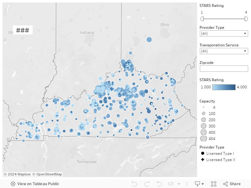
Kentucky State Childcare Map

Yes this is actually my niece! =D
This is part of my #1YearOfViz series! Check out the archive here: http://bourbonandbrains.blogspot.com/p/one-year-of-dataviz.html

Me as a babysitter... also an amazing movie.

I've been pretty busy recently... went to California, hung out in the desert, Los Angeles and everywhere inbetween!

This is a little something I've worked on previously. It isn't much but it's just to get the data out there!

You can find information on what the star ratings mean (4 being the max btw!) here: http://chfs.ky.gov/dcbs/dcc/stars/starsproviderinfo.htm

The data I scraped was located in their search tool located here: https://prdweb.chfs.ky.gov/KICCSPublic/ProviderSearchPublic.aspx

Let's hop right into the map!


As always hit me up on Twitter @wjking0 with any questions!

So true Millhouse, so true.

Thursday, November 24, 2016

West Virginia State Salaries 2007-2015

This is part of my #1YearOfViz series! Check out the archive here: http://bourbonandbrains.blogspot.com/p/one-year-of-dataviz.html


After seeing some work that I did with the University of Kentucky Salaries Viz my mom (who is a teacher at a local college) commented that she thought I should do the same thing with her college. I started looking and found that, unlike Kentucky, the salary records for ALL WV state employees were available all the way back until 2007!!! Yay historical data!

Me when I looked at the site and saw how much historical data there was!
Unfortunately unlike the other salary data I normally have I didn't have access to job titles so there's no way to really know if someone changed positions or anything... it's just name, department, and total compensation for that person per year. Of course with that, particularly given the amount of time... you can do neat things like figure out raise percentages over multiple years! Unfortunately the way the page is laid out that I extracted the data from you cannot look at an individual's salaries over time... so I fixed that with the viz! Below you can type in a name, or a department, and the viz will filter to show that person's salary/raises over time.

Additionally you can click on a particular department or name to have the data re-form to show just that particular set of data. Ie. You can click on the Division of Corrections, then click on Adkins, Lisa to reform the data specifically to show that user. Anyway I'm going to work on some other ways to present this data but in the meantime play around with the dashboard here:


Ultimately you have to remember that, even though it's Thanksgiving... you can't eat money. No matter what Ralph Wiggum tells you:

As always thanks for reading and if you enjoyed this visualization (viz) please share it out on your social networks. If you'd like access to the raw data that I scraped (by hand) from their site then you can download the raw data by clicking here.

Wednesday, October 19, 2016

Car, Cycling and Pedestrian Collision Data - Part 1


This is part of my #1YearOfViz series! Check out the archive here: http://bourbonandbrains.blogspot.com/p/one-year-of-dataviz.html

I knew I would have to do this eventually, I finally came upon a data set so large that I have to split it into multiple posts. I originally was turned on to this data as part of some work I had done with the University of Kentucky Police Department, I had done some work on their crime log and one of the captains thought I would be interested in traffic collision data (Captain Matlock who's super rad and a data nerd himself!). I said oh you mean traffic accidents? He replied, there are no accidents. when he gave me a sample of their data I realized I could deduce several trends in it, particularly in regards to pedestrian and cycling accidents as they occurred on campus.


Being an avid cyclist myself I saw the potential for this data to really help and inform other cyclists and people working on the planning of the University of Kentucky's roads and pathways. One of my last days as an employee of the University of Kentucky was spent with the cycling committee briefing them on this data . They then informed me that this looks to have come from a larger data set from crashinformationKY.org. When I pulled up the site I was giddy with excitement at the fact that there are so many data fields and so much historical data, way more than I had originally been given by the UK police department.

Unfortunately, the yearly downloads from that state police website were not very functional. They were .DAT files but neither of the data definitions listed on the website allowed me to properly parse those 2 GB yearly files into anything usable. I then decided that I needed to just scrape Fayette County as a proof of concept, however even that had to be done in six months intervals which go back over approximately the last six years.

Let's get into the data!

First I would like to mention that all points on the dashboards listed below are clickable, so if you click a roadway name it will reshape all of the shown data to reflect that roadway name until you click off of it clearing that selection. The same goes for things like day of the week of collision or hour of collision, any of those will reshape all the other existing data on the charts below this goes for all four of the dashboards I have posted below.

This first dashboard highlights the locations of collisions highlighted by particular roadways with day of the week and hour of day frequency being shown at the bottom. The map to the right of the roadway names shows coloration by number of injured in particular accidents the concentration of redness at different locations can be a good indicator of where are the most injurious areas of a particular roadway. Take a look around at the data and remember you can use the controls in the upper left of the map to zoom in on a particular area of interest after you have set your filters were selected your items on the other charts.


 This second dashboard is just a comparison of the percentage change of pedestrian and bicycle collisions by month and year. Taken as a whole pedestrian collisions have risen slightly over the last six years while bicycle collisions have fallen slightly . The thing to remember is the percentage differences in these changes are less than 1% so not terribly significant. If we limit the collisions to the last three years we see those trends are reversed. In the last three years , pedestrian collisions have gone down 0.4% while bicycle collisions have gone up 0.2% . I didn't have any particularly significant dates to slide the slider to in order to examine a particular change in Lexington policy or anything. But I left the date slider on the right in case anyone wanted to check something out. 


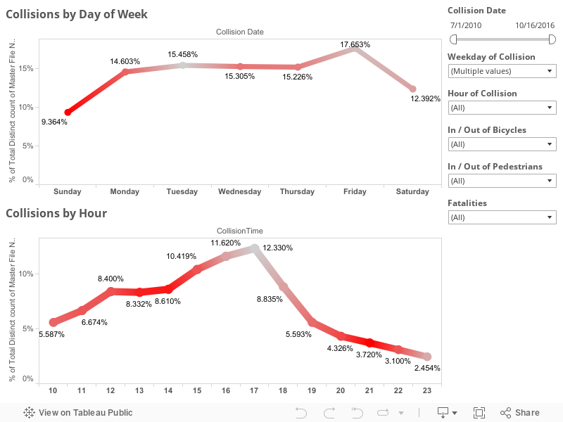
This third dashboard is a slightly more simplified version of the first except that I wanted to look at injury rates particularly. You'll notice the red coloration is the percentage of people injured on that given day or time. Again, the date sliders are on the right as well as selections for the day and hour of collisions though those can be selected by clicking directly on the dots as well . Things like bicycle and pedestrian collisions as well as, in this visualization, fatalities are included. 


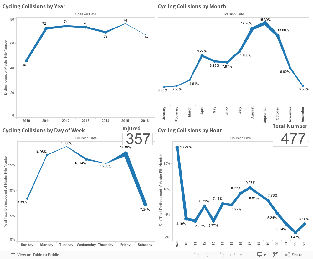
This last dashboard is just one purely to look at every aspect of timing of cycling collations including by year, month, day of week, and hour with both injury totals and total number of collisions also listed in the chart.


 I will be linking the second or third or possibly even fourth part of this viz down below as I complete them but they will all hopefully be part of my one year of viz challenge that I've made for myself. As always, if you have questions or concerns you can leave them in the comments below this blog or hit me up on Twitter at @wjking0.