Showing posts with label #DataViz. Show all posts

Wednesday, May 15, 2019

The Most Popular Cartoons of All Time


I frequently grab a delicious breakfast at one of Lexington's many bakeries and about a month or so ago I was at Magee's Bakery. On Saturday mornings (my "pastry day") they play old school Saturday morning cartoons like Mask, GI Joe, etc. I got thinking about cartoons and how today's compare with the ones I watched growing up... and how some long running shows (like The Simpsons) fare over time.

I did some cursory searches and found IMDB had a list of shows (Top 250 Animated Series by Avg Rating). I thought that was neat but I wanted to look at the shows over time so I designed a scrape to extract every episode ratings data from each episode from each season. These had things like number of people to rate, original air date, etc.

I then started vizzing to get my answers!

Things to Note:
  • Most shows don't go past 4 seasons (by season 5 up to 73% have been cancelled)
  • 1/3 of cartoon series don't make it past the first season
  • Median Star Rating for an episode is 7.6
  • Rick and Morty have an ENORMOUSLY passionate fan-base (6,742 votes per episode average) with a votes-per-episode level that is 4X the next highest show (The Simpsons at 1,636 avg ratings per episode)
  • Star ratings (overall) decline by season without any real upswing until a show hits it's 15th season (which only a very few percent do)

Here's a quick viz of top cartoons by season and their season breakdown. Mouse over the show to get a breakdown of their seasons ratings in a little box-plot to the right.
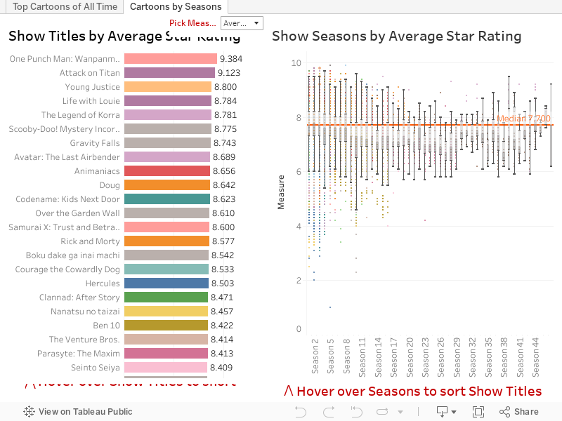


But what if you REALLY want know the "BEST" rated cartoon episode ever...? The problem becomes one of rose colored glasses. I'm personally a fan of Batman The Animated Series... sadly of ALL the Batman cartoons Batman TAS ranks the LOWEST!



I then started thinking about what decade had the greatest cartoons ever and so I built the next viz to help me encompass everything a little more completely (1980 has the highest rating year of any year BTW)... If you click on a year the graphs will reform follow the DIRECTIONS IN RED for help navigating the entire history of cartoons and use your won criteria to figure out for yourself what is the Best Cartoon of All Time! 
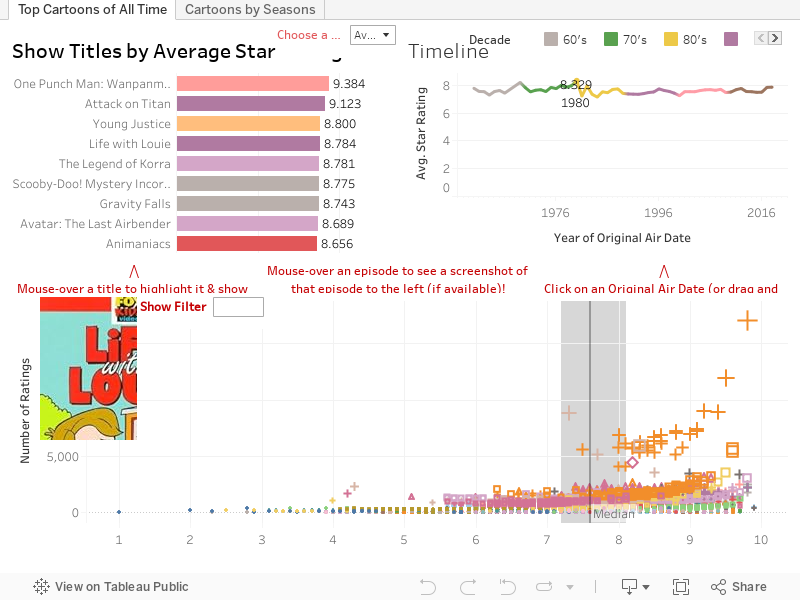


What do you think? One Punch Man? South Park? The Simpsons?


As always hit me up on Twitter @wjking0 with any questions!

Monday, November 5, 2018

Jammer Lap Points in Roller Derby


Let’s talk about Jammer Lap Points (further referred to as “JLP”)… I’m a math guy, a stats guy really… it’s in my job title, “Lead Data Analyst”. I’ve analyzed everything from roller derby, esports, corporate travel to education. Roller Derby though, while more driven as a fan-base is largely ignorant of its own stats. So let's look at them!


How I feel when people say it won't really change the game...
Facts:

  • Total Bout time 90 minutes
    • Minimum total number of jams
      • Theoretical, 0 seconds lead with call, 0 points earned: 180
      • Estimated, 0 points to lead, 10 second lap all opposing skaters: 135
    • Maximum total number of jams (full 2 minute jams, 30 seconds between): 36
  • Looking at 2017 data as a complete year set we have the following bout/score info:
    • 5,307 bouts played
      • 2,245 of which were in tournament play
    • 689 were within 18 points (just guessing that a team gets lead about ½ of the time) or about 13% of the bouts
    • 244 in Tournament Play (or approximately 10.8% of the bouts)

Assumptions:

  • If a team won by less than 18 points (which is adjustable in the viz) I gave the win to the other team so basically flip-flopping every game under 18 points.
  • Unfortunately, I don’t have access to the row level data of each games’ scorekeepers or every pass >= 5 I could change to 4 and we could get a DEFINITIVE list of bouts that would have been decided by the JLP change.


First, I wanted to focus on the meta game, commonly referred to in esports as “The Meta.” When we think about most sports, the rules don’t change terribly frequently. Soccer, American Football, Tennis, etc typically are very settled sports, that is to say they don’t have rules that fluctuate very much. Minor changes and typically nothing to do with scoring are changed. Scoring and defensive changes would reasonably cause the largest change to the meta with everything else done in sports in service of either offense (scoring), defense (preventing score), or penalizing bad behavior (personal/team penalties). Let’s get into it!


The chart below shows a scatter plot of all games over the last 3 years with tight games of 18 or less being represented in the red band. You can filter by tournament type or if it was in tournament play at all. Honestly, JLP’s are only affecting about 1 in 10 games. With that said, however, there is a trend in more recent years of it affecting Tournament games more and more… this makes sense as tournaments become better at seeding and finding similarly skilled opponents to play each other.


If you're viewing this on a phone click a here for a better formatted version of these viz optimized for mobile: https://public.tableau.com/views/RollerDerbyJLPViz/FTSMeta?:embed=y&:display_count=yes&publish=yes


While it doesn't seem to affect MANY games... think of every "barn burner" of a game you've ever seen. Like... Jacksonville in the tournament this year. Jammer Lap Points MADE A DIFFERENCE in that game. There's no denying that.


JLP was a huge part of the comeback against Montreal

This next viz I built to show individual teams the difference it could potentially make in their record over the years. Put in your own team name at the top, again if you're on mobile you can go to a mobile version by clicking here: https://public.tableau.com/views/RollerDerbyJLPViz/IndividualTeam?:embed=y&:display_count=yes 


Ultimately, what I've found is that I lack the access to the row-level stats to truly do correct analysis so this is more of a "close games" analysis but if you know that you're a "5 and done" team typically you can guesstimate how many JLP's your team might average in a bout and put those numbers in to see for yourself!

I think the argument that a person or the public not understanding the rules of a game means that you're catering the game to the enjoyment of the fans and the skillfulness of the athletes/refs. I know that this rules change is going to happen but it's worth noting that now things; like the highest point jam record will never be touched, a 20 point jam suddenly becomes a big deal, and previously a 40 point differential was the tipping point to statistically winning a bout... now that will fall to around 32 points.

With all that said, there are plenty of stats nerds in derby that would run these numbers and I think there should be open debate about rules changes that affect the meta game so seriously.
How I feel about the audience not getting the JLP rules...
As always hit me up on Twitter @wjking0 if you have any questions/concerns!

Addendum: Some people (Thanks Skate Beckett!) pointed me towards WFTDA's stats page to get more accurate data... it took a TON of cleaning (hence why this is being published much later than I initially intended.) With that said, I did the following in the same format... but the WFTDA stats data is super limited only having up to beginning of 2018 and primarily only having tournament info included. I actually reformatted the data at the jam level and reduced anything over 5 points in a pass to 4 points. Ultimately what that led to was the following viz: https://public.tableau.com/views/RollerDerbyJLPViz/WFTDAMeta?:embed=y&:display_count=yes


Also what this resulted in was a closer average game point differential going from a point difference of 63.1 to 53.8. So even though I feel deep in my soul that this is one of those things we should fight, it ultimately should lead to some closer bouts in the long run! So yay!?


Thursday, August 9, 2018

Creepypasta - The Popularity of SCP Stories


I had originally planned to do this visualization during the month of October as I felt it would be a little more fitting at that point. However due to the overwhelming votes for this viz over the other one I had planned to do at this time led us to Creepypasta winning out! I decided to scrape the SCP Wiki as I felt it was one of the best curated sources of Creepypasta around.

Unfortunately Tableau Public no longer lets you embed http data sources (rather than https) and SCP is purely http only. =( As you can see below it looks SOOOOO nice in Tableau Desktop!


Why will you let this work in Desktop but not Public Tableau!!?!?!


Some things to note:
Below is the breakdown of time/date/days of posts of SCP articles:


Here is the breakdown of the "popularity" of SCP CreepyPasta, you can arrange it just about any way you'd like coloring or sizing it by different aspects or choosing a date range and the scatter plot above will reshape in that way. For the shape metrics I decided to go with object class (which took QUITE a bit of cleaning) or if an object was marked as "Safe".

Click on individual entries to be taken to the page about that particular SCP!


As always hit me on twitter @wjking0 or leave a comment below or on other social media for comments/questions.

P.S. Sorry this one took so long and was kinda lackluster, I was hoping to find a work-around for displaying webpages inline with Tableau Public but sadly couldn't quite make it happen. =/

Thursday, February 22, 2018

UK Crimes Minutia

Hi new readers! For those of you returning I'm sorry about my absence from blogging for a while! It's been a busy year or two! I lost my job at the University of Kentucky due to a departmental merger... floated around on unemployment for a while applying to jobs and finally ended up with a job at a startup in Southern California where I worked tons and increased my Tableau skills even more than before.


This is the longer/more-boring version of the shortened article here: http://bourbonandbrains.blogspot.com/2018/02/university-of-kentucky-crimes-mapped.html

One thing kept nagging at me though and that was a project I started years ago while I was still working at UK. Here's the quick story... I worked in the Division of Student Affairs for the last 15 or so years of my employment with the University. Years and YEARS ago I thought that the way we reported crimes on campus was ridiculous. Due to both federal and state laws (known as Clery/Minger laws) the University has to report all crimes and acts of arson on campus. That is currently done in the following format:


Now, I don't know about you but while that fulfills the "letter of the law" I don't feel it fulfills the "spirit" of the law. Those laws were done so people could educate themselves on crime and trends to determine their (or their child's) safety on a college campus. I went to my boss at the time telling her I'd like to get a group together to map out crime on campus to help places like our Violence Intervention Center and other places focus efforts and overall to make campus a more safe place. I was told, in no uncertain terms, that I was not to do that. The fear was that it would "reflect poorly on our Greek community." (Which, once I looked at the data, it doesn't actually!) This, of course, pissed me off. I didn't have the tools to do it on my own... fast forward a few years and I became one of the Tableau super-users on campus and I realize that I now have all the tools (data scraping) and knowledge of data visualization (Tableau) to do this whole project myself. I went to my boss at the time, a different VP who was more forward thinking (Dr. Robert Mock) and let him know that I had gathered this data, analyzed it, and I was going to publish it. I let him know (as with now) I did it all on my own time with my own resources from publicly available data and I wasn't so much asking permission as I was just letting him know I might be kicking a hornet's nest. He told me to contact the UK Police and let them know what I'd done before I publish it... so I did. I wanted to show the police what I'd done and give them a chance to weigh in. I met MULTIPLE times with the then Lt. Barefoot (I believe Captain Barefoot now) and when I showed him the data he wasn't at all surprised. He helped clear up some of my understanding of the data and was SUPER HELPFUL. I can't speak highly enough of all the University of Kentucky Police Department. Seriously, they're great and very forward thinking. 

One of the first things they asked me was if I could do this data live against their database, which I was THRILLED to hear. I worked on a version to be published publicly and running against their database they were using to display on the Crime Log page. Unfortunately this project got bogged down in minutia primarily regarding updating map coordinates. I heard whispers up until about a year ago that someone was still going to publish/maintain it but without me driving the issue it ultimately never happened... UNTIL NOW!

This data is hand-entered into a system so you can imagine with 16000+ rows there is a lot of fat-fingering errors that happen. Additionally the text parsing to clean the addresses was a NIGHTMARE. Basically what I did was find every way to say "RD" and every permeation of every street ending you can imagine and did a huge if/then to combine all those. Took away the punctuation from everything and ended up hand-geocoding most of it with the AH-MAZE-ZING service Geocodio.

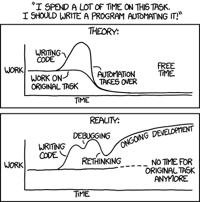
After that I tried to go in and manually include building names where the addresses matched. I considered doing this problematically but honestly it would have taken about the same amount of time either way. Whenever faced with a big problem like that I always like to refer to this XKCD comic:


Anyway... those are the gory details of why I did all this and how I did it. Just as before this data could be presented in this way live but it has never been made a priority by the University. Given the nature of some of the things that have happened recently maybe things like Terroristic Threatening should get a little more of a spotlight shown on it.

As always if you have any questions/comments/concerns hit me up on twitter @wjking0. 

University of Kentucky Crimes Mapped


Sorry it's been a while since I posted! I promise I'm going to get on a better public-release schedule.

That said... this data, while formatted nice has a TON of fat-finger errors in it... it's hand-entry of over 16,000+ things from a state-wide police system to their front-end web interface. If you'd like to hear about it and all the minutia that lead up to this and why it's important to me click here.

Me scrubbing data only to find more data that needs scrubbed.
With recent news of the mishandling of a poor young woman's case as detailed by the Kentucky Kernel I decided now was a good time to talk about the public nature of crime data... Let's get into it!


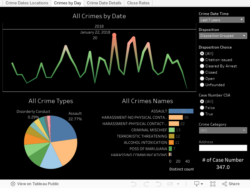
A couple things to note about the above viz is that CSA cases do NOT require a police officer to be involved. Those stand for "Campus Security Authority" so a CSA case can be something like someone spitting on a nurse (a frequent occurrence unfortunately) or drinking in a dorm room etc. To get an idea of the "real" police workload change the filter for "Case Number CSA" to False. Now you'll be looking at only the crimes where an actual officer was involved.
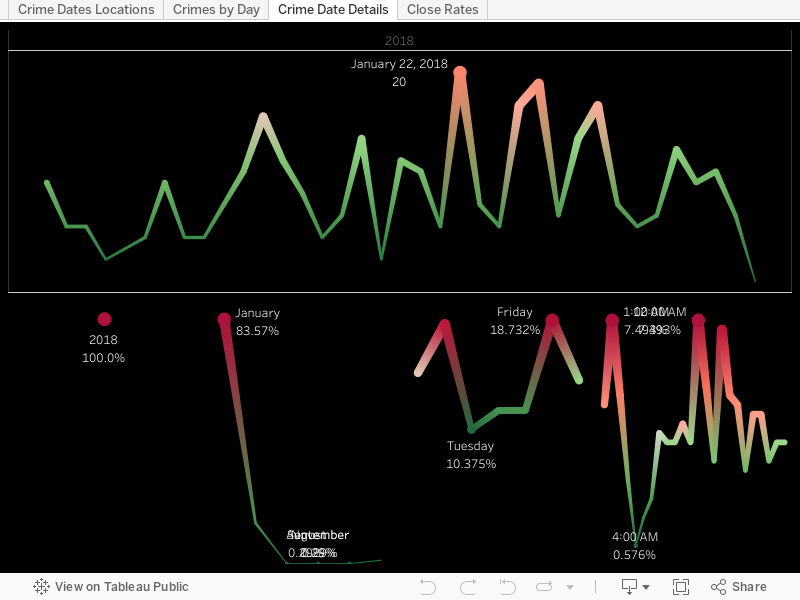
Aside from Eastern State Hospital (which is largely a mental health facility) what is one of the main drivers of crime on campus? Well... turns out that's UK Football. When you look at crimes by individual dates over the years there are some pretty obvious spikes. When I checked the dates, yep... all home UK football games.


What's that? You want to know the longest list of charges? Well that would belong to case 20143565 which has the following laundry-list of offenses:
"FAILURE TO ILLUMINATE HEAD LAMPS/V, DISREGARDING TRAFFIC CONT DEV-TRAFFIC LIGHT/V, OPER MTR VEHICLE U/INFLU ALC/DRUGS/ETC. .08(AGG CIRCUM) 1ST OFF/M, FLEEING OR EVADING POLICE, 1ST DEGREE (MOTOR VEHICLE)/F, FLEEING OR EVADING POLICE, 1ST DEGREE (ON FOOT)/F, CARRYING A CONCEALED WEAPON/M, WANTON ENDANGERMENT-1ST DEGREE-POLICE OFFICER/F, POSS OF MARIJUANA/M, TRAFFICKING IN SYNTHETIC CANNABINOID AGONISTS OR PIPERAZINES/M, POSS CONT SUB 1ST DEG 1ST OFF (COCAINE)/F, PROMOTING CONTRABAND-1ST DEGREE/F, WANTON ENDANGERMENT-1ST DEGREE/F, POSS OF OPEN ALC BEVERAL CONT IN MOTOR VEH PROHIBITED/V."


Want to dig a little deeper into specific crimes? Check out the viz below!


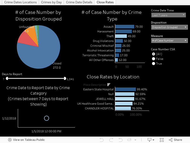
Realistically though the University of Kentucky Police are really SUPER AWESOME and nice people whom I've met with personally several times. The next chart highlights close rates of cases and the ones you'd expect to not get closed (theft, burglary, etc) are the types of things you see most unsolved. Click around and see what you're curious about. When I was going through the data one of the most concerning things to me was to look at the "Unfounded" category and see how Sex Offenses is the highest rank (when including CSA cases). That doesn't seem like a thing people would exaggerate on and I trust the UK Police to have done their due diligence, but I also am concerned about the culture we live in and how that affects things like this in aggregate.


I'd also like to share this cleaned version of data that I am posting out on Google Drive for download as well as one of my new fave repositories at Data.World. If you'd like to know more about what went into cleaning the data again go to the page here where I talk about some of the data cleansing that went on.

As always I hope you all found this informative and if you have questions please post a comment below or hit me up on twitter @wjking0!


Thursday, March 23, 2017

Reddit /r/Datasets Analysis


This is part of my #1YearOfViz series! Check out the archive here: http://bourbonandbrains.blogspot.com/p/one-year-of-dataviz.html
Let me start off by apologizing. I've been trying to work out some issues with +Tableau Software and getting Tableau Public working with the last several web pages I've tried to do a web-part embed with... and I've tried all the suggestions on the support forum. It works fine in Tableau Desktop and Tableau Public apps but once I upload it to Tableau Public it just doesn't show up. I originally thought it was the mix of http (this blog) and https (Tableau Public) but even when viewing just on the main Tableau Public page it is still showing up as a blank page. =/


Me shaking the 'Do Better' stick at Tableau Public


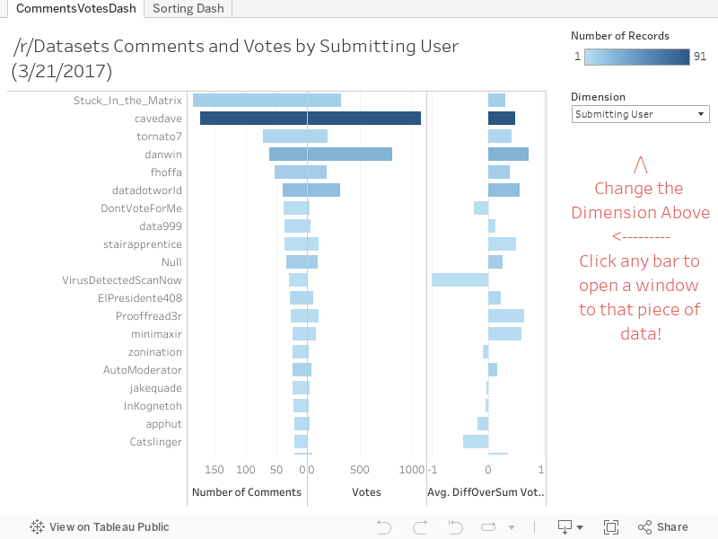
What this means for you is today's viz (in part) features new window pop-ups because the integration isn't working right with the Tableau web part.

Today's dataset is an analysis of all the links I could mine back through the history of a subreddit I am one of the admins of. If you're reading this blog and you're into dataviz and you haven't been to /r/Datasets yet then you really need to!

How being a subreddit mod really feels.


Below is the viz... you can change which dimensions you'd like to measure votes/comments by and if it has an associated link (such as profiles, domains, etc) you can click on the bar and a pop-up will come up with that data loaded in it.


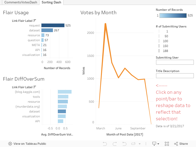
The second part of this viz is just a little more in-depth breakdown of things if users from the subreddit are checking it out and want to see a how different categories are broken down.

Ultimately here are some of the base numbers:


52.55% are "Requests"
26.3% are "datasets"
7.31% are "resources"
5.71% are "questions"


Keep in mind this data only represents the past 1000 or so posts in /r/Datasets only really spanning about 3 months worth of time from the date of 3/21/2017 (the original scrape date). In the future I'll likely work on a more "live" version of this probably utilizing some IFTTT recipies but until then I hope you enjoyed this little glimpse into the weird world of datasets and the people who love them! <3


As always if you have any questions/comments/concerns hit me up on Twitter @wjking0 or in the comments below!

A meta image about a meta reddit dataset from where... ? You guessed it... reddit.


Thursday, January 5, 2017

Veterans Affairs Database of Military Graves


This is part of my #1YearOfViz series! Check out the archive here: http://bourbonandbrains.blogspot.com/p/one-year-of-dataviz.html

I hope this week's viz doesn't come across as too morbid, You'll also find none of my typical gifs in this post as I wanted to keep it as respectful as possible. I was looking through data.gov the other day for a Kentucky-centric piece of data to viz when I found the Kentucky record from the VA of military burial sites and it seemed to be out of a larger dataset. Sure enough, I found the entire dataset which includes full names, birth dates, death dates, wars fought in, branch and occasionally rank of the individuals!

This is really neat for me as I've had several family members serve including both grandfathers who fought in World War II. As a matter of fact I recently got to go to LA to hang out with one of my best friends and we got to tour my Grandfather Davis' old battleship the USS Iowa! Here's a pic:
Me in front of my Grandpa's old ship the USS Iowa - Photo courtesy of Casey Miller

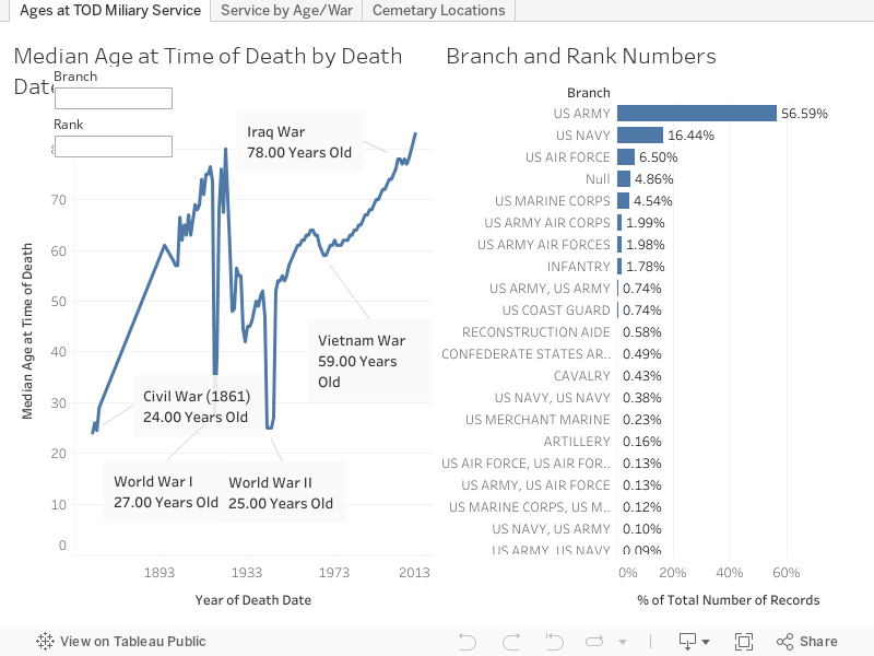
I having birthdays and death dates I was hoping I could do some more in-depth calculations on ages at time of death but the problem is that you can't specifically know based on the data that an individual died IN that particular conflict. You can make some pretty strong inferences to see how wars in particular pull down the median ages of people who pass away at different points. Let's go ahead and look at that dashboard now. You can click on a branch of military (the % of ALL records are on the right) and the ages/dates will reformat on the left (Median ages of people who passed away certain years). You can also just enter in a particular branch or rank on the left hand side if you'd like to filter the whole dashboard that way as well.


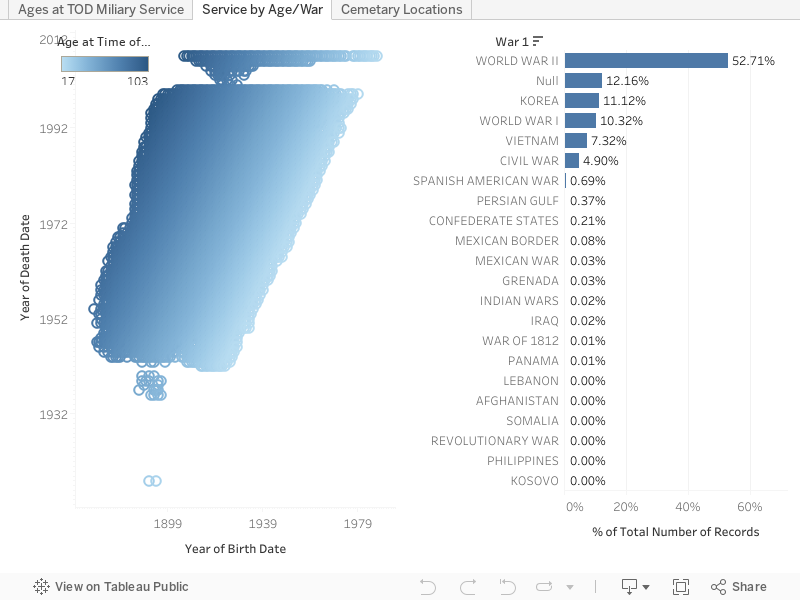
As you can see periods of war, particularly the first and second World Wars caused great dips in the median ages of veterans that passed away on those years. These pronunciations become much more distinct if you limit the ages of those who pass away to 35 and younger. The data as it's shown above represents ages 16-62 (the mandatory retirement age for military personnel barring special circumstances). In this next dash however you can see some gaps in the VA's data. Particularly between the years of 2001-2005... there's only a very small spattering of people represented in those years compared to the rest. Again you can reformat either side of the data by clicking or selecting parts from the opposite side. I'd suggest using a box select on the left side and selecting an individual war on the right. You can expand the "War" column on the right to allow for people who served in multiple wars to be selected. Generally speaking they are in chronological order but occasionally not. Some people, for instance, had WWI listed AFTER WWII... but let me assure you I did a TON of data cleanup on this... and I had to stop somewhere so ordering all the dimensions was my stopping point!


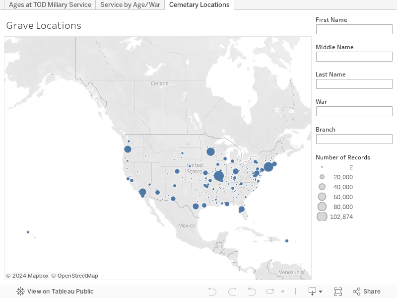
Finally this last one is a map of all the known military burial sites listed by the VA. I imagined there would be more than 183 but several have VERY large sections dedicated to soldiers. If you know that you have a family member or friend that is buried in one of these locations you can do searches. If you limit it down to a single person per location it will actually give you the full details of the location of the grave in the tooltip if you hover over the location with your mouse or finger. I hope that can be useful for some of you out there to find your loved ones.


Lastly let me say thank you to all those who have served... who lived and died for the freedom for people like me to be able to find public data and publish it.

As always hit me up in the comments below or on twitter @wjking0 if you have any questions or concerns.

Thursday, December 29, 2016

Fayette Co. (Kentucky) Public Schools (FCPS) Salaries 2015-2016


This is part of my #1YearOfViz series! Check out the archive here: http://bourbonandbrains.blogspot.com/p/one-year-of-dataviz.html

Me when I hit Import.io's scraping limit and get banned (again)
I wanted to start this post talking about the problems I've recently encountered was using Import.io. Multiple times now I have run into the their scraping limit for "free" users and have been temporarily banned from using their services. one time accidentally ran cloud-based scrape as a test but the scrape continued after I closed it so I ended up running a query of a thousand instead of the 20 to 30 I wanted to run. Then this month I've ran a scrape of over 10,000 (their new limit on local clients scraping) in a given month, I was originally told the Legacy client would be allowed to have infinite scraping as long as it was done locally (via their Facebook users group). This was apparently not the case.


I started out looking for a new scraping client checking out several pages for clients to use. But almost all web scraping services required monthly subscription fees, or have no local clients to use for cheaper or free rate. That's when/how I discovered Octoparse!
/\ Me hugging Octoparse!

It is kind of magic! It took me over a week to really learn how to use it, but this is been extraordinarily worth it! The main school and Octoparse are much more tools in imports. Octoparse allows unlimited queries from the local client and you only have to pay when you're using their cloud-based services. Which is the way I suggested import price their systems when support contacted me about my ban from their services.

Hey Octoparse, I just met you,
and this is crazy,
comment my blog,
and sponsor me maybe!?
I only wish I had known about Octoparse earlier so that I could have stayed myself around 12 hours worth of work when I did the West Virginia State salary scrape a while back! what you will be looking at in this visualization is the first scrape that I have completed using Octoparse. The data came out incredibly clean and simple, my only complaint in the export of Octoparse is that CSV export to be not directly readable by excel when opened. It's really a minor complaint next to the awesome flexibility of the product though! Let's get into the data!


I've settled in on my designs for salary-based dashboards with only a single year of data. I decided not to fix it since it's not broke and replicated the same types of dashboards I've done in the UK Salary Viz here and a little bit of the work I did in the WV State Salary Viz mentioned previously. The "Dots Dash" as I call it is really just a fun visual representation of all the people/years/money that goes into something like public education in one single county.


This next one is just Salary Over Time and Number of People Over Time so basically how many people are making approximately how much, how quickly do you see raises given, etc. If you'll notice at the side this viz starts out with a filter of "Instructor" on it to show specifically teachers salaries over time as all teachers (I think) have 'instructor' as part of their titles. You can set this wildcard filter to whatever you'd like (ex. 'bus driver') to see how your or a friend's particular job futures will look over time.


The next story dashboard I really wanted to look at how locations/grade-types pay different teachers. Do art teachers make more at Liberty than at Brian Station? How about music teachers at Elementary schools vs High Schools? Step through the story with the top tabs and you can filter on the right and compare median salaries by location. I'd like to ultimately turn this into part of what I'll use for a future dashboard I'm going to work on that will compare test scores to teacher salaries for particular places... but this will have to do for this week! =D The last little section was just because I was curious how how much principals make in general and I was surprised (and glad) to see they make good money.


This last dash is just the "big list" that a lot of people like to see... if you CLICK on a location or a job title the data to the right (medians/averages of salaries and years worked) will reformat to that highlighted selection. If you click on a job it will not be the medians/averages for that particular school (as each school doesn't have enough non-teaching staff to make that functional) so it reformats to show EVERYONE who shares that job title. You can also filter this list by name if you're looking for someone in particular's salary.


Finally, as the son of a public school teacher let me say to all of you out there doing the work every day...

As always hit me up on twitter @wjking0 or in the comments below for questions/concerns!

Friday, December 23, 2016

A Year on Google's Project Fi


This is part of my #1YearOfViz series! Check out the archive here: http://bourbonandbrains.blogspot.com/p/one-year-of-dataviz.html
Most of you that know me know that I drink deep of the Google Kool-Aid... I've been a nexus 10 owner for years, I've beta tested apps from the Googs... you name it. That's why, about a year ago I was thinking about switching my cell phone service when I realized that they had a no-interest payment plan on their latest phone! I figured I would give the service a shot and see if it was everything it was cracked up to be. This is not as much a DataViz post as it is a Quantified Self post about what I learned while changing cell phone providers.

Also I just SUPER wanted a new phone, again if you've known me for a few years I carried around a Samsung Galaxy S3 with a screen that was more often cracked that normal (thanks alcohol!). Anyway the Nexus 6P was about the sexiest phone I've ever laid eyes on and I figured if Google held up their promises of using multiple networks to boost speeds it might be pretty amazing. I ordered my phone and was going to wait until Jan 1st to turn it on... it arrived and I had it in my hands for a cool 2-3 days (using wifi only) when my Galaxy S3 gave up the ghost and had a major problem with it's motherboard. To this day I think it was just jealous of the new phone. =D

What I hadn't really thought too much on was exactly WHEN and HOW I used my cell service. I kept thinking "I shouldn't really use much 'real' data because I'm always at places with wifi"...like my apt, my office, etc. This is where I was WRONG. After getting the phone that first day I was really wanting to run speed tests all the time and see exactly what this combined network signal would mean as far as speeds on the phone... but to test speeds do you know what you need? Large data files to transfer. I burned through almost 1/2 a gig in a few hours... I'd only allotted myself 2Gb a month (though it's not a problem if you use more, it just adds to your bill). You see I was coming from an UNLIMITED Sprint plan that I'd had forever and it was pretty rad. Anyway... I've logged my wifi connections via IFTTT for years so I figured I would give it a solid year to look at the differences. Let's get into the data:


Let's just take stock of the positives and negatives:
Super fast = Super Pricey!

  • Positives
    • It's AH-MAZING-LY fast! (see screenshot to the right!)
    • Reception is better in most previously "dead" zones
    • The build-quality of the Nexus/Pixel line of phones is impeccable
    • Initial cost of entry is very low ($20/month)
    • Integration with Google Services (like Google Voice/Hangouts) is GREAT
  • Cons
    • Actual phone call quality (particularly on Wifi) is kinda janky
    • $10/Gig of data is TOO DAMNED HIGH
      • Ex. I spent $5 in a few hours just running speed tests around town the first day or so.
      • I could burn through 1/2 Gb of data A DAY walking to work watching YouTube which, if I continued doing, would have cost me approximate $100/month in data
    • Really paying per gig is almost impossibly hard when you're used to unlimited data
    • Have I mentioned that fast network speeds really only matter when you feel that you're not paying for every Mb that flys to your phone at Mach 6!?


How I feel after trashing a Google Service
What does all this mean? Well... have I had good network speeds? Yes. Has my call quality been good? MOSTLY (drops sometimes, particularly in Wifi calling). Have I had to SUBSTANTIALLY alter the way I think about my phone being online? HELLS to the YES. That to me is the big flaw in Project Fi... The fast access just means that ultimately you're going to pay them more because you're going to pull down larger data and more HD video, etc. If they said something like "OK, all Google-related services are going to be FREE to access..." I could subsist on YouTube and Play movies/music etc while walking around town. Now I see the draw to places like T-Mobile who are bundling things like Netflix and Hulu in as "Unlimited" as far as data usage goes. Don't even get me started on things like image-heavy Instagram and other services that are no longer text based but image/video based only... ugh.

Bottom Line (literally)... Can I recommend Project Fi as a service to most people? Yes. Only if you're not someone who likes to constantly have your phone out. If you're a super nerd like myself and live on the Interwebs... you're going to hate Fi.

As always hit me up on twitter @wjking0 with any comments or questions!