I'm not going to spend a whole lot of time writing up the viz today when I've got the presentation below and the slideshow with all the relevant links in it you can click through yourselves!
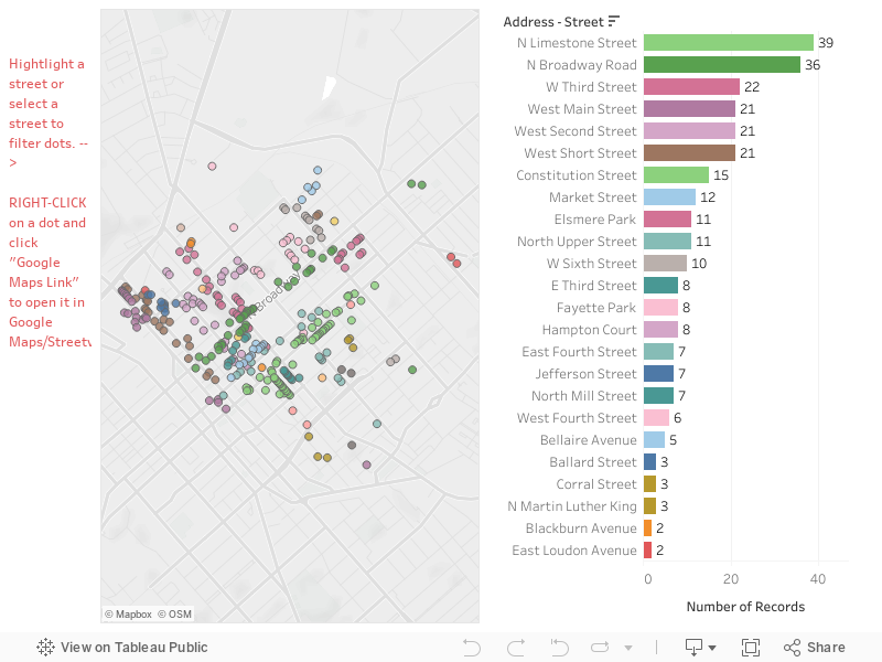
Please watch the video for an explanation about these vizzes! Here is the Bluegrass Trust Plaques viz:
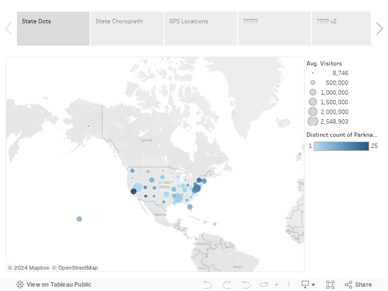
Here is the fun one, I've since taken the data and saved it up here to Data.World... which, if you haven't checked out is pretty amazing! I'm just now scratching the surface of all the options they have for datasets! Here is the National Parks Visitation Viz:
As usual if you have any questions feel free to hit me up on Twitter @wjking0!
Originally found the subject of today's blog in a Reddit forum that I am an admin of called r/datasets/. I'm a pretty big fan of our national parks and have several faves including Monument, Yellowstone, etc. This year marks the 100th year of the United States National Park Service has been in existence so I thought this would be a great time to make a viz about our nations national parks!
Some of the things that I discovered in the data are as follows:
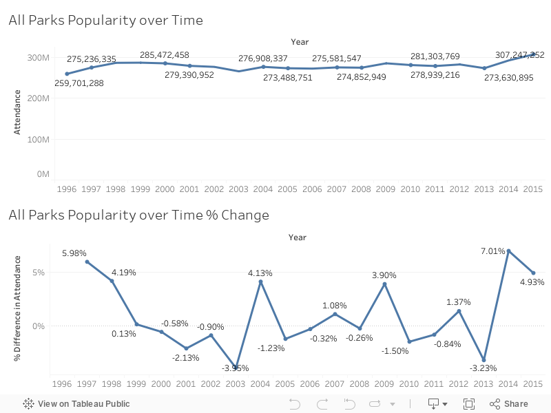
I started noticing a trend that over the last couple of years national parks have been visited more than any time in the last 20 or so years! I've been searching for a reason in this uptick of people visiting national parks have yet to discern one. One suggestion is that the "Every Kid in a Park" initiative is responsible for the growth over the last couple of years. This seems unlikely however because after further research the beginning of the Every Kid in a Park initiative was September 1, 2015. You'll see by the chart below the last two years in particular since 2013 has seen some of the heaviest growth in recent recorded history.
Unfortunately, not all of the data that I'm showing Nice charts was available from a singular data source. I had to scrape the national parks website located here, as well as the national parks statistical site located here. Unfortunately, I was also unable to easily join the data set as the names of the national parks on the website do not match the names of the national parks on the report that they issue on their statistical page. Additionally, the main national parks website does not have any year by year breakdown of monies coming into a state per park (just a state total).
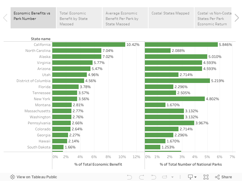
That said, we can still do some calculations with the amount of money that has come in totally and the number of parts located in the state to get a rough value of return over the last years 20 years per park. As you can imagine, none of this requires mind blowing mathematics or calculations. After I began examining data I noticed a trend in which coastal states tended to have a higher return value per national park than non-coastal states. I decided to do a grouping to see if that assumption was correct and it turns out, that it is! Check out the Story below and click through the stages I described above to see for yourself!
This makes sense if you think about it, most people (that I know anyway) don't vacation by going inland but a lot of people who are in land-locked states I believe tend to go towards the coast for vacation purposes. If you're curious about how the NPS calculates the amount of money coming in feel free to check out their write-up on these numbers here (PDF). What this appears to be on the outside is that coastal based national Park tend to pull about half million dollars more a year in revenue then non-coastal national parks. We can figure this out by assuming that the total on the national parks website was from the last 20 years of data they have collected.
Interestingly enough, the state with the highest return her national Park is actually North Carolina!
As always, if you have any questions or concerns you can leave a comment below or hit me up on Twitter at wjking0.
I posted the original version of this back several years ago as one of my very first geo-located dataviz that I'd created. With the new changes in Tableau Public I have finally found a way to get the live-updated data from the Lexington Health Department. If you'd like to see the raw Google Sheet that I'm pulling this data from I'll make it available here.
I didn't do too much as far as changing this data from it's original form except making the data a live-updating format and putting some additional filters and analysis on top of what I'd done previously.
First off I'd like to announce that I've developed what I think is a good mobile version which you can pull up on your phone if you'd like to bookmark to be able to quickly/easily check food scores/violations for a place. Click on the image below to be linked out directly to the dash!
If you'd like to see the full dash and analysis list click below to open up the rest of the blog post!
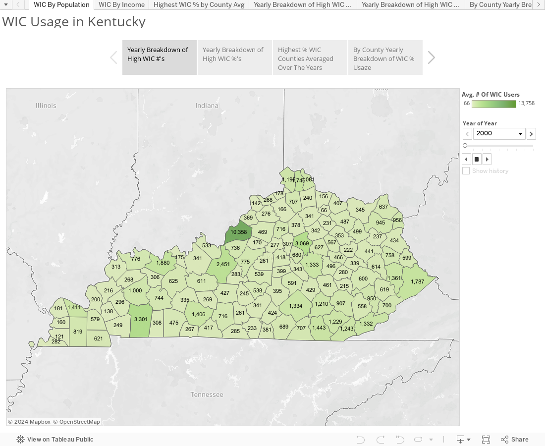
As a non-native Kentuckian I wasn't sure what WIC usage looked like in this state. My assumption was generally that WIC was something you'd see more of in large developed cities. It turns out I was wrong.
Total Population Numbers came from the 2000 and 2010 census.
For the calculations I applied the numbers to total calculation and not to subgroups for women or children under 18 so usage percentages for those may be higher but I don't have the WIC info regarding numbers of mothers vs children utilizing services so I didn't want to further muddy the numbers.
Also for these calculations I applied the 2000 census amounts to the 2000 WIC numbers and then for the 2006-2013 WIC numbers I used the closer 2010 census numbers as populations estimates for most regions were fairly stable over that time period.
As you can see, the large urban areas of Lexington and Louisville (Fayette and Jefferson Counties respectively) have fairly low usages of WIC (<2%) while areas particularly in eastern KY you can see have fairly high/consistent usage. I haven't done cost analysis yet but once the USDA fixes their website and I can get some more in-depth numbers I should have some more data to play with.
As usual hit me up at @wjking0 if you have any questions or concerns or just want to talk about public data!
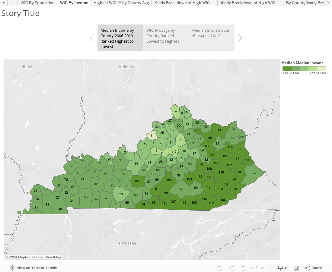
EDIT: I've added the second dashboard/story as there was a request to look at the comparison of WIC % to Median Household Income so I crunched that out real quick:
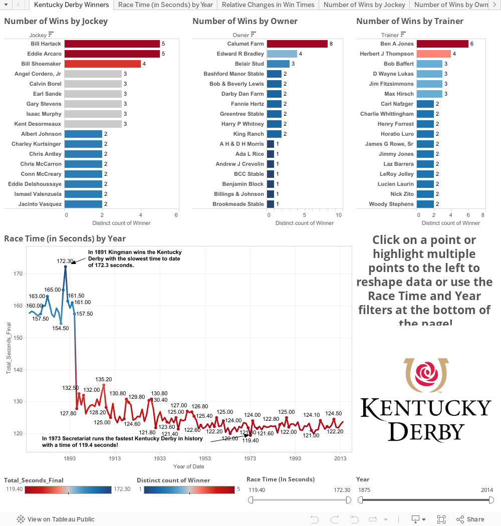
After attending #Data14 the Tableau Conference it came to my attention after a session from Jewel and Crew that I should start sharing out all my #WeirdData that I enjoy viz'ing? I hemmed and hawwed about what kind of viz to do so I figured I would start with one from Kentucky (my current home). Here in Kentucky we love three things above all else... Basketball, Bourbon, and Horse Racing.
The Kentucky Derby is one of the oldest continually running horse races in the world. The data set there is pretty expansive but I was amazed at how hard it was to find. The data I ended up using I scraped from a couple Wiki's and I have some other data that I may enhance this with later (such as Purse collected). For now though enjoy playing with my first ever blog post and my first ever Tableau Public Viz. Comments/suggestions welcome! @wjking0