Showing posts with label #Analysis. Show all posts

Thursday, November 24, 2016

West Virginia State Salaries 2007-2015

This is part of my #1YearOfViz series! Check out the archive here: http://bourbonandbrains.blogspot.com/p/one-year-of-dataviz.html


After seeing some work that I did with the University of Kentucky Salaries Viz my mom (who is a teacher at a local college) commented that she thought I should do the same thing with her college. I started looking and found that, unlike Kentucky, the salary records for ALL WV state employees were available all the way back until 2007!!! Yay historical data!

Me when I looked at the site and saw how much historical data there was!
Unfortunately unlike the other salary data I normally have I didn't have access to job titles so there's no way to really know if someone changed positions or anything... it's just name, department, and total compensation for that person per year. Of course with that, particularly given the amount of time... you can do neat things like figure out raise percentages over multiple years! Unfortunately the way the page is laid out that I extracted the data from you cannot look at an individual's salaries over time... so I fixed that with the viz! Below you can type in a name, or a department, and the viz will filter to show that person's salary/raises over time.

Additionally you can click on a particular department or name to have the data re-form to show just that particular set of data. Ie. You can click on the Division of Corrections, then click on Adkins, Lisa to reform the data specifically to show that user. Anyway I'm going to work on some other ways to present this data but in the meantime play around with the dashboard here:


Ultimately you have to remember that, even though it's Thanksgiving... you can't eat money. No matter what Ralph Wiggum tells you:

As always thanks for reading and if you enjoyed this visualization (viz) please share it out on your social networks. If you'd like access to the raw data that I scraped (by hand) from their site then you can download the raw data by clicking here.

Sunday, November 20, 2016

The Inherent Racism of Election Years 2000-2015

This is part of my #1YearOfViz series! Check out the archive here: http://bourbonandbrains.blogspot.com/p/one-year-of-dataviz.html

Better late than never right!? That's my thoughts on this week's post! I had a lot of life-related things happening recently and I haven't had the time to focus on data collection, ETL, etc as I'd hoped. Part of that was some personal things in my life and then I decided in the middle of the week to come to my hometown of Charleston, WV to spend some time with my dad post hip-replacement surgery.
Telling my dad not to do anything is IMPOSSIBLE.

I have something on-deck for next week that should be pretty big if I can find the time to get it done so that'll hopefully make up for the lack-luster few weeks of Viz!

So while looking around on my laptop I realized that I had WAY fewer datasets on here than I anticipated. I've been poking around a little more on Data.World lately and I saw a crosspost between there and /r/datasets about FBI statistics on hate crimes from 2000-2015 and thought with the given political climate this might make for a good viz. Sadly the 2016 data isn't in yet... it's probably gonna be a mess.

If you'd like to read up on what constitutes a "Hate Crime" according to the FBI they have a really great site located here.

You can see I just did the one Tableau Story for this viz as I think it's pretty logical to "step" through and isn't terribly interactive (sorry!). Check it out below:


I can't really think of too many things in the country that occur pretty cyclically every 4 years that could contribute to these pretty significant increases in trends. Of course the largest hate-crime related trend since it has been tracked starting in 2000 is the change in Anti-Islamic hate crimes that happened after 2001 (likely a result of 9/11/2001).

As always hit me up on twitter @wjking0 or via the comments below to talk about dataviz!

Friday, November 11, 2016

Video Game Music Viz - Part 1

This is part of my #1YearOfViz series! Check out the archive here: http://bourbonandbrains.blogspot.com/p/one-year-of-dataviz.html

First let me apologize... for those readers not in the United States this was election week so everything's been a little.... let's use the word hectic around these parts. Secondly, I'm sick (see photo below) and was hoping Thursday/Friday I could really crunch though some data. That said... I didn't START crunching through the data until about 1AM Friday morning (you should be reading this on Friday hopefully).
Me sick in my comfy hoodie vizzing at 3AM.
I know what you're thinking....
Gotham... great show AMIRIGHT!?
The upshot of all this is to say that, due to various reasons, today's viz is going to be a little... thin. I still wanted to scrape and ETL some data for my readers but it's not nearly the level I'd LIKE to do with this data. If I can convince the awesome folks at Import.io to give me their top-tier plan for free I would be vizzing the shiz outta all kinds of stuff... but my feeble internet connection and their lack of support for their legacy application don't lend themselves to me doing 50,000+ queries anytime soon! That said Import.io's product is my ABSOLUTE FAVORITE for data extraction! *bats eyes, looks for endorsement deal*

Today's data is my initial scrape from the Video Game Music Database which really is an exhaustive list of titles... of course most of which are in Japanese so I don't necessary know all the titles the music is referring to, it's impressive that their community has built something so rich! They even have a dedicated stats page that you can poke around in located here.

I found this through a podcast I listen to pretty regularly called the Legacy Music Hour featuring 8-bit and 16-bit era games.

This really isn't so much a comprehensive look at the data as it is a quick viz so I can stick to my schedule... that said....

I just did two dashboards... one which simply augments and simplifies their searching process to give you all results that you can scroll through and load by album title. It's nothing fancy but you can use it to total up things to compare how many game soundtracks Sonic has had to Mario, etc.


This next one shows the trends in the video game music industry over the last several years. Unfortunately game sales data is hard to come by (if anyone knows a source please let me know). The height being in the late 2000's around 2009 or so with a dip after that. I kinda wonder that, like with gaming, VGM reached a saturation point where people had more than they could reasonably listen to or enjoy?

I also filtered the early days of VGM and limited it to 1983+ (which you can edit with the filter-slider) because I felt that really the explosion of game music came when the Famicom hit Japan in 1983. You can see this reflected


I promise you all next week I'll unveil something worthwhile when I'm feeling less like poop for a zillion reasons! In the meantime ... at least I'm keeping my schedule of 1 Viz per Week! I do have the scrape started for the deep dive into this data and I'll likely plow through that and get it published in a week or two from now (probably 2 as I don't like to put two similar topics published back-to-back). Hit me up on Twitter @wjking0 or leave a comment below and tell me what you thought!

Me with this week's viz.


Friday, November 4, 2016

$25,000 Dollar Prop, Mascots with Guns, and other fun things in a Halloween Express Scrape!

This is part of my #1YearOfViz series! Check out the archive here: http://bourbonandbrains.blogspot.com/p/one-year-of-dataviz.html

I'll provide visualizations however some of my initial findings are as follows: 
  • Some assumptions you would make are accurate, such as plus size costumes tend to be more expensive I considerable amount (28.60% more expensive on average).
  • Interestingly enough plus size costumes tend to be cheaper when they are classified as "sexy" (18.18% cheaper!).
  • There are also just about equal percentages of sexy plus-sized costumes as sexy non-plus size costumes (12.12% Plus vs 16.07% Non-Plus).

Thanks to my friend Barbie I thought it would be a good idea to look at Children vs Adult costumes to see which had more. I would assume more children costume exist than adults costumes, as it turns out there are considerably more adult costumes than children's costumes! The assumption could be that people tend to make children's costumes or children's costumes simply require make-up and accessories (which does make up more than 30% of the total items in the Halloween express store).

Also the assumption that women costume cost more than men's costumes is incorrect men's costumes cost more by approximately 20% and there are approximately 20% fewer men's costumes as women's costumes. This may be a result on pricing vs demand. Just guessing that possibly women's costumes are sold more frequently so can ultimately be priced lower.

I would say I'm sorry for all the Mean Girls gifs... but nah.

Since gender of costume isn't specifically stated in every case I did a little formula, I just wanted to give you a quick note on how I defined gender in this data. If any of the categories or the item title or item subtitle contain the word "women" or "girl" then I defined it as 'Female' and "boy" or "men" then I classified it as a 'Male' costume.

Anyway here's the data that I just mentioned! It's not really meant to be "played with" but don't worry the next viz below this factual story viz will be more interactive!


Now as promised I wanted to put some individual links to things in here that I just found horrifying:
  • Basically the ENTIRE "Mascots" Category but most specifically this gem. He's a "Patriot" mascot... with a shotgun. Not sure what Mascot carries heat.... but ya never know.
  • The $25,000 PROP.... which really just scratches the surface of expensive things for sale at Halloween Express. You can play around below with the full dataset and set it to $1,000+ on the filter and you can see HOW many crazy items there are in there!


I've been a little distracted lately so I promise a better and more deep dive into some data next week! As always hit me up on Twitter @wjking0 or in the comments below if you have questions/comments/concerns!
I'm OUT!

Wednesday, October 19, 2016

Car, Cycling and Pedestrian Collision Data - Part 1


This is part of my #1YearOfViz series! Check out the archive here: http://bourbonandbrains.blogspot.com/p/one-year-of-dataviz.html

I knew I would have to do this eventually, I finally came upon a data set so large that I have to split it into multiple posts. I originally was turned on to this data as part of some work I had done with the University of Kentucky Police Department, I had done some work on their crime log and one of the captains thought I would be interested in traffic collision data (Captain Matlock who's super rad and a data nerd himself!). I said oh you mean traffic accidents? He replied, there are no accidents. when he gave me a sample of their data I realized I could deduce several trends in it, particularly in regards to pedestrian and cycling accidents as they occurred on campus.


Being an avid cyclist myself I saw the potential for this data to really help and inform other cyclists and people working on the planning of the University of Kentucky's roads and pathways. One of my last days as an employee of the University of Kentucky was spent with the cycling committee briefing them on this data . They then informed me that this looks to have come from a larger data set from crashinformationKY.org. When I pulled up the site I was giddy with excitement at the fact that there are so many data fields and so much historical data, way more than I had originally been given by the UK police department.

Unfortunately, the yearly downloads from that state police website were not very functional. They were .DAT files but neither of the data definitions listed on the website allowed me to properly parse those 2 GB yearly files into anything usable. I then decided that I needed to just scrape Fayette County as a proof of concept, however even that had to be done in six months intervals which go back over approximately the last six years.

Let's get into the data!

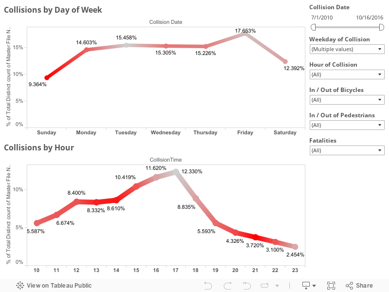
First I would like to mention that all points on the dashboards listed below are clickable, so if you click a roadway name it will reshape all of the shown data to reflect that roadway name until you click off of it clearing that selection. The same goes for things like day of the week of collision or hour of collision, any of those will reshape all the other existing data on the charts below this goes for all four of the dashboards I have posted below.

This first dashboard highlights the locations of collisions highlighted by particular roadways with day of the week and hour of day frequency being shown at the bottom. The map to the right of the roadway names shows coloration by number of injured in particular accidents the concentration of redness at different locations can be a good indicator of where are the most injurious areas of a particular roadway. Take a look around at the data and remember you can use the controls in the upper left of the map to zoom in on a particular area of interest after you have set your filters were selected your items on the other charts.


 This second dashboard is just a comparison of the percentage change of pedestrian and bicycle collisions by month and year. Taken as a whole pedestrian collisions have risen slightly over the last six years while bicycle collisions have fallen slightly . The thing to remember is the percentage differences in these changes are less than 1% so not terribly significant. If we limit the collisions to the last three years we see those trends are reversed. In the last three years , pedestrian collisions have gone down 0.4% while bicycle collisions have gone up 0.2% . I didn't have any particularly significant dates to slide the slider to in order to examine a particular change in Lexington policy or anything. But I left the date slider on the right in case anyone wanted to check something out. 


This third dashboard is a slightly more simplified version of the first except that I wanted to look at injury rates particularly. You'll notice the red coloration is the percentage of people injured on that given day or time. Again, the date sliders are on the right as well as selections for the day and hour of collisions though those can be selected by clicking directly on the dots as well . Things like bicycle and pedestrian collisions as well as, in this visualization, fatalities are included. 


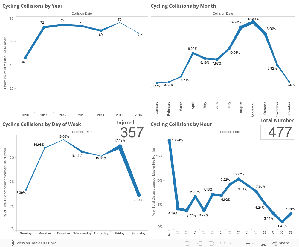
This last dashboard is just one purely to look at every aspect of timing of cycling collations including by year, month, day of week, and hour with both injury totals and total number of collisions also listed in the chart.


 I will be linking the second or third or possibly even fourth part of this viz down below as I complete them but they will all hopefully be part of my one year of viz challenge that I've made for myself. As always, if you have questions or concerns you can leave them in the comments below this blog or hit me up on Twitter at @wjking0.


Wednesday, October 5, 2016

Where (NOT) to Eat in Lexington, KY - UPDATED LIVE DATA!

Lexington, KY Skyline
This is part of my #1YearOfViz series! Check out the archive here: http://bourbonandbrains.blogspot.com/p/one-year-of-dataviz.html

I posted the original version of this back several years ago as one of my very first geo-located dataviz that I'd created. With the new changes in Tableau Public I have finally found a way to get the live-updated data from the Lexington Health Department. If you'd like to see the raw Google Sheet that I'm pulling this data from I'll make it available here.

I didn't do too much as far as changing this data from it's original form except making the data a live-updating format and putting some additional filters and analysis on top of what I'd done previously.

First off I'd like to announce that I've developed what I think is a good mobile version which you can pull up on your phone if you'd like to bookmark to be able to quickly/easily check food scores/violations for a place. Click on the image below to be linked out directly to the dash!


If you'd like to see the full dash and analysis list click below to open up the rest of the blog post!

Friday, September 30, 2016

Phoning It In - Analyzing My Call History


This is part of my #1YearOfViz series! Check out the archive here: http://bourbonandbrains.blogspot.com/p/one-year-of-dataviz.html

Disclaimer: This viz is only calls I've MADE, not calls I've RECEIVED. There isn't really any way for IFTTT to track incoming calls and Project Fi (my provider) does have a data-dump utility but it doesn't have contact names etc in it. Additionally it's only limited to around Feb 2016 and Forward so the historical data isn't really there yet for me. Also this viz (thanks to the new Google Sheets connector in Tableau 10.0) will automagically update by itself as time goes on so the viz you're looking at now will be the most fresh version anytime you look at it!

For the last few years I've been keeping some details of my usage of various things (calls, wifi, etc) that I do with my phone in order to work more on what a lot of data scientists called the "Quantified Self". A little better self-understanding never really hurt anyone and understanding your own usage of things can be a good predictor of future needs as well as making behavioral changes.

I started logging all of my outgoing calls on April 24, 2014 and had a slight hiccup in data collection from 5/2/2015 to 12/18/2015 as I didn't know there was a problem with the IFTTT formula I was using and it stopped working until I checked on it. DOH!

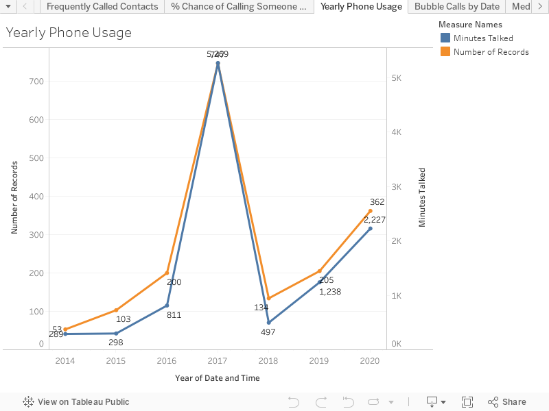
Like the title suggests this was a pretty quick viz for me to throw together. Let's jump into the data! The first chart is just something I found interesting when the data is zoomed out to the topmost level. You think that you're making less phone calls and your talking less but according to my data (which again is largely incomplete from 2015) that's actually inaccurate. I'm making MORE calls in 2016 than in previous years!


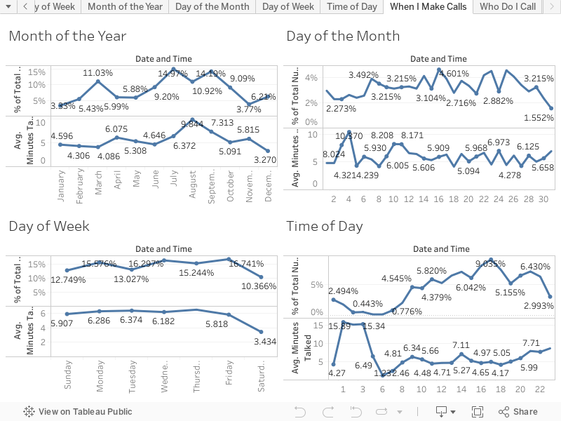
The second viz is literally just a chart of all the breakdowns you can imagine for a phone call, Month of Year, Day of Month, Day of Week, and Time of Day.


And of all the strange things I found when I was doing the write-up for this viz I came across this gem...

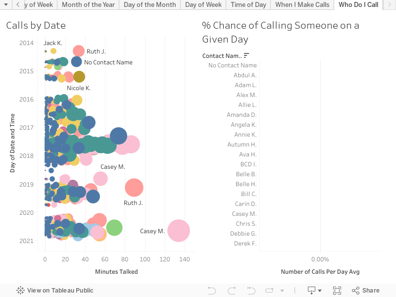
The last one is the one I like the best, it shows frequency of contacts. I decided the most fun calculation was to see how likely I was to call a given person any given day. I calculated up how many days there had been total that I'd gathered data and divided by the count of days for each individual user to come up with a nice little percentage chance that you'll get a phone call from me!


If you really want to talk to me though you'll have to reach out to me either in the comment section below or via twitter @wjking0 (Or Click the giant Pusheen kitty below!).


Wednesday, September 7, 2016

Churches versus Stoplights - "Small Towns" in KY


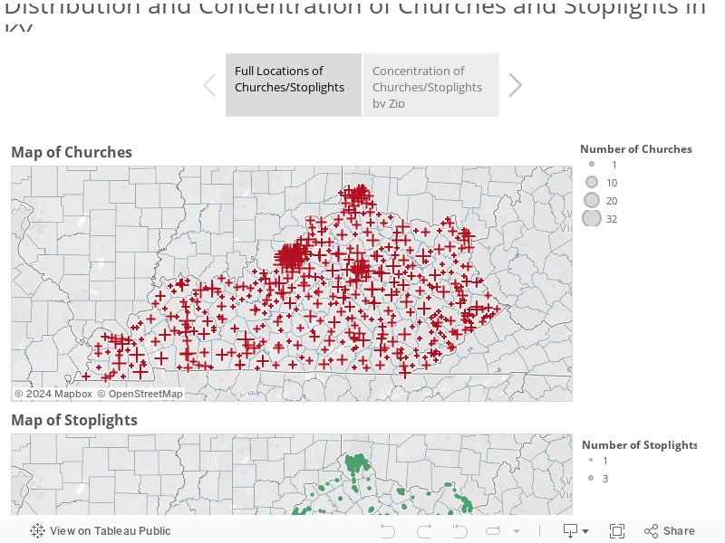
Growing up in a small town just outside of Charleston, WV and being part of the "Bible Belt" it was always a running joke in my hometown between some of us there there were (literally speaking) twice as many churches as there were stoplights in our small town. With 6 Churches and 3 Stoplights (giving the town the 3rd stoplight is pretty generous as it's on the very edge of town) the math was easy. I wondered though, could I do it on a larger scale? A scale of a larger city? Or a whole State?

First trick would be to find the church data? I tried to think of religious databases then I realized I was approaching it was from the wrong direction. What is every church besides a religious organization...? A tax exempt organization! You know who likes taxes? The Federal Government! I knew that tax records are a matter of public record so a quick jaunt over to data.gov later and I'm swimming in tax exemption data!


I realized after I got this data that I'll do a future blog just about the non-profit data in the US, there is WAY more than I anticipated there being in that data. Luckily there is a tax exemption category for "churches" which includes churches, synagogues, mosques, and of course the Church of Scientology.

Next I wondered how in the world I was going to get the location of every single stoplight in KY. I hopped onto the Kentucky Transportation Cabinet and found their IT staff and shot one of them an email. BOOM! The county/latitude/longitude of EVERY SINGLE operating stoplight in the entire state! They were SUPER NICE about it too! I didn't even have to file an open records request! That is how you do public service ladies and gentlemen!

Thanks to the Kentucky Transportation Cabinet for making Kentucky a safer place to drive than this!


Interestingly one of the things I came to notice really quickly was that several entire COUNTIES within Kentucky contained not ONE single stoplight! This thusly caused a "divide-by-zero" error in my calculations which is why you'll see several that are "null" in the maps etc (which are by zip not county). I figured out a different way to write my calculations to take into account the Null/Zero data for stoplights in certain zip codes.

Let's get into the data!

Where ARE all these things!? Check out this and click through the tabs to see where the locations and densities of churches and stoplights throughout Kentucky!


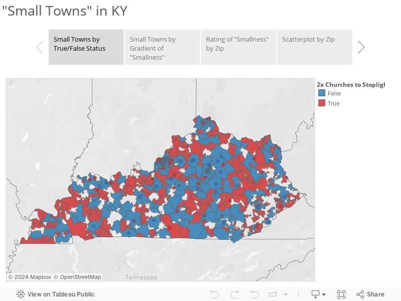
Next is a little Tableau Story showing the True/False status of "Small Towns" by Zip. Red represents small towns and blue are "Big City" towns. The next tab contains a more granular breakdown of "levels" of smallness. Finally is a chart showing "largest" to "smallest" using a difference over sum equation to normalize for the total number of churches/stoplights and keep it relative! Where does your hometown or birthplace fall!?


Ultimately what it all boils down to is that there are 504 zip codes with relevant data in the state of Kentucky and of those 185 are "big towns" in Kentucky and 319 are "small towns".

I know this data may not seem like much but it's been a LONG time in preparation and presentation. As always if you have any questions or anything hit me up on twitter at @wjking0!

P.S. This is the first in what I'm going to call my #1YearOfViz where I'm going to try to do a visualization EVERY SINGLE WEEK. I can't promise I'll always publish on the same day of the week or time but right now I'm looking at either Mondays or Wednesdays as my "publish days". If anyone knows any newspaper contacts or data journalism contacts that are looking for fun data related news stories have them tune in and get in touch! Also if you have any suggestions or thoughts on what you'd like to see over the next 52 weeks of viz give me a shout or leave a comment below!


Monday, June 27, 2016

Instagram In My Hood (1 Year of EVERYONE's Lexington, KY Instagram Posts)


PREFACE: This page contains LARGE-SCALE dataviz! It will NOT work on your phone! Walk or run to a desktop/laptop/tablet computer to view the dataviz properly formatted!

A little over a year ago I came across an amazing IFTTT (If This Then That) recipe for "Instagram in My Hood" and I thought "well I'm going to look at this just for the name..." and what I found was fantastic! It was an IFTTT recipe for cataloging ALL the geo-tagged Instagram posts within a region!

UNfortunately, Instagram's usage policy changed and now those location-based IFTTT recipes will no longer function due to changes in their API. BOOOO! =/

When I checked to see what all I'd gathered since turning it on I found it had run from March 26th, 2015 until June 1st, 2016 so a GOOD chunk of data! Of course I would have like to have run it multiple years to see if trends change or if predictors held true but alas, that's not the world we live in. Instead I can show you when and where certain people talk about certain things in Lexington!

Let's talk for a second about what this data IS:

  • PUBLIC Instagram posts
  • GEO-LOCATED posts
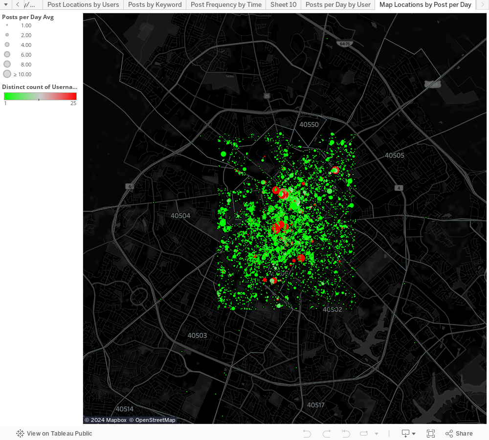
  • Limited to WITHIN New Circle Road in Lexington, KY (this was approximately the limit on the area I could cover with the IFTTT Instagram API call).

What the data is NOT:
  • PRIVATE Instagram posts
  • NON GEO-LOCATED posts
Interestingly enough if you choose to geo-tag an Instagram post that makes it public regardless of settings (essentially because you are "tagging" a place). 

First let's look at posts over time and by hour-of-day and day of week. Please note that the days where there are only 6-10 posts are ones where Instagram and IFTTT had some technical glitches. Also notice that if you're interested in a particular hashtag or word you can search the text content of the Instagram posts to look for frequency with the search bar on the right of this viz screen.


You can see that (as you would expect) Friday, Saturday, Sunday are the largest post days-of-the-week but I thought Thursday (because of Thursday Night Live) might actually be the next highest day-of-week. Surprisingly the next highest is actually Tuesday for some reason! I haven't done a deeper dive into the data to figure out why yet. If anyone has any suggestions let me know!

I realized that I could figure out the average posts-per day for a place but I realized that there were some places that had tons of posts per day (I'm looking at you Wild Fig! ;-) ) but I decided to scale the size of the dot on the following image to the number of posts per day and then use the count of distinct users to help bring a "pop" to the places where there are actually large numbers of different users talking about/from.

The next thing I looked at is WHO is posting and where do particular users post from the most?

I know this is a little messy but given the number of users I wanted some color variation (highlighting didn't seem to work as well without it). You can enter a username or select from the list of names below sorted by most frequent posters. If you mouse-over the name or the bar representing their number of posts it will show you a highlight on the map of all the places that particular user posts from around Lexington.


Finally I replicated some of the functionality of Instagram's search by doing a text search as well as adding mapped locations where that thing is mentioned. Below you can see "Beer" as the search term and you'll notice it coordinates to bars but more specifically breweries in Lexington! Imagine if you could do this globally with Instagram and you could find the most talked about bars in a town!


As always if you have any questions about this dataviz or any other please feel free to hit me up on twitter @wjking0

And also this is totally how I feel when I spend the majority of my birthday writing up dataviz blog posts, playing video games, and eating donuts from the awesome North Lime Coffee and Donuts. =D
<------

Thursday, June 2, 2016

Kentucky School Vaccination Rates (2015)


Let's talk about vaccines. First off, I'm NOT going to have a debate about how effective or dangerous vaccines are. They're both effective AND safe. I've crunched the numbers for the amount of things like mercury (Thimerosal actually) contained in vaccines and basically if you've eaten fish in the last year or two you've consumed more actual mercury than in all your childhood vaccines combined.

OK, now that we're done with that... let's talk about vaccination rates! Contrary to popular belief MOST of the world is vaccinated!
Rates of measles vaccination worldwide
Turns out that even in super-rural and third-world countries people will travel great distances to get their children vaccinated.

I stumbled across the Student Health Data provided by the Kentucky Department of Education and thought, "Man, I wonder how many kids in this state go unvaccinated?" For those with other questions such as what the average BMI of school kids of different grades in different counties are etc.

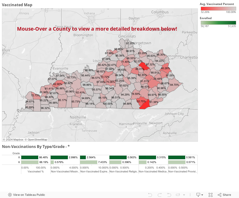
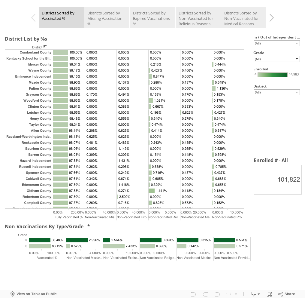
Turns out more kids are vaccinated than I expected when I started crunching through the data! Good job Bluegrass! To let you know how these numbers were calculated I used the enrollment number of each school and just did a little division with the other variables represented. No fancy-dancy math needed here! To be clear the data comes from the 2015 school year.

The classification for the numbers you're going to see here may need a little defining.


  • "Grade"
    • 0 = 5-6 years old 'Preschool' (pre-1st Grade)
    • 6 = 12-13 years old 'Middle School' age
  • Vaccinated Definitions
    • 'Vaccinated' = Fully Vaccinated and Up-To-Date on Boosters
    • 'Non-Vaccinated Missing' = No Vaccines and No Boosters
    • 'Non-Vaccinated Expired' = Previously Vaccinated but did not receive booster shots
    • 'Non-Vaccinated Religious' = Vaccinations not applied for "religious reasons"
    • 'Non-Vaccinated Medical' = Vaccinations should not be applied to these individuals likely because of immuno-compromising diseases or treatments (such as AIDs or chemotherapy)
    • 'Non-Vaccinated Provisional' = Vaccines may not be completely up-to-date and/or may be being delivered at a staggered rate for medical reasons but are planning to be delivered on a particular schedule.
  • "In/Out of Independent School"
    • In = Independent/Private School System
    • Out = Public School System
  • "District"
    • For most senses this is represented as the county in which the school resides but excludes Independent School systems

Let's jump right in to the data!


For those of you who would prefer a sort-able list to see where your county falls in the scheme of things you can also use the following Tableau Story to click through... also feel free to click around and sort any of these fields you would like to!


I know there's not a ton of interactivity on these Viz's nor a lot of differentiation but I wanted to just share that the percentage of immunizations in KY was surprising to me. The big thing is that there are preventable things happening in regards to immunizations in children which could easily be preventable. The prime thing is keeping children current on vaccines.

The trend in the data from my perspective is that In almost every other category

To summarize here are a few things I found interesting:

  • The majority of KY children who are susceptible to these types of infections are ones who have not received booster shots so they fall into the "Expired" vaccine category
    • The largest change in any group is in the "Expired" group
    • The increase in students from grades 0-6 is about 4.869% in lack of updated booster shots
  • In virtually EVERY other category (save Provisional which increases by 0.010%) all other reasons for non-vaccination go down rather drastically between grades 0-6
  • Looking at the difference between Independent (private) and Public schools I saw very little difference on most issues and didn't feel it was relevant to look at it with this differentiation included. A few things worth noting:
    • Independent schools do start with a higher average of students with religious and provisional exceptions
    • By grade 6 stay Independents retain almost exactly the same % of vaccinated students
      • Expired %s go way up (3x approximately)
      • Missing and Religious %s go down
  • The data in some places is missing a fairly large number of students
  • Bell and Bath Counties all are VERY low as far as full vaccination rates (this could be because of missing data, which we have to count as a loss)
  • Breathitt County has 15.8% of their students non-vaccinated due to legitimate medical reasons


Places like Breathitt County are the reason that the idea of herd immunity is very important! Unfortunately the rest of their stats aren't looking very good either, the big problem is the total number of enrollment there is very low so the likelihood that those immuno-compromised students will interact with non-vaccinated students is very high. Finally I just wanted to share out with you this little gif explaining why herd immunity is important in protecting people:

As always for comments or questions comment below or hit me up at @wjking0 on Twitter!