Friday, July 8, 2016

Police Shootings 2015-2016


I don't have the time or the drive to make this "pretty". It shouldn't be "pretty", it isn't. I wanted to get FACTS out to people because it ultimately isn't about 1 or 2 individuals getting killed out there, it's about the systemic racism of police forces in America. I pulled this data from the Washington Post's great viz about this which you can find here.

I'll post the viz's below and you can play around with the morbid data yourselves but I'd like to point out a few things that came to light for me:
  • UNARMED Black people in America are 2x more likely to be killed by a police officer than a White person (UNARMED Hispanic Americans are 1.5x more likelythan White Americans to be killed)
    • If you are UNARMED, Black, and show signs of mental illness you are4.6x more likely to be killed by a police officer than an UNARMED, White, and showing signs of mental illness
  • UNARMED Black Americans are 3.39x more likely to be killed than White's in a state of "Not Fleeing" and not "Attacking" (Hispanics are 2.18x more likely)
  • The approximate US Population is as follows from the 2010 US Census:
    • White American 223,553,265 72.4 %
    • Black American 38,929,319 12.6 %
    • Asian American 14,674,252 4.8 %
    • American Indian or Alaska Native 2,932,248 0.9 %
    • Native Hawaiian or other Pacific Islander 540,013 0.2 %
    • Some other race 19,107,368 6.2 %
    • Two or more races 9,009,073 2.9 %

That is to say there are literally more than 5x as many "White" people as "Black" people in America so regardless of the stories of individual numbers. Are you going to tell me why the numbers of UNARMED people getting killed in America is almost equal between these two racial groups? No really, I'll wait.

All of this said, I believe that police officers risk their lives for us every single day. The large majority of those people are heroes in every sense of the word, but I feel that the systemic racism in America causes an "other" reaction when dealing with someone not of your own race and unfortunately in quick life-or-death moments those systemic feelings can cause people to make tragically wrong decisions. Are there racist cops out there? Certainly. Should we treat all cops like racists? Of course not. If you'd like to hear a great video that I feel encapsulates my feelings check out Trevor Noah's take on the whole thing:


Now let's get on to the Viz, like I said it isn't pretty or super-cleaned-up, it's just the facts. These percentages represent how many UNARMED people of that particular group were killed vs ARMED members of that group. When I say UNARMED I excluded ALL weapons, they had no guns, no knives, no shovels, nothing in their hands. I urge you to mess with the filters to find your own truths in this data.


This last one is just a map so you can see city-by-city and state-by-state:


As always if you have any questions about this dataviz or any other please feel free to hit me up on twitter @wjking0. Try to stay safe out there everyone and if you know someone who is struggling with all that's happened now, just offer them a shoulder to cry on and a hug. *hugs to you all*

Monday, June 27, 2016

Instagram In My Hood (1 Year of EVERYONE's Lexington, KY Instagram Posts)


PREFACE: This page contains LARGE-SCALE dataviz! It will NOT work on your phone! Walk or run to a desktop/laptop/tablet computer to view the dataviz properly formatted!

A little over a year ago I came across an amazing IFTTT (If This Then That) recipe for "Instagram in My Hood" and I thought "well I'm going to look at this just for the name..." and what I found was fantastic! It was an IFTTT recipe for cataloging ALL the geo-tagged Instagram posts within a region!

UNfortunately, Instagram's usage policy changed and now those location-based IFTTT recipes will no longer function due to changes in their API. BOOOO! =/

When I checked to see what all I'd gathered since turning it on I found it had run from March 26th, 2015 until June 1st, 2016 so a GOOD chunk of data! Of course I would have like to have run it multiple years to see if trends change or if predictors held true but alas, that's not the world we live in. Instead I can show you when and where certain people talk about certain things in Lexington!

Let's talk for a second about what this data IS:

  • PUBLIC Instagram posts
  • GEO-LOCATED posts
  • Limited to WITHIN New Circle Road in Lexington, KY (this was approximately the limit on the area I could cover with the IFTTT Instagram API call).

What the data is NOT:
  • PRIVATE Instagram posts
  • NON GEO-LOCATED posts
Interestingly enough if you choose to geo-tag an Instagram post that makes it public regardless of settings (essentially because you are "tagging" a place). 

First let's look at posts over time and by hour-of-day and day of week. Please note that the days where there are only 6-10 posts are ones where Instagram and IFTTT had some technical glitches. Also notice that if you're interested in a particular hashtag or word you can search the text content of the Instagram posts to look for frequency with the search bar on the right of this viz screen.


You can see that (as you would expect) Friday, Saturday, Sunday are the largest post days-of-the-week but I thought Thursday (because of Thursday Night Live) might actually be the next highest day-of-week. Surprisingly the next highest is actually Tuesday for some reason! I haven't done a deeper dive into the data to figure out why yet. If anyone has any suggestions let me know!

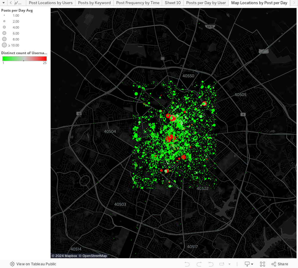
I realized that I could figure out the average posts-per day for a place but I realized that there were some places that had tons of posts per day (I'm looking at you Wild Fig! ;-) ) but I decided to scale the size of the dot on the following image to the number of posts per day and then use the count of distinct users to help bring a "pop" to the places where there are actually large numbers of different users talking about/from.


The next thing I looked at is WHO is posting and where do particular users post from the most?

I know this is a little messy but given the number of users I wanted some color variation (highlighting didn't seem to work as well without it). You can enter a username or select from the list of names below sorted by most frequent posters. If you mouse-over the name or the bar representing their number of posts it will show you a highlight on the map of all the places that particular user posts from around Lexington.


Finally I replicated some of the functionality of Instagram's search by doing a text search as well as adding mapped locations where that thing is mentioned. Below you can see "Beer" as the search term and you'll notice it coordinates to bars but more specifically breweries in Lexington! Imagine if you could do this globally with Instagram and you could find the most talked about bars in a town!


As always if you have any questions about this dataviz or any other please feel free to hit me up on twitter @wjking0

And also this is totally how I feel when I spend the majority of my birthday writing up dataviz blog posts, playing video games, and eating donuts from the awesome North Lime Coffee and Donuts. =D
<------

Thursday, June 2, 2016

Kentucky School Vaccination Rates (2015)


Let's talk about vaccines. First off, I'm NOT going to have a debate about how effective or dangerous vaccines are. They're both effective AND safe. I've crunched the numbers for the amount of things like mercury (Thimerosal actually) contained in vaccines and basically if you've eaten fish in the last year or two you've consumed more actual mercury than in all your childhood vaccines combined.

OK, now that we're done with that... let's talk about vaccination rates! Contrary to popular belief MOST of the world is vaccinated!
Rates of measles vaccination worldwide
Turns out that even in super-rural and third-world countries people will travel great distances to get their children vaccinated.

I stumbled across the Student Health Data provided by the Kentucky Department of Education and thought, "Man, I wonder how many kids in this state go unvaccinated?" For those with other questions such as what the average BMI of school kids of different grades in different counties are etc.

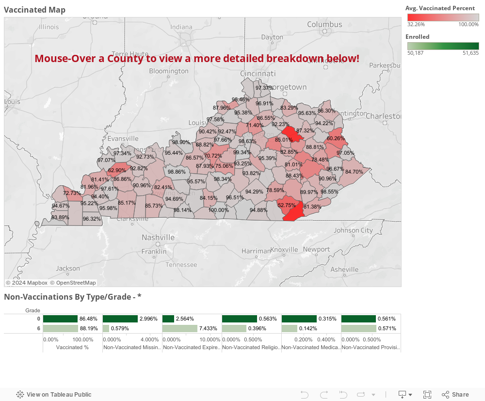
Turns out more kids are vaccinated than I expected when I started crunching through the data! Good job Bluegrass! To let you know how these numbers were calculated I used the enrollment number of each school and just did a little division with the other variables represented. No fancy-dancy math needed here! To be clear the data comes from the 2015 school year.

The classification for the numbers you're going to see here may need a little defining.


  • "Grade"
    • 0 = 5-6 years old 'Preschool' (pre-1st Grade)
    • 6 = 12-13 years old 'Middle School' age
  • Vaccinated Definitions
    • 'Vaccinated' = Fully Vaccinated and Up-To-Date on Boosters
    • 'Non-Vaccinated Missing' = No Vaccines and No Boosters
    • 'Non-Vaccinated Expired' = Previously Vaccinated but did not receive booster shots
    • 'Non-Vaccinated Religious' = Vaccinations not applied for "religious reasons"
    • 'Non-Vaccinated Medical' = Vaccinations should not be applied to these individuals likely because of immuno-compromising diseases or treatments (such as AIDs or chemotherapy)
    • 'Non-Vaccinated Provisional' = Vaccines may not be completely up-to-date and/or may be being delivered at a staggered rate for medical reasons but are planning to be delivered on a particular schedule.
  • "In/Out of Independent School"
    • In = Independent/Private School System
    • Out = Public School System
  • "District"
    • For most senses this is represented as the county in which the school resides but excludes Independent School systems

Let's jump right in to the data!


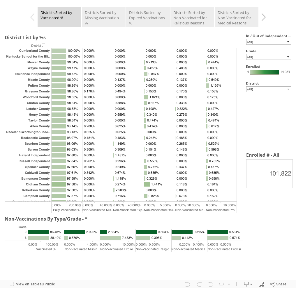
For those of you who would prefer a sort-able list to see where your county falls in the scheme of things you can also use the following Tableau Story to click through... also feel free to click around and sort any of these fields you would like to!


I know there's not a ton of interactivity on these Viz's nor a lot of differentiation but I wanted to just share that the percentage of immunizations in KY was surprising to me. The big thing is that there are preventable things happening in regards to immunizations in children which could easily be preventable. The prime thing is keeping children current on vaccines.

The trend in the data from my perspective is that In almost every other category

To summarize here are a few things I found interesting:

  • The majority of KY children who are susceptible to these types of infections are ones who have not received booster shots so they fall into the "Expired" vaccine category
    • The largest change in any group is in the "Expired" group
    • The increase in students from grades 0-6 is about 4.869% in lack of updated booster shots
  • In virtually EVERY other category (save Provisional which increases by 0.010%) all other reasons for non-vaccination go down rather drastically between grades 0-6
  • Looking at the difference between Independent (private) and Public schools I saw very little difference on most issues and didn't feel it was relevant to look at it with this differentiation included. A few things worth noting:
    • Independent schools do start with a higher average of students with religious and provisional exceptions
    • By grade 6 stay Independents retain almost exactly the same % of vaccinated students
      • Expired %s go way up (3x approximately)
      • Missing and Religious %s go down
  • The data in some places is missing a fairly large number of students
  • Bell and Bath Counties all are VERY low as far as full vaccination rates (this could be because of missing data, which we have to count as a loss)
  • Breathitt County has 15.8% of their students non-vaccinated due to legitimate medical reasons


Places like Breathitt County are the reason that the idea of herd immunity is very important! Unfortunately the rest of their stats aren't looking very good either, the big problem is the total number of enrollment there is very low so the likelihood that those immuno-compromised students will interact with non-vaccinated students is very high. Finally I just wanted to share out with you this little gif explaining why herd immunity is important in protecting people:

As always for comments or questions comment below or hit me up at @wjking0 on Twitter!

Friday, May 27, 2016

University of Kentucky Salaries 2015-2016 Viz


Since the 2014-2015 University of Kentucky Salary Viz was such a hit I figured I would both redo and improve some of the fancy stuff I did previously. First off let me say that I work at the University and have for quite some time. I've loved my work and the people I work for, I also think that everyone should watch this video (embedded below) first before wanting to be super-secretive about what they make:


After the last time I presented this data several emails went around UK regarding if I had done anything illegal in creating these viz's. Soon afterwards I actually met with UK Human Resources (who were extremely nice by the way) to talk about ways to get this info in a more "live" format for them to use. To be able to do quick assessments on medians and averages for different position levels or departments was apparently something they'd been striving to do for about 2 years. Even going so far as to hire a person specifically for the development of that kind of system. I ended up meeting with them and discussing the idea of developing a live version using our UK Tableau server but never really heard much back after the initial meeting. Anyway... the upshot was, I didn't get in trouble as that one (like this one) was done on my own equipment, on my own time, using publicly available data.

NOW, on with the viz!

The three graphs you'll recognize from last year but I also squashed several bugs. The first is the bubble graph showing all salaries and years worked. Years worked is represented by the size of the circle and salaries is the richness of the blue coloring.


Next I wanted to establish medians with quartiles for both years worked and salary. At about 17 years now I'm in the upper threshold of the quartile for years worked and hovering just over the median salary at UK.


Third is the big "full list" of salaries that you can scroll through. It's sorted by position (aka "job title") and then Department, Full-Time or Part-Time, then "Rank" (which only applies to faculty so there is a rank of 'non-faculty' for everyone else), Salary, and the number of Years Worked. I sorted it by position because if you hover the mouse over the Position the info on the right (medians and averages for years worked and salaries) will change to reflect the job title you're exploring.


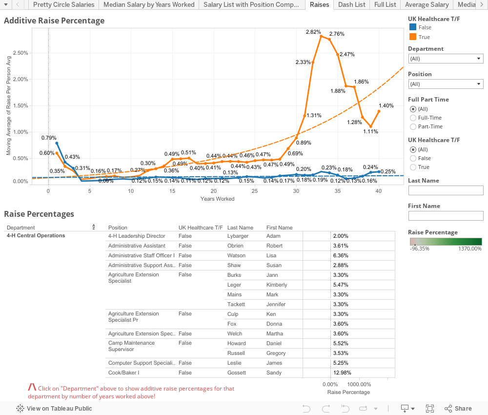
Now comes the big one... the one that I know a lot of people have waited over a year for. What can you calculate when you have TWO years of salary data? Raise percentages. The BIG THINGS to keep in mind here is that when calculating these I made sure the people met the following criteria:


  1. In the same Department as 2014-2015 data
  2. In the same Position as 2014-2015 data
  3. In the same Full-Time/Part-Time status as 2014-2015 data
  4. In the same Exempt/Non-Exempt status as 2014-2015 data


The other thing I thought about was if there was any discrepancy to raise % by the number of years worked. IE is there a good-ole-boy system at play that rewards people who stick around longer? The short answer to that is not particularly, pay rates DO go up over years but that's to be expected, raise percentages don't tend to increase that much as you go up the scale (and remember the "scale" we're looking at is over 40+ years in length of service). The one noticeable trend I did see was that, over time, raises at the Medical Center side of campus tended to add up to larger amounts. You'll see the orange line at the top of this dashboard represents a MOVING AVERAGE of raise percentages. This is generally pretty low because there are LOT of people, particularly when you include part-timers, that receive 0% raises.

You'll notice the list of raise percentages is very similar to the median/averages for salary/years worked from the other dashboard but the primary sorting field is now department so you can click on a particular department and see how raises have been handled by the number of years worked. Obviously, when you have such few numbers you'll notice that the moving averages tend to shift pretty severely... still, if you select a department with hundreds of people you can get a pretty good idea on what the financial upward mobility looks like there.


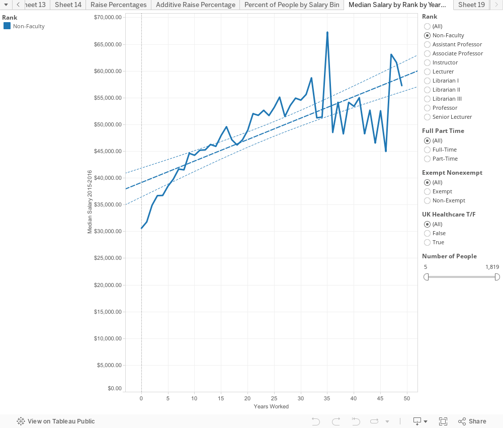
This last little one is just to give you median's by "Rank" (faculty/non-faculty) over time. To keep the graph at least someone accurate and smooth it out a little I limited it to at least 5 people with that particular number of years worked. You can bump the slider up to 10 if you'd like a little more accurate picture.


Ultimately though the university spends $1,137,609,613.91 on Salaries according to their released data for the 2015-2016 fiscal year. While that may seem like a METRIC TON of money (and it is), think that the University of Kentucky is also one of the single largest employers in the state of Kentucky. It's the flagship university of the state of Kentucky. And sadly while none of us working here will ever be like the guy picture below, it's nice to know where state money is going and to know (now that we can calculate raise percentages and have historical data) that nothing crazy is going on.


Lastly I'd like to make this data as available as possible so you can obtain all the data used in this here: https://goo.gl/S8fVTc

As always you can hit me up in the comments below or on twitter @wjking0

Friday, March 25, 2016

The Expansion of Roller Derby (2016)

I did this a few years ago but I figured it was time to update it! I took data from Flat Track Stats and did some geocoding to map out when and where roller derby really took off. Of course, you'll notice the large spike in January 2010 after the September 2009 release of Whip It. This data is current as of 3-24-2016 so it doesn't get much fresher than this!


I also totally made this to help get the 2016 Roller Derby Relationship and Gender Survey out there a little more. If you haven't taken it yet, get on it!

Monday, February 22, 2016

Analysis of Roller Derby Gender and Relationship Study 2015 (Preliminary)


This post has been a LONG time coming...

If you need to catch up on the history of this study you can find it here: http://bourbonandbrains.blogspot.com/2015/02/roller-derby-relationship-and-gender.html

Let's jump right into the results!

One of the big questions I wanted to answer was whether or not roller derby increases likelihood of divorce or infidelity? The other question is seemingly a lot more ridiculous but remains a roller derby myth up until this day; Does roller derby "turn people gay"? (I HATE that misconception). I'm a data guy so I needed numbers to back up my claims.  Thusly, the survey went out in its last iteration.

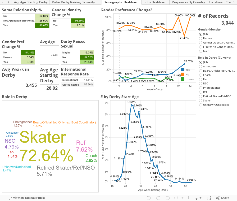
Let's answer those questions, but first let's look at our demographics.


Now if we look at divorce rates for skaters we find that based on age brackets roller derby divorce rates are almost precisely the same as the national averages for the United States of America (where approximately 50% of all respondents reside). It appears that age, more than roller derby involvement, is the factor in the divorce rate of derby skaters.


Further proof of marriage being fairly stable when it comes to derby is this chart showing that of those who come into roller derby married almost 80% are still married, you can adjust the Starting vs Current Status to see the "Flow" of where skaters go relationship wise.


Subsequently, if you want to look at the "Categories" of who people date in derby you'll see slightly lower numbers in this survey as far as people pre-derby with a non-derby affiliation compared to the married graph listed previously. This would mean that it's very likely that some of these significant others have subsequently become involved in roller derby due to their spouses' involvement. Play around with that graph and compare to the above one below!


The next big question is if derby influences sexual preference?

While there is a slight increase over time in interest in expanded sexual horizons past heteronormative relationships this can, I believe, be accounted for with the fact that there is a VERY high percentage of LGBT athletes participating in the sport. To put it in numbers, compared to estimates for United States populations just a few years ago it's 10-12x what we would find reported as a national average. I think it's this exposure to a high rate of LGBT experiences which might account for some of the results that were seen.

Unfortunately I cannot find (currently) any studies that look at the rise of LGBT self-identification over time to compare to this study. Therefore, a direct comparison for these numbers cannot be made to the general populace at large in the same way as a one-shot self LGBT identification can with national studies.

So, while I cannot point definitely to the fact that derby is not a factor in changes of sexual desires I can say with certainty that the high LGBT inclusion rate does expose people who may have otherwise not been exposed to LGBT culture.

That said the VAST majority of people who came in to roller derby tend to be people who are involved with someone external to roller derby. This holds true for both people who are and are not in the same relationship as when they started becoming involved in roller derby. The chart below is one you can play with and see exactly who ends up with who. You can see specifically who ends up with who over the course of the average derby career.

Now for the interesting results!

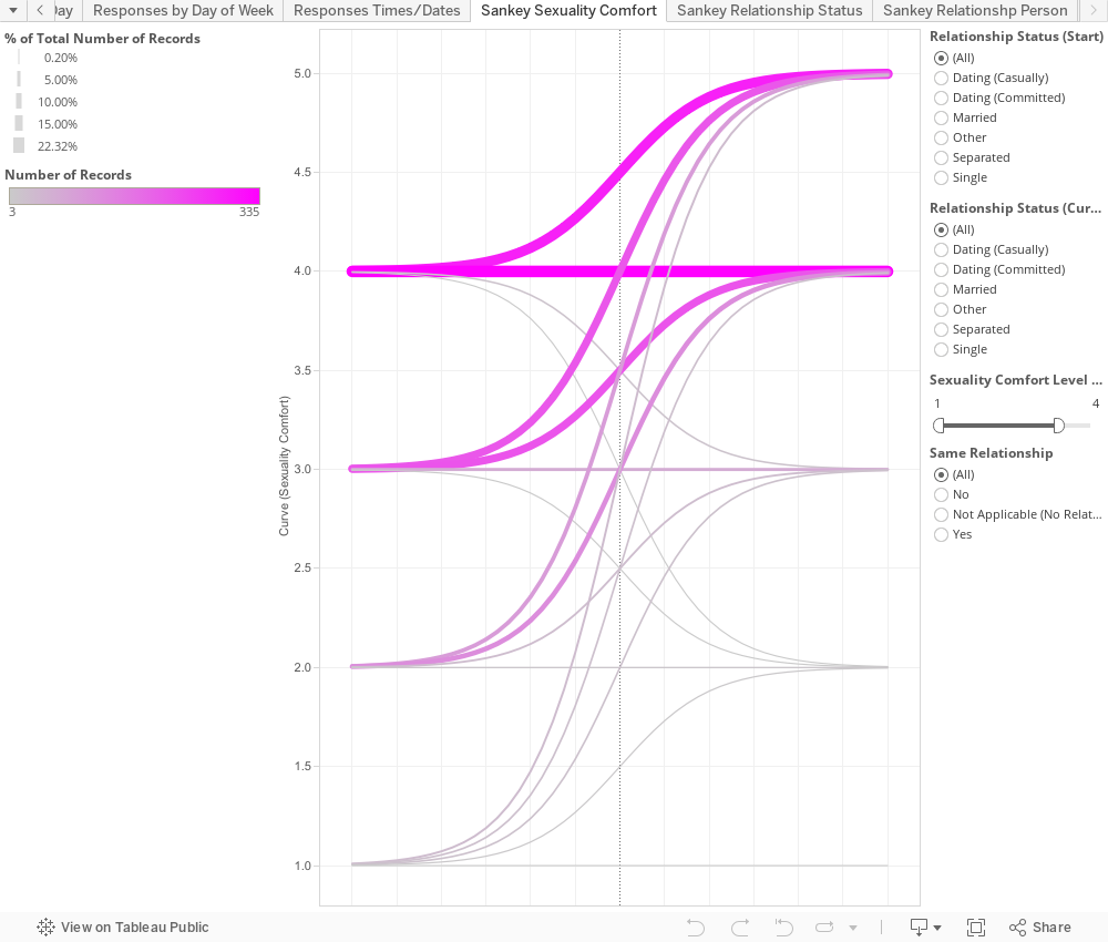
One of the most surprising results that came out of the data is that younger skaters exhibited a greater growth in "comfort" in sexuality. Skaters in their late teens or early 20s, particularly, showed significantly higher comfort levels across the board, with generally all skaters involved in derby showing an increase in comfort regardless of age. Given the high rate of LGBT suicide and suicide attempts this may point to roller derby as one of the most inclusive and positive contact sports LGBT sports youth can participate in. Inclusion and acceptance in the culture of derby may literally be a lifesaver for young LGBT youth. From a purely personal perspective I can tell you as a junior roller derby coach I had a skater come out to me before they came out to their parents. With the large amount of LGBT individuals involved in roller derby the sheer likelihood of getting an understanding coach or themselves an LGBT individual is astronomically higher.

Here is the chart showing the rate of change in comfort by age (orage is pre-derby, green is current):


Below you can see the chart on increases in comfort of sexuality. I removed "5" as a start because almost 50% of people started and ended with a "5" in comfort so I just wanted to see how much and what percentages the increases were as an aggregate:


I'm still working on an academic paper to submit to some journals regarding this research (if you have suggestions those of you from academia I'd love to hear them!). In the meantime I'll likely parse out posts about further results findings throughout this blog (which I'll add links to the end of this post as they come online).

The other big thing I can announce is the next iteration of the survey. I won't go into a ton of detail but I've decided to attempt to make it longitudinal based on people who requested to be contacted with results of this survey's analysis. If you chose to be contacted with results last time (approximately 41% of you), please use the same email address as a contact point this year so I can link data year to year. If you didn't elect to be contacted previously but would like to be part of the longitudinal study please leave a note in the "Final Thoughts" field saying you'd like to be included and I'll try to match country / state / birthday / league type.

I encourage you to take/share out the new survey via this link: https://goo.gl/H6Sib3

As always if you have any questions or concerns please email me at inform8n@gmail.com or message me on Twitter @wjking0. Thanks again for reading and for continuing to help us all understand the impact Roller Derby has on lives both around the block and around the world!

P.S. I titled this "Preliminary" since it's prior to publishing a paper on the topic with more in depth analysis. I also tend to publish a little more on this topic as the time goes on, including a TL;DR version that I'll link to here eventually.

Thursday, February 18, 2016

Dead Drops


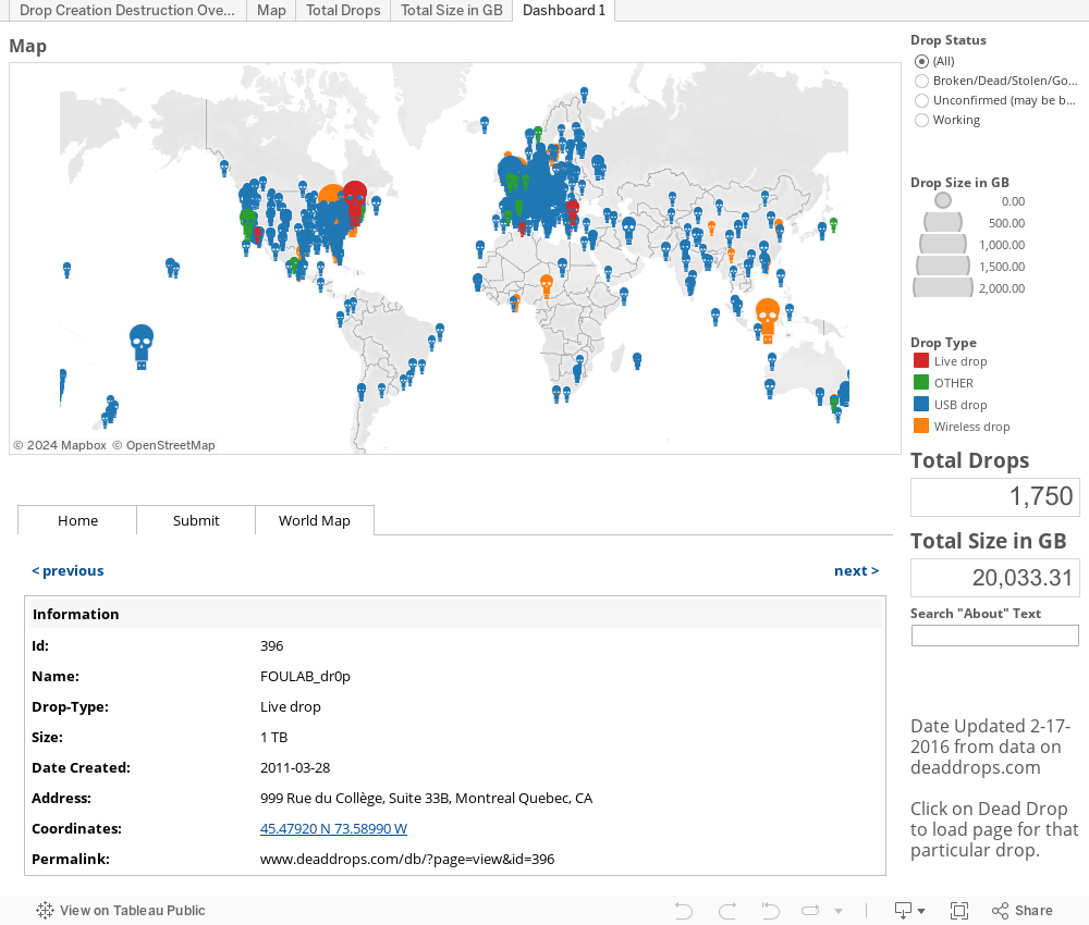
I've heard about Dead Drops for a while but it wasn't until someone posted a link to the site DeadDrops.com with a link to their database (which was the source-material for this viz) that I really took notice.

It's interesting that dead drops would be created (by-and-large) the way they are as they seem to be ripe for people breaking on accident as they're attached to walls or just people breaking out of maliciousness.

I didn't do anything wild with this except for show that the total number of drops currently in existence is a LOT smaller than the total number listed on their site with only 791 working out of 1750 total. Meaning that since November 2010 when this project started more have failed in the last 6 years than have continued to exist. Thanks to spurts of activity in 2013 and 2015  there is are still some positive results that overtake ones that have been marked as non-working. I considered doing some fancy date calculations to show dates for unsure or disabled ones at their "change" date... but honestly I'm just working on this so I can have something to take my mind off the relationship study which has drawn most of my focus over the last week or two.

I considered this my little visual palate cleanser! =) Enjoy!