Monday, March 13, 2017

Buffy the Vampire Slayer 20 Year Anniversary & Strong Women on Television

This is part of my #1YearOfViz series! Check out the archive here: http://bourbonandbrains.blogspot.com/p/one-year-of-dataviz.html


I initially wanted to do a viz this week based on Buffy the Vampire Slayer for its 20th anniversary... I got my scrape all figured out and what all I wanted to look at. I considered pulling the Nielsen Ratings from Wikipedia only to discover it was lacking several seasons worth. 

Me when discovering Wikipedia was missing Nielsen data
I'm not a huge fan of their ratings system anyway though as the sample pool is so small they extrapolate more data than I'm comfortable with. (This is probably the reason they don't have a searchable database on their site.)

Then I remembered that IMDB had a ratings system embedded in it!

Thanks Giles! Finding data is my jam!
In my hunt for data I found this fun little viz of Buffy ratings and I based some of what I did initially off of this. I started thinking about doing a viz in a similar vein and then I thought "Why not add more data!?" So I changed up my Octoparse scrape and used a list URL format instead... then I thought about some of my favorite shows... Crap, there's a LOT of my fave shows that have strong female leads in them, what if I miss one!?

I decided to enlist the help of my social networks... when posting about strong female character TV Shows my friends did not run short on suggestions! After 50+ comments (most containing several shows each) I had a pretty solid list together and a much richer chunk of data than I initially was going to viz!

Realizing I now had about 50x more data than I intended...
While some of the shows had strong female roles I tried to limit my personal suggestions to shows where the female character played a lead role. Also I tried to stay away from characters (even if they had a lead role) who were a little too Damsel-in-Distress-y.

One of the first things I noticed was what a HUGE lead Stranger Things has had on basically EVERY other show out... don't get me wrong, it's FANTASTIC... example below along with the listing of "My Shows" that I looked at. Mouse over the icon to see median ratings and number of votes per episode.
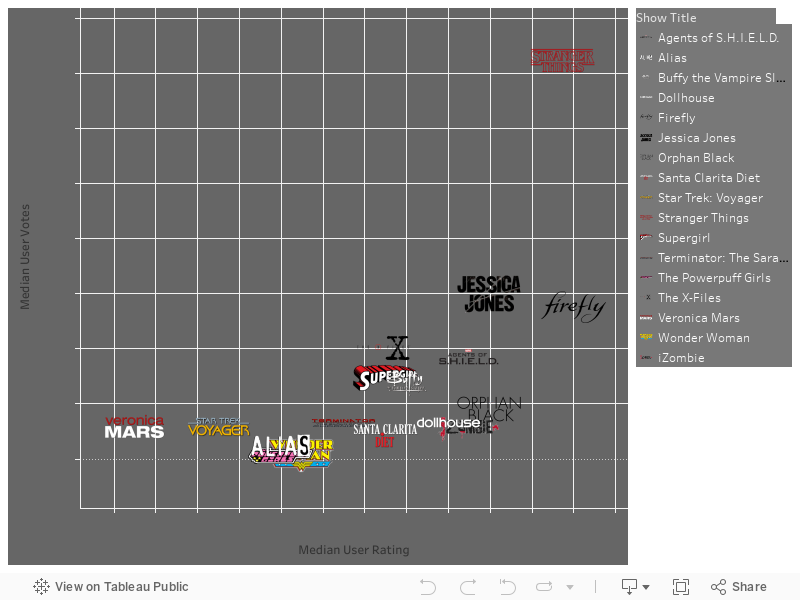


Eleven is here to eat waffles and kick ass in ratings... and she's all outta waffles!

I decided to split it up like that example I looked at earlier and color episodes by season and then make them highlight-able and the ratings click-able. For this one I stuck with just my fave shows but I promise all you that put your input in.... the following viz will contain everything. I really like this one below though as I feel it's a fun way to explore the data, clicking around on things and highlighting the zillions of little show points. Kinda reminds you of the lights in Stranger Th--- ARGH gotta stop thinking about that show!



The one thing you should notice however is that the Buffy Episode "Once More With Feeling" is literally one of the highest rated shows EVER (out of this pretty large chunk of VERY popular shows)! So this following viz looks a little rough but contains the data from ALL the suggested shows (with one exception which I found didn't really have any strong female representation in it). The formatting gets a little gross with the dots on this as several of the "old" shows (like I Dream of Genie, and others from that era) had 40+ episodes to a "Season". Feel free to click around on the show points to reformat and see how your favorite shows did season to season or how their ratings changed per episode... Is your favorite show a strong finisher? Does it have a good trend towards mid-season finales? You can find out now!
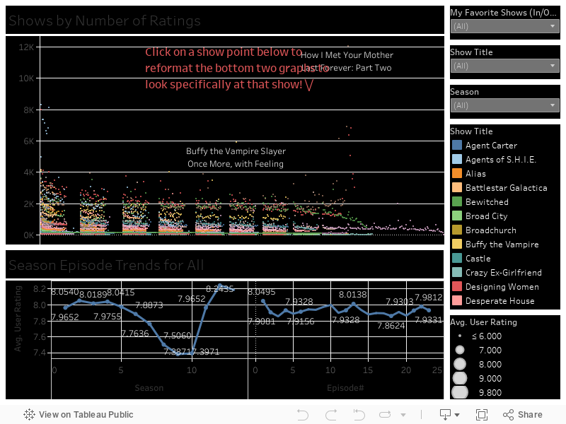

Same girl. Same.
Finally I did this little number below which doesn't really DO much but is a nice representation of all the data and seeing the trends in shows/seasons by the density of the chart itself. Again this represents all data but I limited the number of episodes to 23 to keep it from getting too broke up due to the older programs.
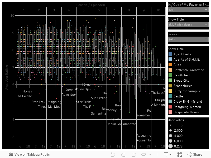

As always if you have any questions leave a comment below or hit me up on Twitter @wjking0. Finally if you just need a good (ugly) cry you can relive some of the best Buffy moments here.


Monday, February 27, 2017

DashWrecks - The Best of CakeWrecks

This is part of my #1YearOfViz series! Check out the archive here: http://bourbonandbrains.blogspot.com/p/one-year-of-dataviz.html
I've been looking for a fun dataset to work with lately. While sitting around the other night my girlfriend and one of her kids was sitting around going through CakeWrecks.com and wailing with laughter.

How I hope people react to this less serious post!
They wondered out loud "I wonder which are the most 'popular' cakes...?" And I thought to myself... "You know who could find out.... !? I could!" So I went to work scraping all the posts made up until that point looking at metrics such as Facebook Shares, Pinterest Shares, Other Shares (I'm assuming twitter), and number of comments left on each post. I ignored "email" shares as the numbers were just really too low to make a difference in most cases (think single digits).


Before we get into the data I wanted to say that while this is only one Dashboard I put a lot of TLC into it... EVERYTHING is selectable/changeable ... you can change the measurements on the X and Y axis (labelled up/down and left/right for those non-math inclined people) to use any of the available measurements... and you can change the coloration to either be by 'Year' of publishing or by the Name of the person publishing. I included median lines so you can get an idea of approximately what the medians are for different types of measures... like for Facebook it's pretty high but Pinterest tends to be pretty low (comparatively speaking). One thing I noticed while I was playing around was that Pinterest interest (try saying that 5 times fast!) tends to be highest on 'Pretty' cake posts where as Facebook tends to love the Wrecks more!

Additionally you'll notice all the dots are all cake themed! I tried to pick appropriate dots for each user based on their frequency of posting... so yay custom icons in the viz! If you click on one of those cake-themed dots the left side of the screen will load up that particular post so you can browse each and every wreck! Anyway... click around and play with the data below!


I have to admit that one of the most widely cross-posted cake posts is also one of my favorite titles... "You want vagina cakes? I'LL GIVE YOU VAGINA CAKES." I literally though I was going to pee myself laughing at the title alone! Do yourself a favor and see if you can figure out which one that is to view that gem yourself! You know what the absolutely hardest part of doing this entire viz has been? Figuring out which of the MANY hilarious animated cake gifs to use!

Me trying to pick the right gifs to use for this post.


If you have any questions as always please hit me up on Twitter @wjking0 or in the comments below

Friday, February 24, 2017

FDA Inspection Data 2008-2016 #Resist

This is part of my #1YearOfViz series! Check out the archive here: http://bourbonandbrains.blogspot.com/p/one-year-of-dataviz.html


This is all of us in the data science community when we
heard whole datasets were just "disappearing" off .gov sites!
Given the recent trend of disabling publicly available data sources thanks to the President of the USA those of us in the public data science community have been frantically downloading all we can from .gov websites.

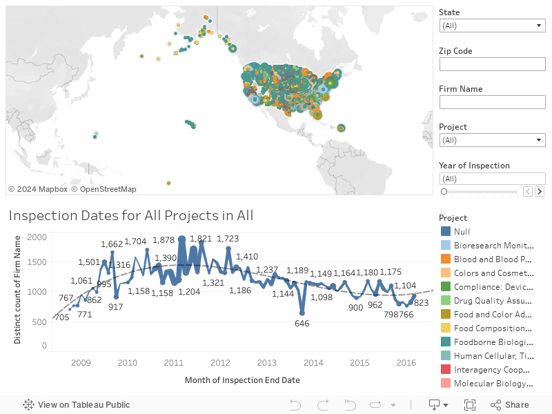
I'd heard that FDA was getting gutted so I wanted to look at inspection dates/locations. This viz isn't particularly fancy and I'm going to get to some more fun topics next week but I wanted to get this one out the door while I get my scrapper to stop crashing!
#dreamjob

Unfortunately they don't have the details of the inspections themselves or the results from them in this data. Still there are certain types of FDA inspections that are caused by complaints or warnings which can be figured out pretty quickly/easily.

For instance you can look at "Foodborne Biological Hazards" as these usually stem from complaints of food poisoning by multiple sources (as well as regular inspections). The trick then is to look for places that had multiple inspections on a particular year. I sized the bubbles by number of inspections in a particular year so you can quickly find groups that have had numerous inspections in a given year. When I actually got into the data you can see how much the FDA is responsible for, from checking laboratories, food creation locations, and even medical product testing (think artificial hearts etc). It's neat to see how many of these types of inspections happen each year.

Let's get into the data. There isn't a ton to this dashboard and all interactions are done with the filters on the right-side of the dashboard. I tried to include "City" in the data listed on the map unfortunately "City" is a field that caused a LOT of problems so I decided to just leave it out and kept in zip code.

As usual if you have any questions leave a comment below or hit me up on twitter @wjking0! Remember not to let data disappear! We need to be the digital monks of these digital dark ages and archive things in as many places as possible! #RESIST gang!
Me as a food inspector

Wednesday, February 15, 2017

The International Investments in Kentucky - Part 2


This is part of my #1YearOfViz series! Check out the archive here: http://bourbonandbrains.blogspot.com/p/one-year-of-dataviz.html
As promised I'd like to jump back into the data I started two weeks ago with information about international dollars that come into the state of Kentucky based on investments in businesses both foreign and domestic.

I just had SO MUCH DATA from the ThinkKentucky.com site that I wanted to split it into two different blogs so I could really not overwhelm browsers (particularly on mobile) with a huge page-load. Really though, too much data ... what a problem to have! I think the big thing also is the diversity of the data and the number of dimensions/measures that I was able to play with really allowed for a lot of interesting viz out of what's in there.


Originally I planned to write up something about the proposed trade restrictions on Mexico and how that could affect the Kentucky economy but after hashing out the data I wasn't really pleased with how it read. I'm a proponent of the NAFTA and unfortunately putting the larger amount that Mexico would have had to spend made it appear that the economy would be that much richer if the border taxes were enabled as proposed. Realistically though you can see in news stories such as this one... the real result is that when the cost becomes to much to export to a particular place a country finds another venue.

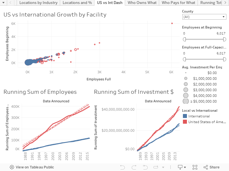
On this first dash I wanted to point out something; you'll notice that in the graphs below the running sum of investments by US vs International groups is MUCH closer than the personnel hiring. This lead to the bubble graph at the top showing Starting vs Full Employment numbers sized by the amount per person spend on the facility. There really isn't a whole lot of interactivity to this graph beyond looking at the County selection to see how each county has been funded over time. When combined with the other dashboard from part 1 you can really begin to get a more full view of how each county in Kentucky is impacted by international dollars.


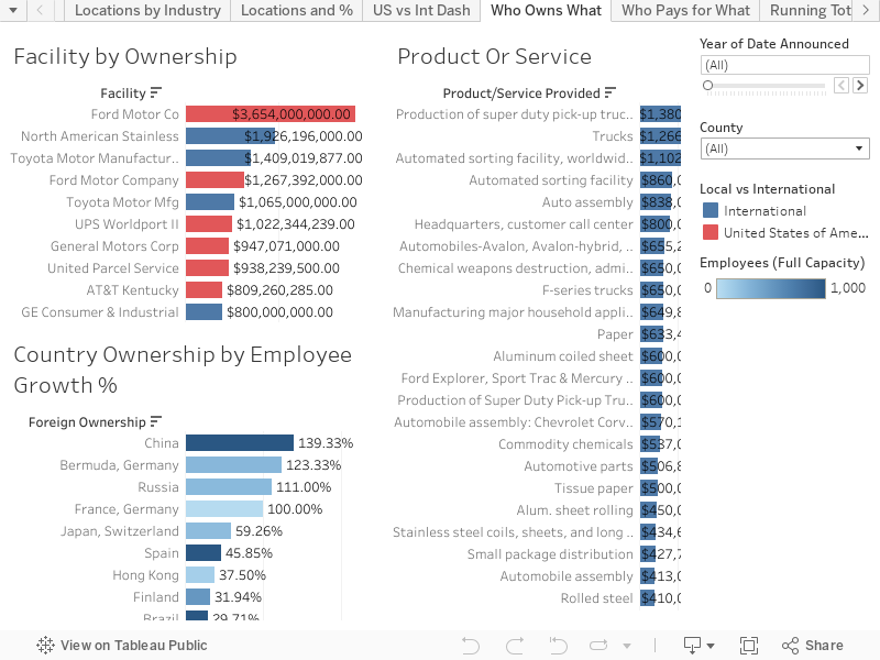
Who is providing the most job growth, for what places, and regarding what industries though? That's when I developed this next Dashboard to look at the ways the different countries funded different industries and with differing rates of job growth. All of the following bar charts just have to be moused-over to filter the other two charts further. As with the other chart you can choose to define it by county or even by particular year (though I feel adding both county/year tends to be a little too refining).


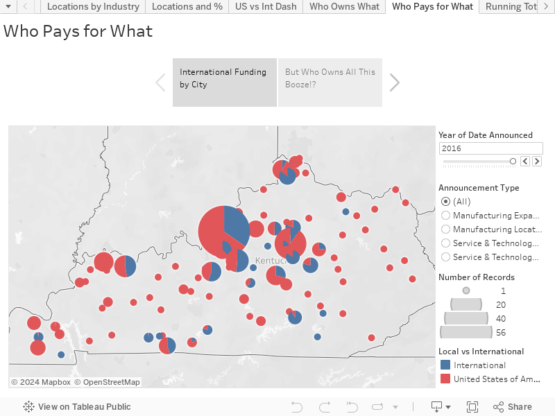
Lastly I have a little "story" I put together which has a breakdown of how much each City has had invested in it by US companies vs International companies... and while working on the Dashboard above I got thinking about distilleries and how many "Kentucky" distilleries were actually owned by a multi-national corporation. Mouse-Over the dots to uncover what Countries invest in your favorite drinks!

Four Roses funding is Japanese!


I wanted to share all this out, like I mentioned previously, because a lot of people want to separate the United States from the rest of the world. This is just a sample of how complex international business is within the relatively small state of Kentucky. So when ideas like changing HUGE trade agreements comes around... please try to remember all you've learned looking through all this data! As always if you have any questions or concerns please post them in the comments below or give me a shout at @wjking0 on Twitter!

Friday, February 10, 2017

Birth Rates & Life Expectancy by Population - Honoring Hans Rosling


This is part of my #1YearOfViz series! Check out the archive here: http://bourbonandbrains.blogspot.com/p/one-year-of-dataviz.html

As most of you know I was originally going to post the second part of my international money in the state of Kentucky visualization, the one that I started last week. However, with the death of Hans Rosling I have decided to do a memorial of sorts that is a re-creation of one of his most famous visualizations showing the population changes in the world overtime.

Below is a video of one of Hans Rosling's most famous lecture. He is known by many as the founder of modern data visualization and one of the first data scientist to really show people a data-driven world.


I wanted to re-create the animation he did using people and birthrates... unfortunately Tableau isn't exactly functional when doing animations so I used Windows 10 new "screen record" ability from the games menu to record video of the animation running. I then imported that video into Photoshop and was able to create an animated gif from it which you can see here. 

I feel this is a pretty accurate re-creation of his work and will be this week's #1YearOfViz visualization. The hardest part of this data was ETL'ing the proper sets from the United Nations data repository (how did I JUST NOW find this!?).

These are the sources for the dataviz:

At one point I accidentally did a "bad" join with some of the data replicating things to the point where I had over a BILLION rows of data (thus crashing Tableau Public). I didn't do much and unfortunately my animation isn't as "smooth" as Hans Rosling's but mine is by 5 year jumps instead of singular years (I'm guessing estimates were used in his data between the 5-year increments).

Here's my little quick viz I cranked out this week in honor of the amazing Hans Rosling's work:


I'll be publishing the second part of my International Money in Kentucky visualization next week so I can touch it up a little more! As always hit me up on twitter @wjking0 if you have any questions!

Dr. Hans Rosling... taker of NO shit.

Monday, February 6, 2017

The International Investments in Kentucky - Part 1

This is part of my #1YearOfViz series! Check out the archive here: http://bourbonandbrains.blogspot.com/p/one-year-of-dataviz.html
I'd like to start off with the fact that I live in one of the larger cities in Kentucky. Lexington is known for it's diversity of people and it's large international community. Given recent events and the recent gathering of people to protest the now overturned ban on people re-entering the US from several countries I thought it would be interesting to look at what the international community brings to the 'economic table' of Kentucky!

First a picture from one of my awesome junior roller derby skaters from the Lexington protest:
A photo posted by amelia (@amelia.loeffler) on


I found this data at the ThinkKentucky.com site which is actually the Cabinet for Economic Development. Their datasets weren't numerous but their site allows for a lot of search/interaction so I dug that! Thanks again for all the rad data and if anyone from there wants to give me a shout I'd love to get some more in depth data sometime!

That said, I designed over 25+ worksheets out of this data and realized it would be foolish (as well as poor time management) to squeeze them all into one blog post. So this week will be covering the viz I published last week and then a secondary part of the viz I've buffed up for this week! That way I'm totally still on schedule for publishing one a week!
Me when I looked down and saw I'd already created 25+
Tableau worksheets from data!
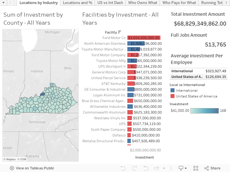
Let's get to it! I took investments in towns/counties and looked at how the domestic vs foreign interests were spread around... this first dashboard is a look at Total Investments in Areas by Facilities. If you mouse-over any county the industries that have invested in that county will be displayed to the right color-coded by their ownership (foreign or domestic).


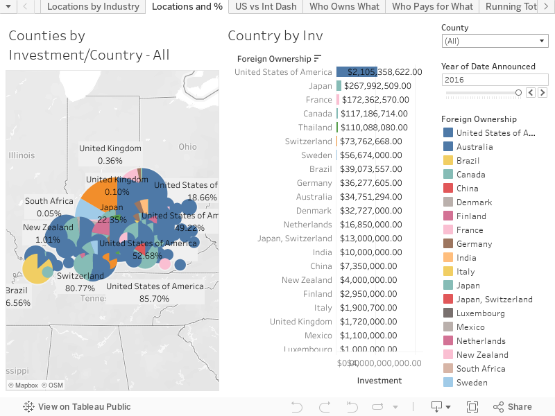
The second dash (and last one of today) is a little more in-depth breakdown of particular countries investments in counties in Kentucky. Again in this viz just mouse over an area to see it highlighted in the other half of the viz or for a more in-depth look by county or year feel free to manipulate the dropdown/slider at the top right of the viz.


I think the big thing to remember is that while we think of places as "American" literally 38.2% of investments in businesses in Kentucky over the last 2-3 decades or so have come from international money. With the climate of separatism that has arisen lately in these beautiful United States of ours... it's good to keep in perspective what international businesses have done for even rural areas in places like Kentucky with SERIOUS investment dollars!

Don't worry part 2 will be coming soon!
As always, if you have any questions or concerns leave a comment below or find me on twitter @wjking0!

Monday, January 30, 2017

My Previous Life - Analysis of Trouble Tickets

This is part of my #1YearOfViz series! Check out the archive here: http://bourbonandbrains.blogspot.com/p/one-year-of-dataviz.html

Before we get started this week I wanted to say that I haven't spent a whole lot of time on anything but I did publish this little quickie viz from last week (hey they can't all be winners right?!). I spent a good part of last week working on upgrading my dad's computer and hanging out with my niece... so while the viz got published last week it's taken me a while to sit down and write a blog post for it! I'm sure you can understand!
Me reading to the Niece (Regan)
It's really because after almost 5 years I finally took down my "ticketing" form that I used for people in my prior job as a sys admin at the University of Kentucky to submit trouble tickets (if possible). Of course there were TONS of people who couldn't submit a ticket online, due to connection issues or whatever, so they ended up calling in. These represent I'd guess about 3/4 of the total amount of tickets myself and my partner in crime would get through the course of our time there.
I worked at the University of Kentucky (UK) for 19 years in total... I literally worked there my entire professional career. I worked there longer than I didn't work there (I started when I was 18). It really became a second home to me. I was let go back in October as part of a "Reduction in Force" during a departmental merger. A lot of people would think I'd be SUPER mad about it but honestly this has given me the kick-in-the-butt I've always needed to pursue my career as a data analyst; which is something I found myself heavily involved with in my last 4-5 years there.
Click image for full comic!
A lot of people think I should be mad about the whole situation... but I'm not mad. Honestly I'm just sad (see comic to the left!) about the whole thing. I just felt very invested in the future of the University only to find out they weren't terribly invested in the future of me. Isn't that crappy?! Shouldn't I be mad about that!? The problem is WHO to be mad at... the people who actually let me go are nice people who really weren't given any other choice. They had to make some hard decisions and I fully expect they'll retire after the full transition period is done.

Over my time at the University I spearheaded several programs that I felt really made a difference both in our impact towards students and on things like the environment. One of the largest (and EASILY most painful) projects I worked on was the transition from personal printers, which at the time consisted of about 35% of my work-time, to large-scale networked printers via our UK contract with Ricoh for Managed Print Services.

Towards the end the large majority of requests came for adding/removing users, file problems... just hum-drum admin stuff. Which is one of the reasons I started poking around with Tableau in the first place actually! So yay boring work! I limited the time in this viz to only the time I was actually at work (even though the form itself stayed up until very recently).


Let's break down the numbers real quick:


  • 1,882 Tickets submitted from 11/16/2011 - 9/29/2016
    • 912 Distinct Days Tickets Submitted
    • Approximately 2 tickets per day
  • Avg Days to Complete = 7
    • This number was driven up by a few VERY longstanding tickets that we couldn't do anything to speed up
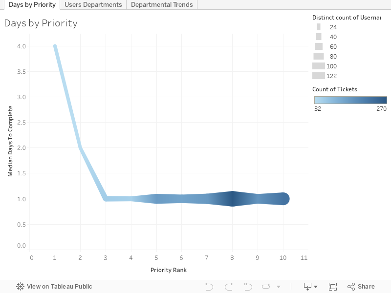
  • Median Days to Complete = 1
    • I'm super-proud of this obviously!
  • Avg Priority Rank (self-ranked by the way!) = 6.912 (out of 10)
  • Median Priority Rank = 7
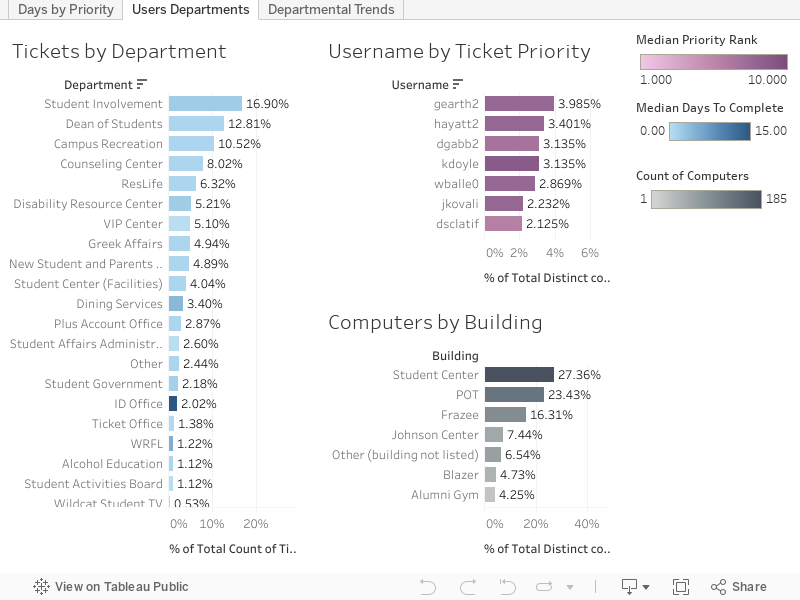
  • Served 336 distinct usernames
  • Worked on 666 distinct computer names
  • Covering 22 departments across 19 different buildings
First here's a quick little look at tickets by priority:


Now let's get into it and look at Users and Departments:


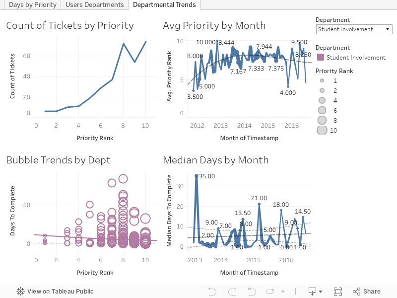
Finally let's examine trends by department:


As always hit me up in the comments below or on Twitter @wjking0 if you have any questions!